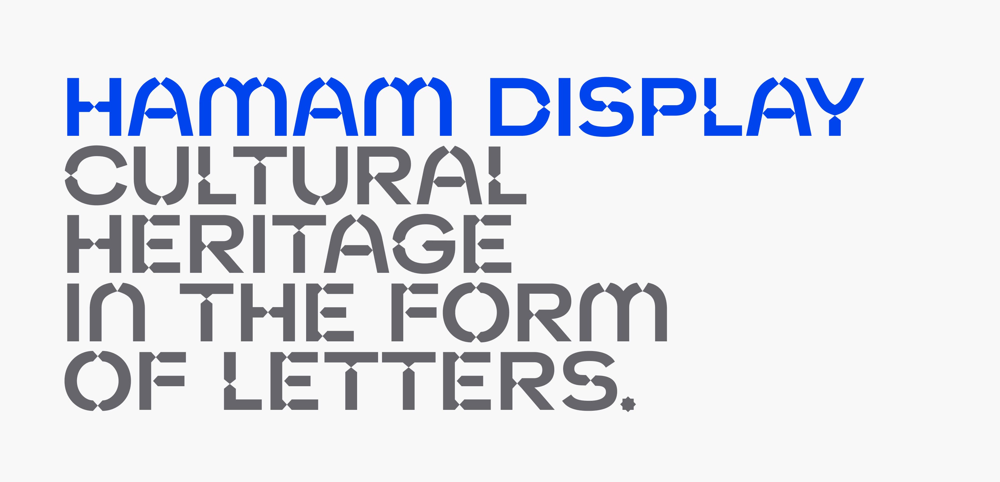

Drawing the history, architecture and culture on a typeface.
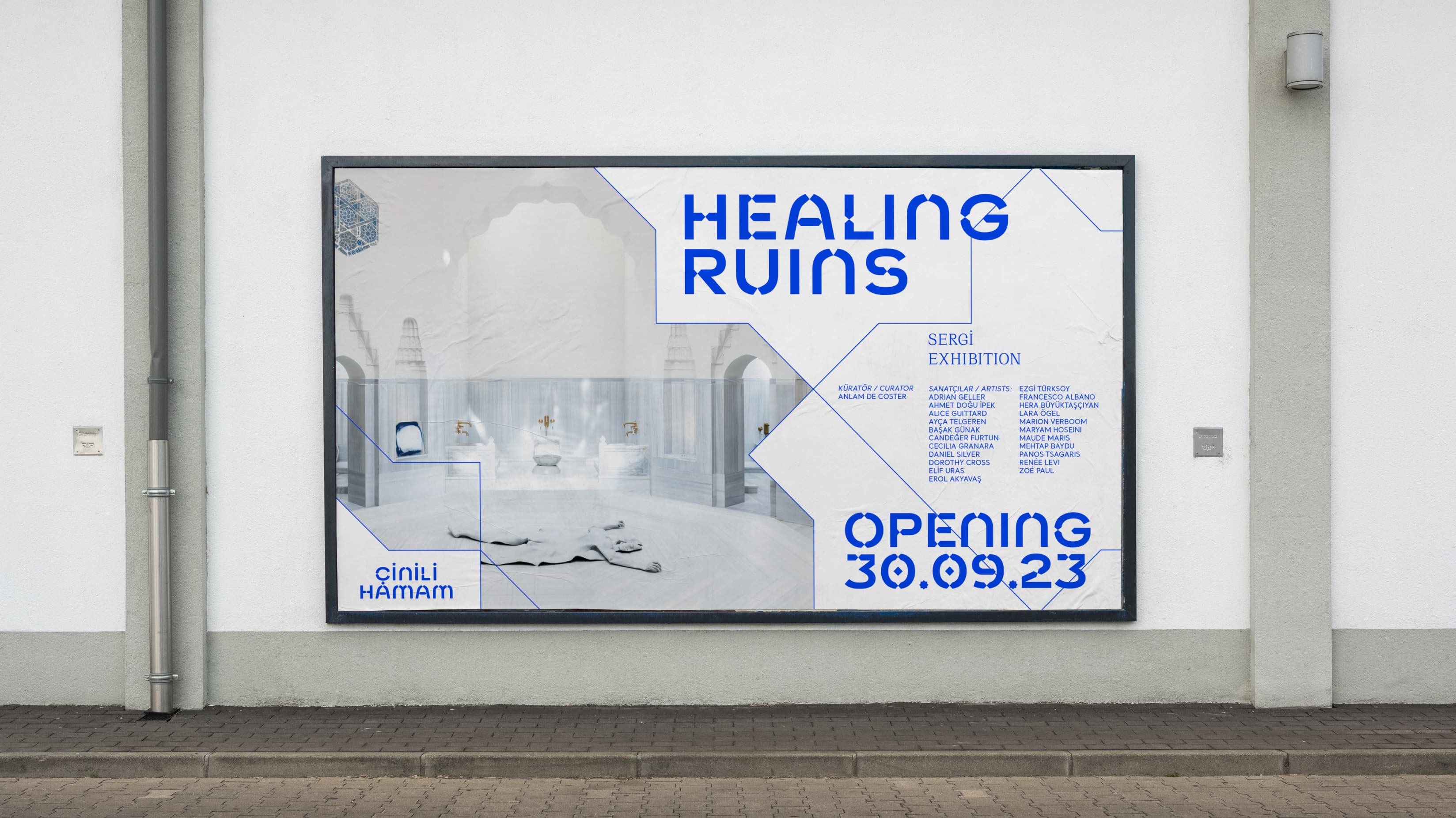
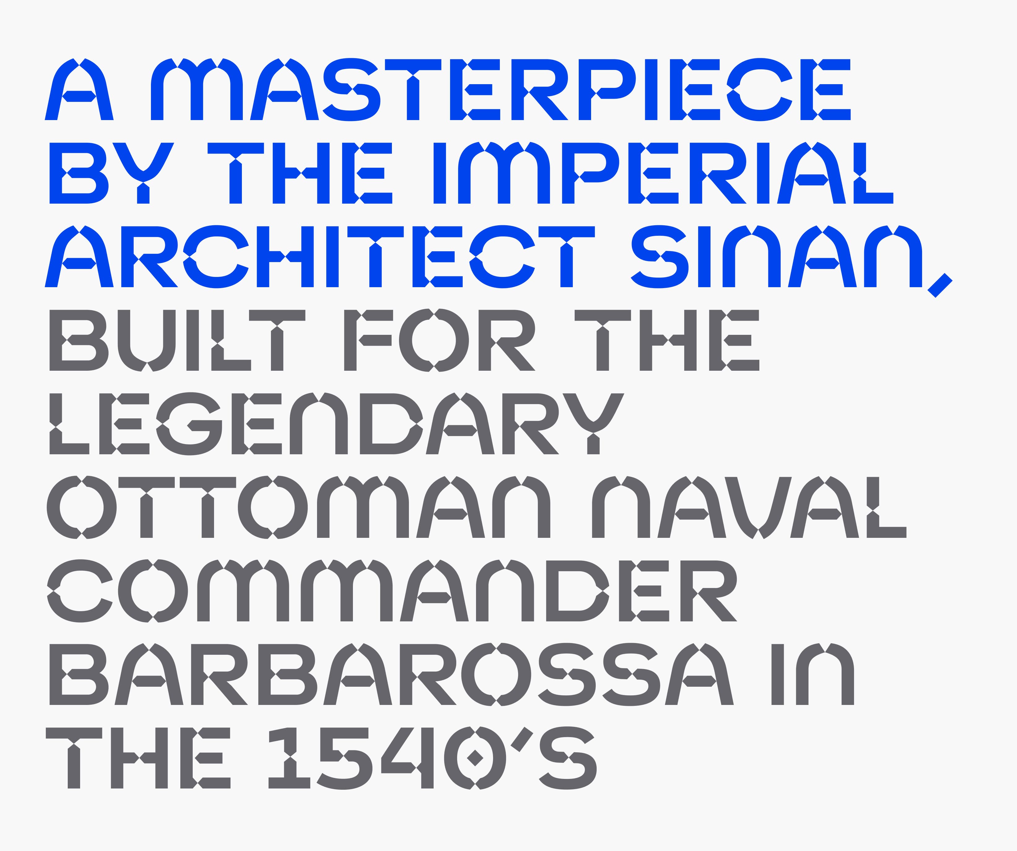
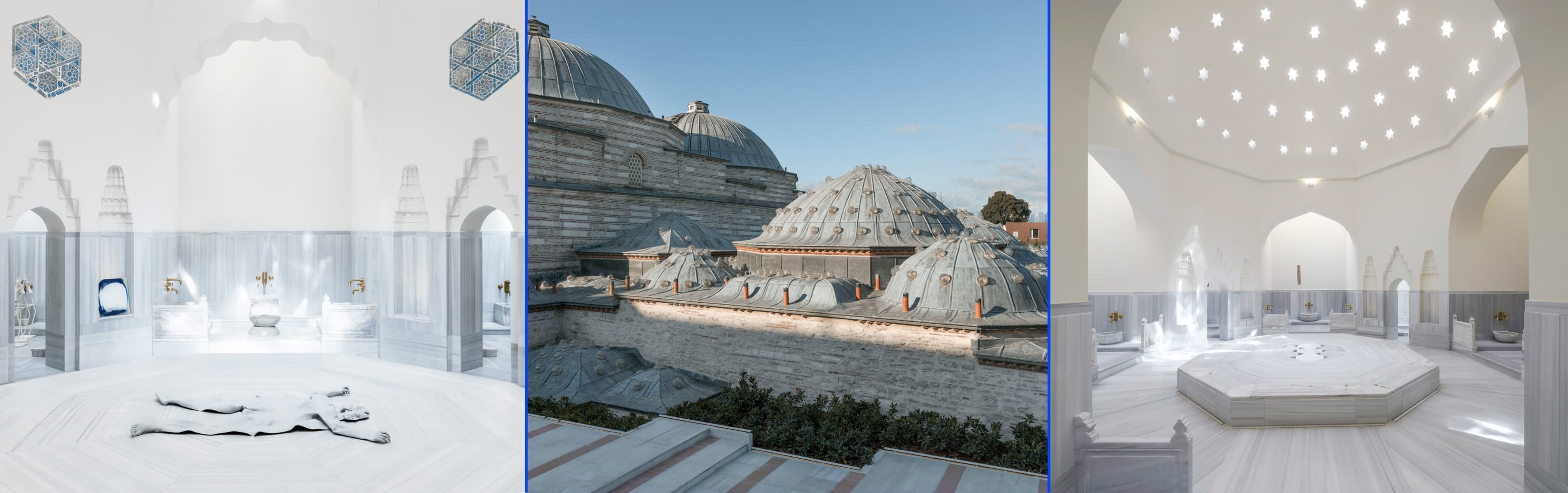
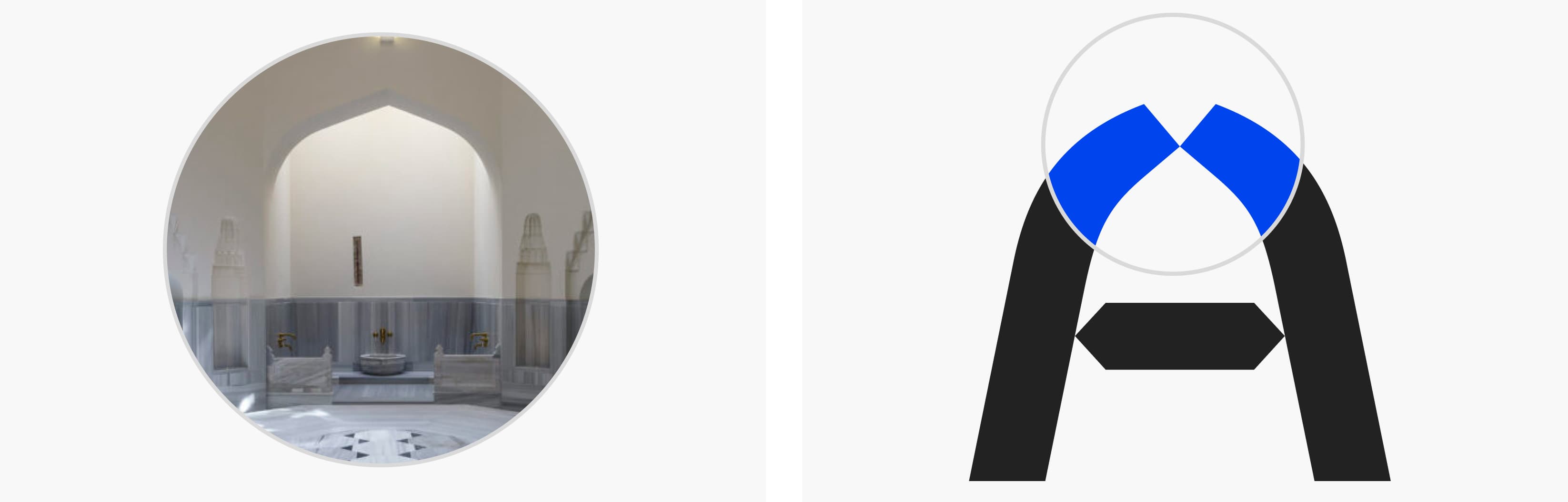
The Zeyrek Çinili Hamam, built between 1530 and 1540 under the direction of Admiral Barbaros Hayrettin Paşa for the Ottoman Navy, is a UNESCO World Heritage-listed masterpiece and one of the crowning achievements of imperial architect Mimar Sinan. Collaborating with the brand and TBWA Istanbul, we were tasked with creating a font design to be an integral part of the visual identity for this historic masterpiece, which now serves as a museum.
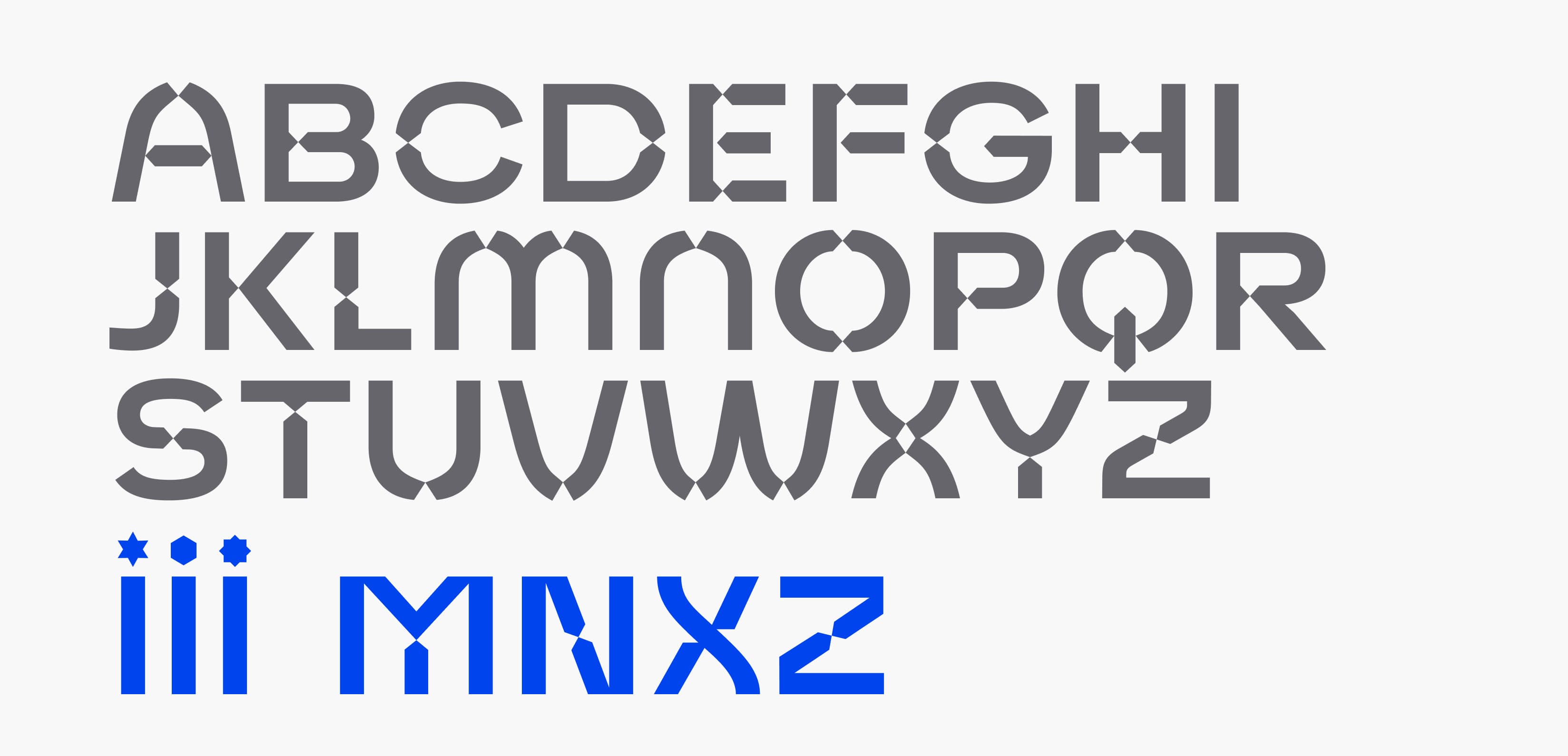
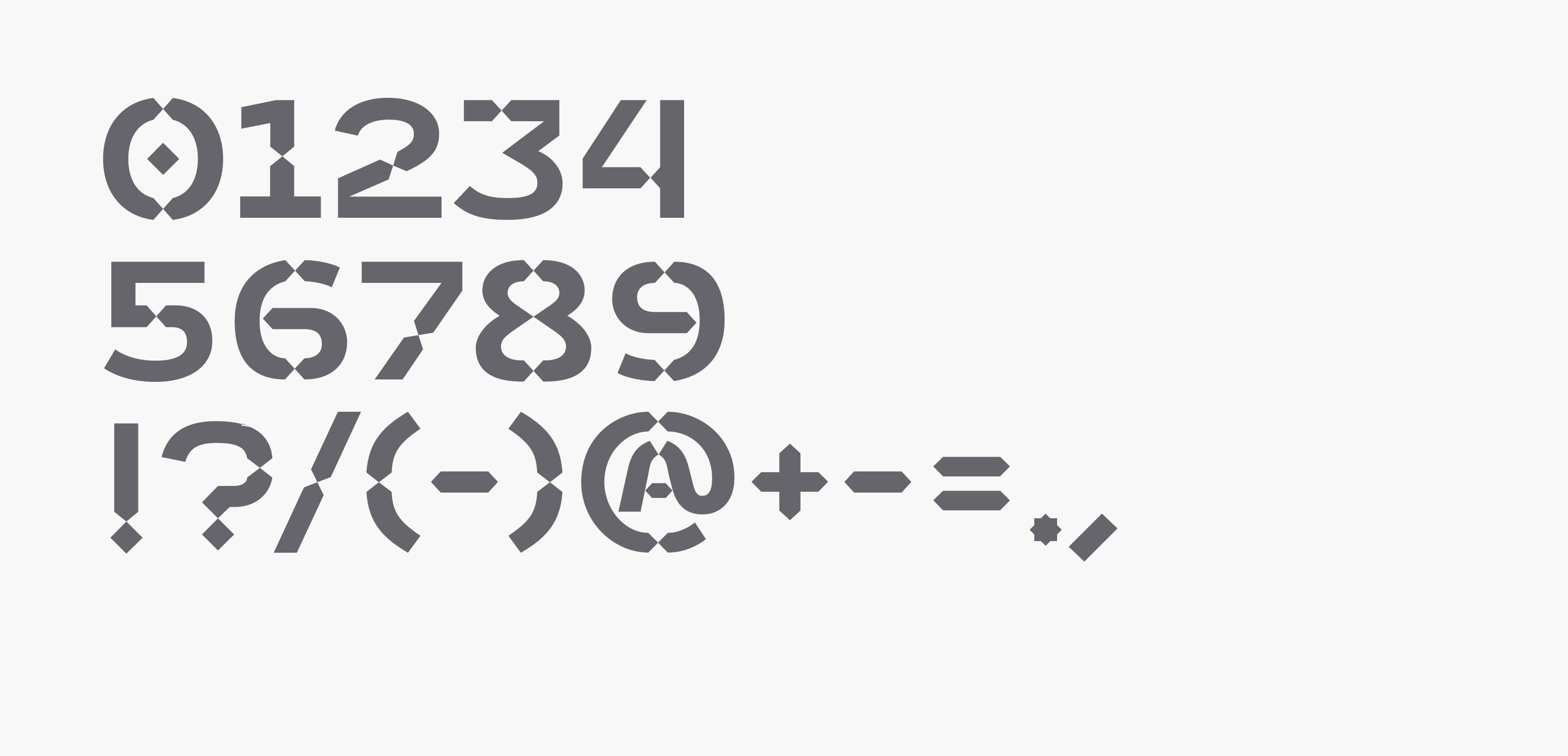
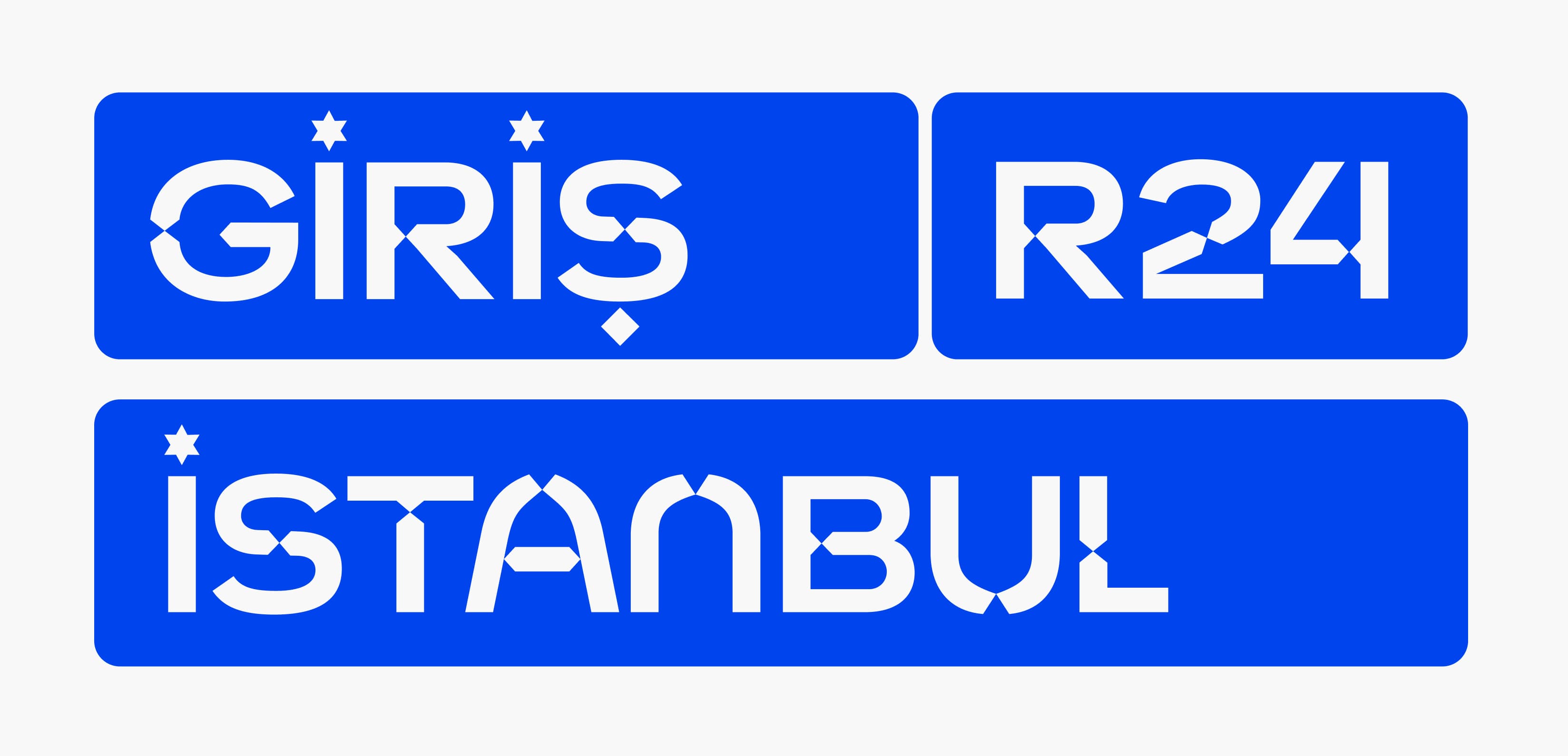
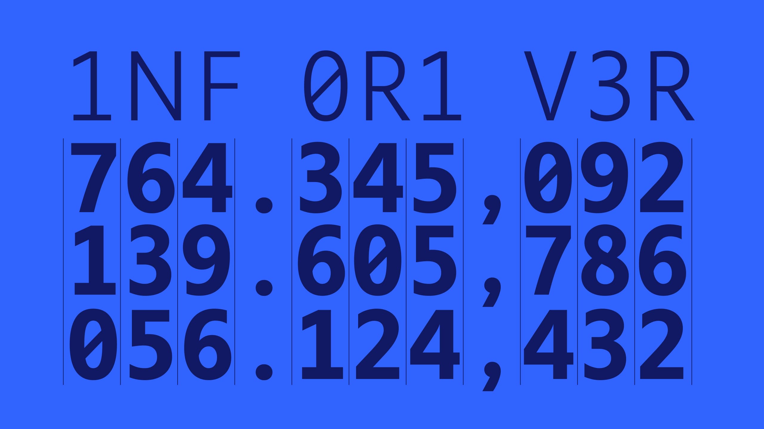
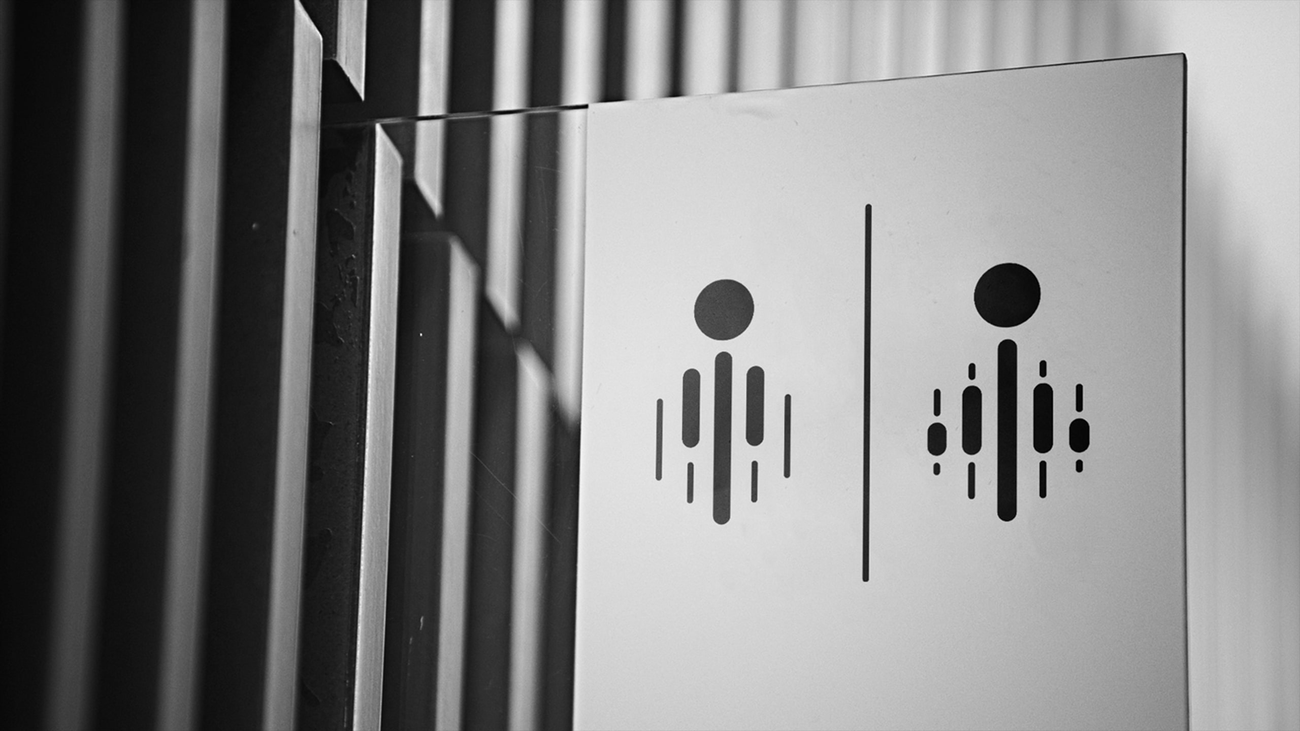
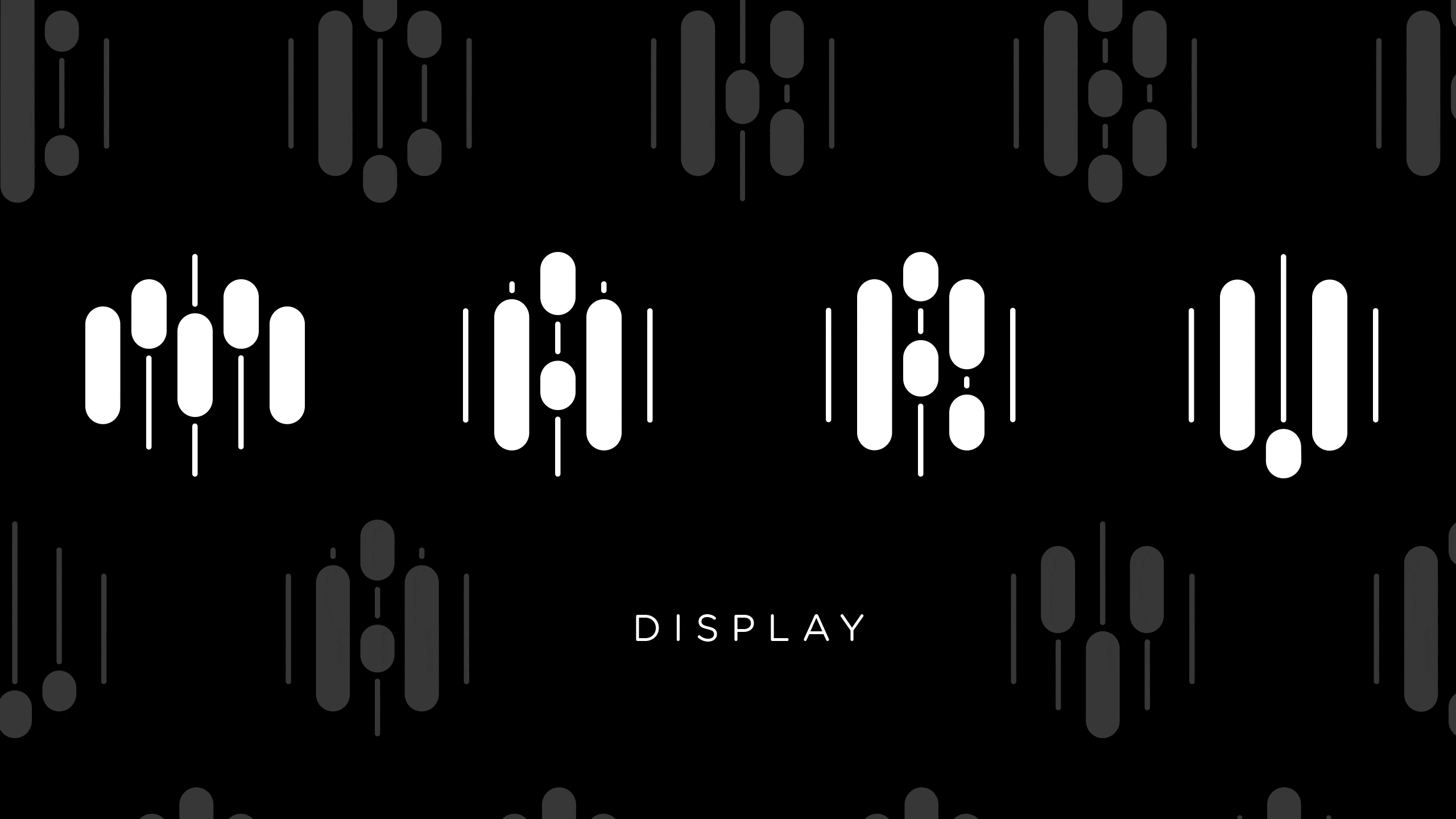
Our approach aimed to create a font that not only prioritized functionality but also conveyed artistic and cultural heritage. The font would serve as a museum font, making functionality was also crucial. Borrowing lines from the architecture to carry cultural influences seemed like a promising idea. While this is a common practice in graphic design, doing so in font design required expert maneuvers. The agency's design proposal included an orientalistic approach involving rhombus-like shapes adorning the ends of almost all letters, an idea that integrated graphic elements into the font. While this idea had graphic appeal, when minimized letters were placed side by side, it evoked a futuristic rather than a cultural impression. To overcome this, we needed to construct a font body that could carry these graphic elements on a calligraphic solutions.
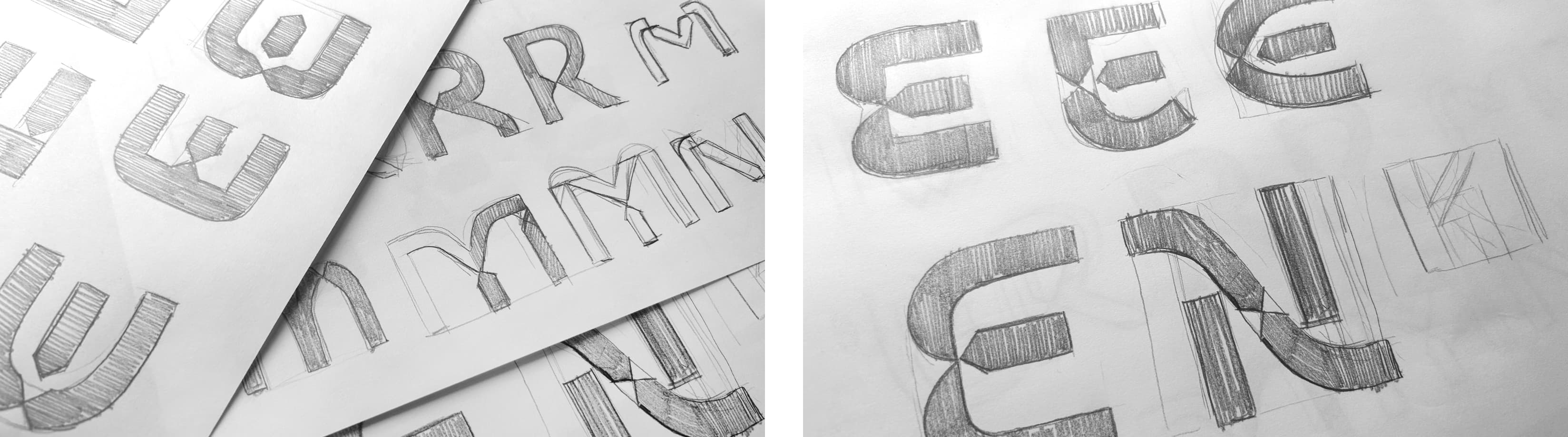
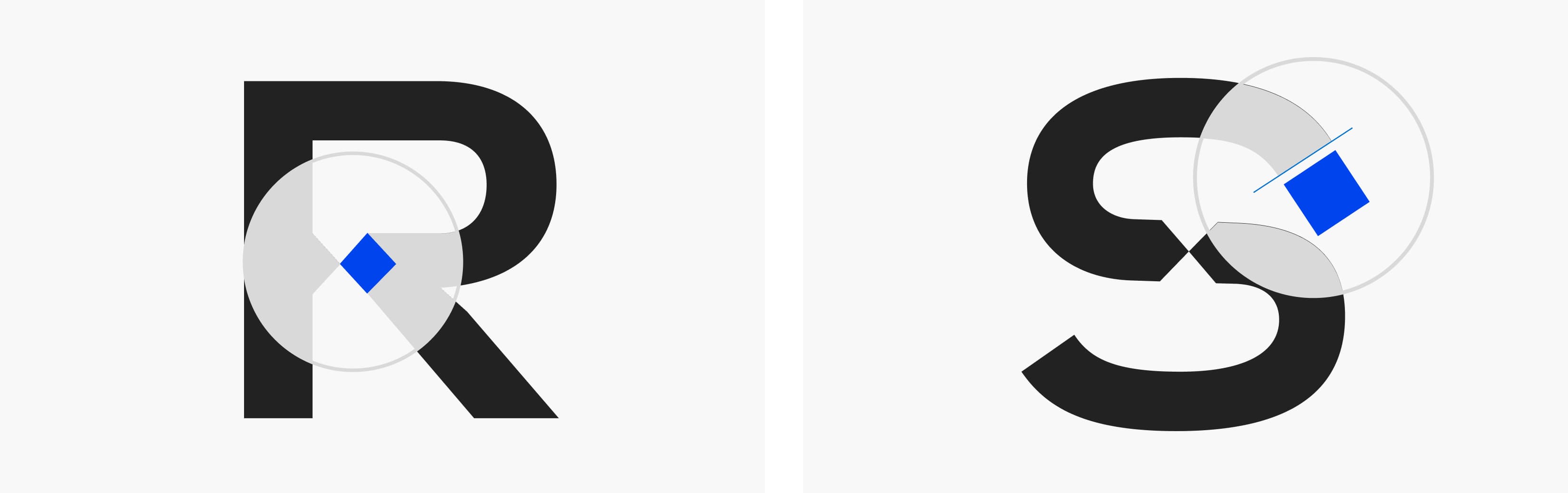
We followed a path of integrating design details onto the correct font body. We positioned the rhombus concept we had at hand as diagonal sections, negative cutouts, and positive additions in various parts. We merged the diagonal sections with the calligraphic strokes of the letters to maintain visual consistency. We even modified the diagonal body of triangle-shaped letters like "A" to be part of the graphic accordance. We synthesized the curved characteristics of Eastern geometries of architecture with letter curves to enhance cultural references. Specific principles were developed for the anatomical features of letters. We carefully applied subtraction and addition methods. While doing so, our most important criterion was to create harmony between letter combinations. One of the significant challenges was positioning the integrated rhombus-diagonal graphic elements correctly in terms of density and position. Ultimately, all letters had to harmonize when placed side by side. Creating aesthetic appeal at the letter level and achieving the correct design and balance at the word level were critical aspects of our journey. After numerous letter-specific trials and multiple rounds of testing and revisions, we successfully achieved the desired consistency and rhythm.
Hamam Display font stands as a collective achievement both within our team and in collaboration with the agency. The creation of this font, deeply rooted in architecture and culture, not only represents our values but also holds a significant place in our portfolio in terms of font design within the context of culture and the arts.