
A versatile typeface representing sports disciplines...
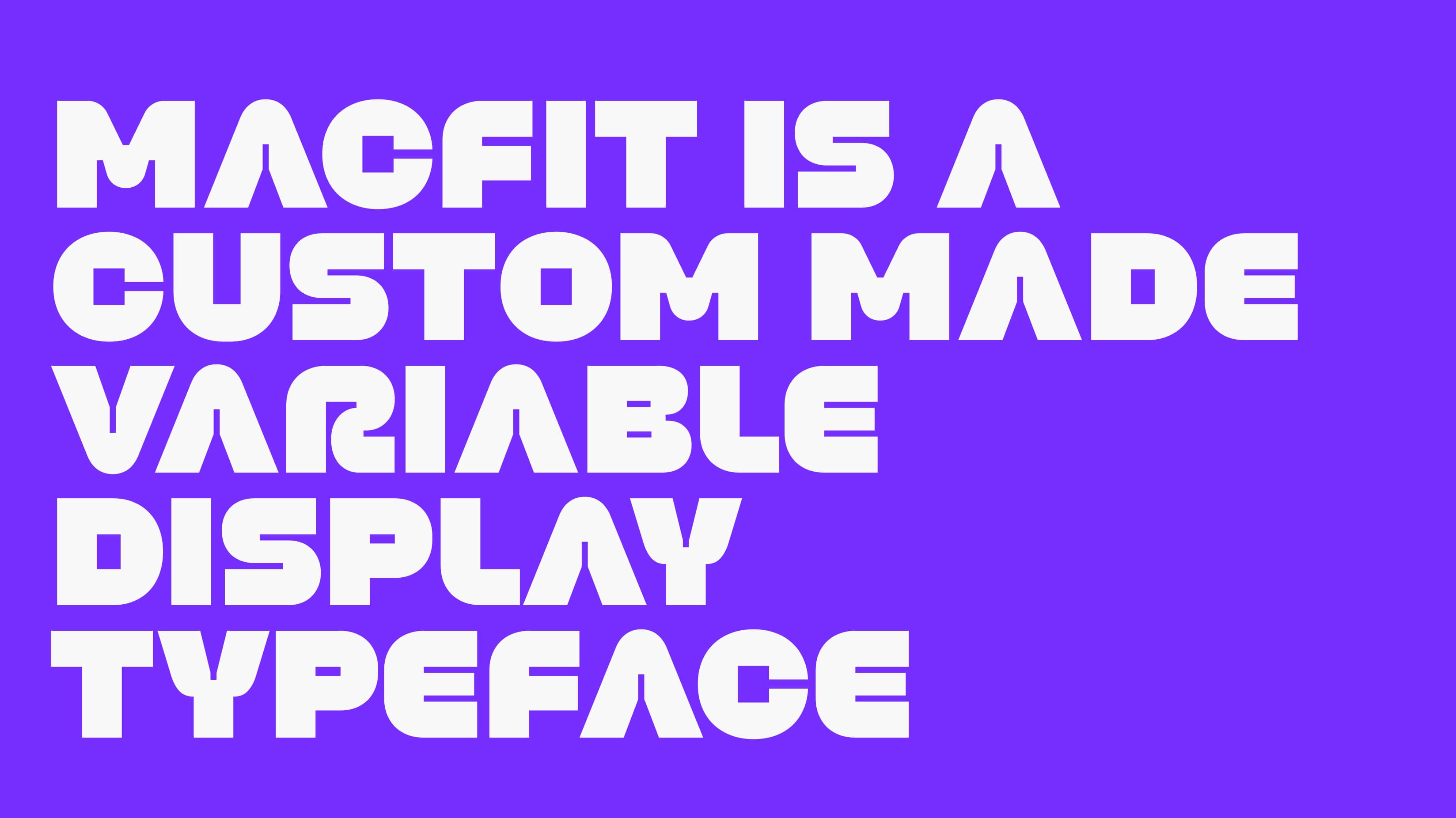
The Macfit typeface design project arose from the need to create a font for the brand's upcoming advertising campaign. The campaign's concept and strategy were centered on capturing people's sporting moments, regardless of where or when they occurred. The vision was to have a font style that could represent every sport. The core idea behind the font's creation was to seamlessly transition between scenes using font transitions and to strengthen the transitions between different sports with font style shifts. The font to be created would play a significant role in shaping the artistic direction of the film and would prominently feature in all outdoor media for the advertising campaign. In essence, our brief was to craft a font construction capable of representing various sports disciplines and facilitating visual transitions from one font to another.
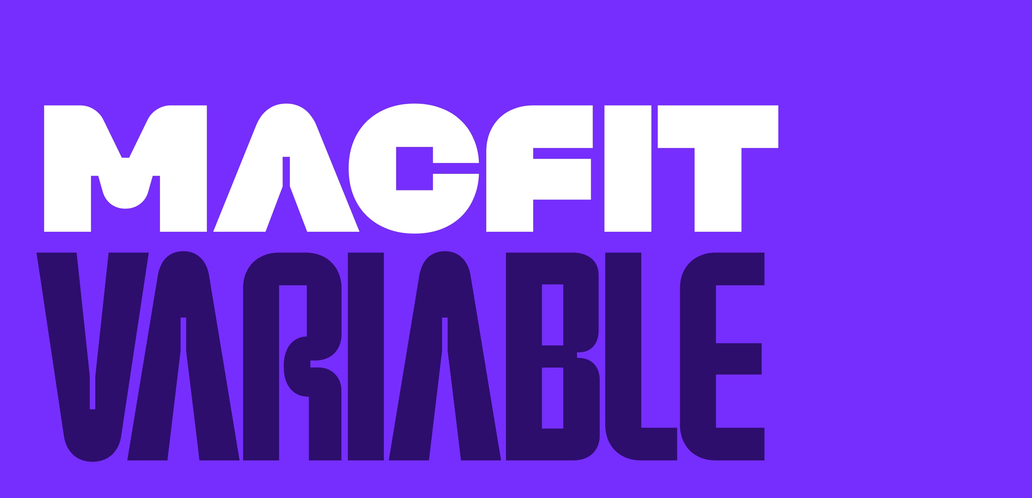
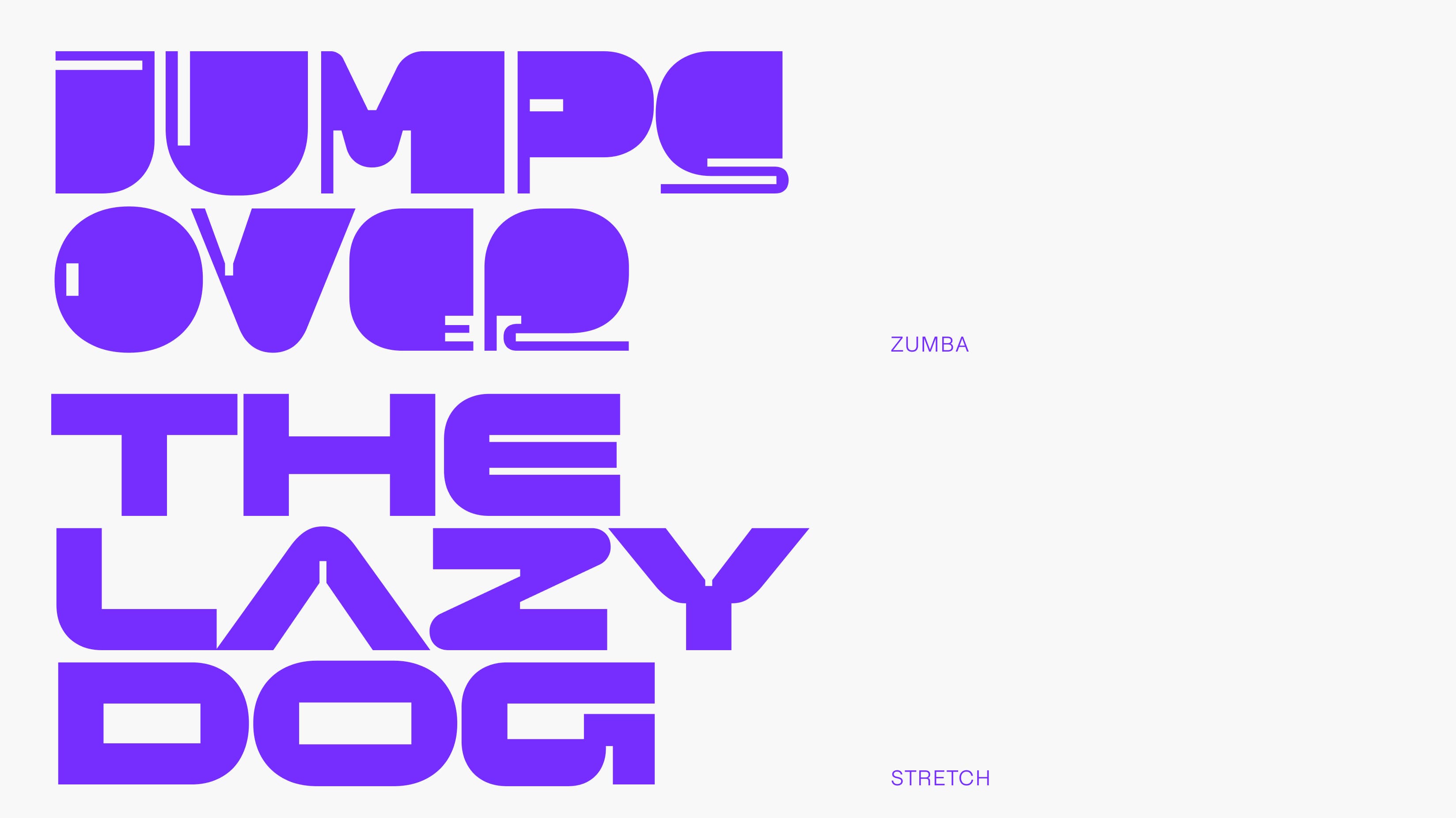
We've updated our brief to create variable font. Opting for a variable font was a prudent decision, as it would not only offer convenience for designers but also align with the design model envisioned in the brief. Four distinct sports disciplines were identified: running, squatting, zumba, and stretching. From a design perspective, the challenge lay in effectively representing the structures associated with these sports disciplines while harmonizing with the visual aesthetics of the campaign.
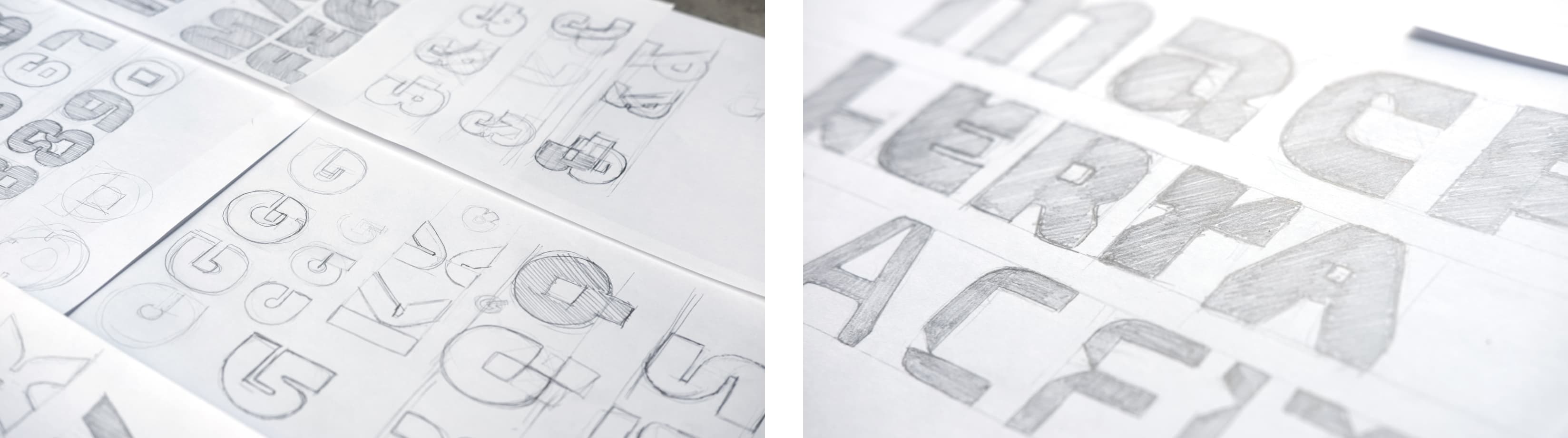
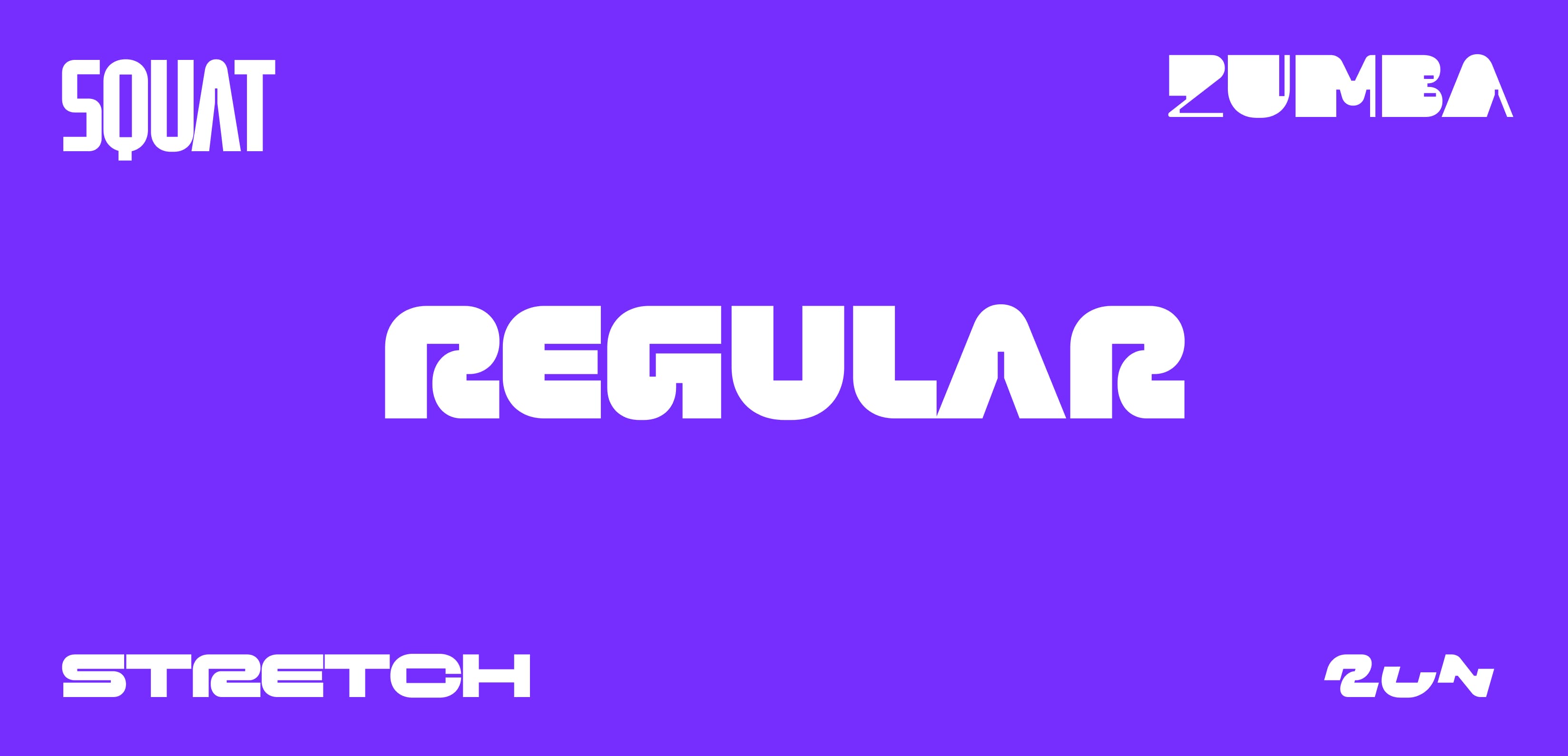
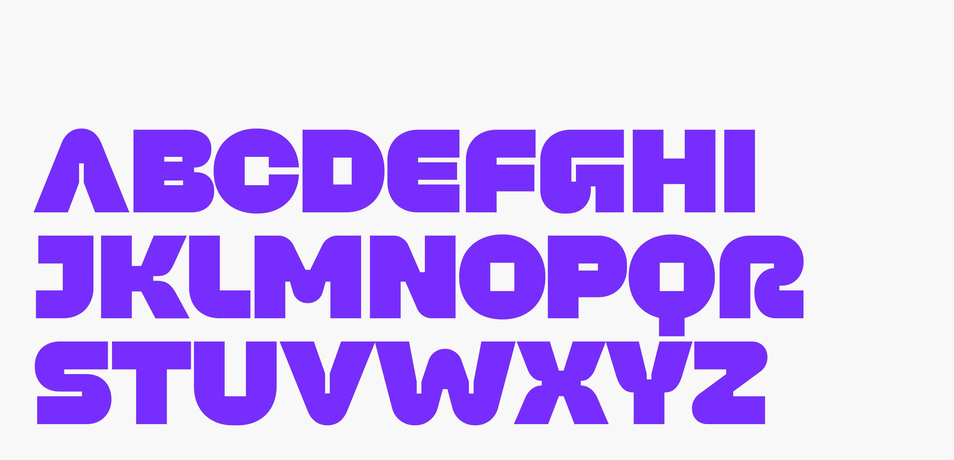
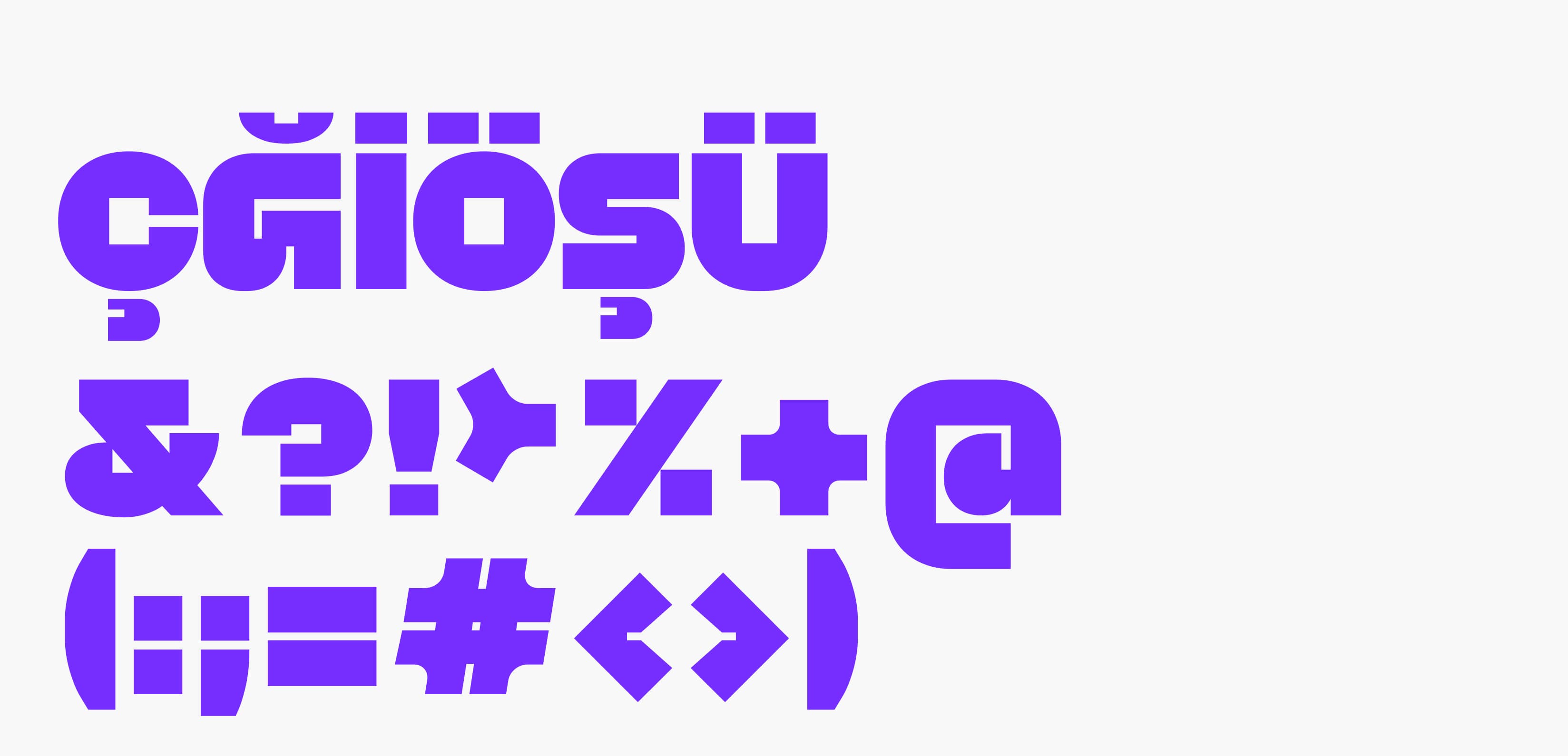
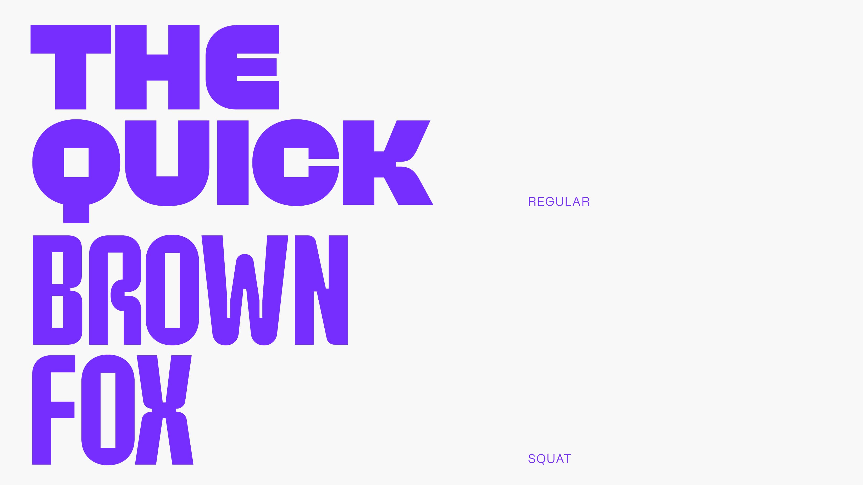
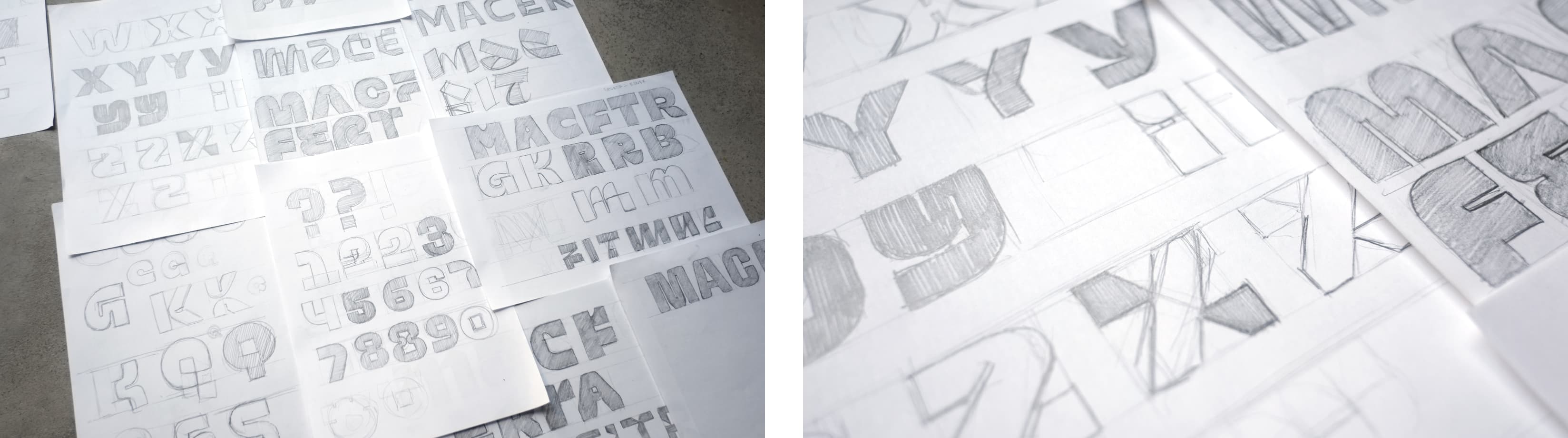
We began our journey with sketches on paper, drawing inspiration from the robust and dynamic nature of sports to create bold and athletic structures. Following discussions with the agency, we reached a consensus through sketches and rapid digital experiments, pinpointing the right course of action. We embarked on the creation of a total of 5 fonts. Methodologically, we prepared one main font and +4 variable fonts representing the sports disciplines. Inspiration was drawn from the directions and movements inherent to each sports discipline. We designed variative transformation effects such as expansion, elongation, and shortening. It was imperative to design our main font in a manner conducive to the anatomical transformations of the variations. The process was highly complex, encompassing both technical and design dimensions. Several factors posed constraints on each font from a design perspective. Both variation consistency and design dynamics necessitated meticulous detailing of characters. It was essential for visual harmony to be maintained across every variation, and each font had to be aesthetically satisfying. Leveraging the advantages of being a display font, we developed innovative solutions by reducing details in certain anatomical areas and enhancing details in others.
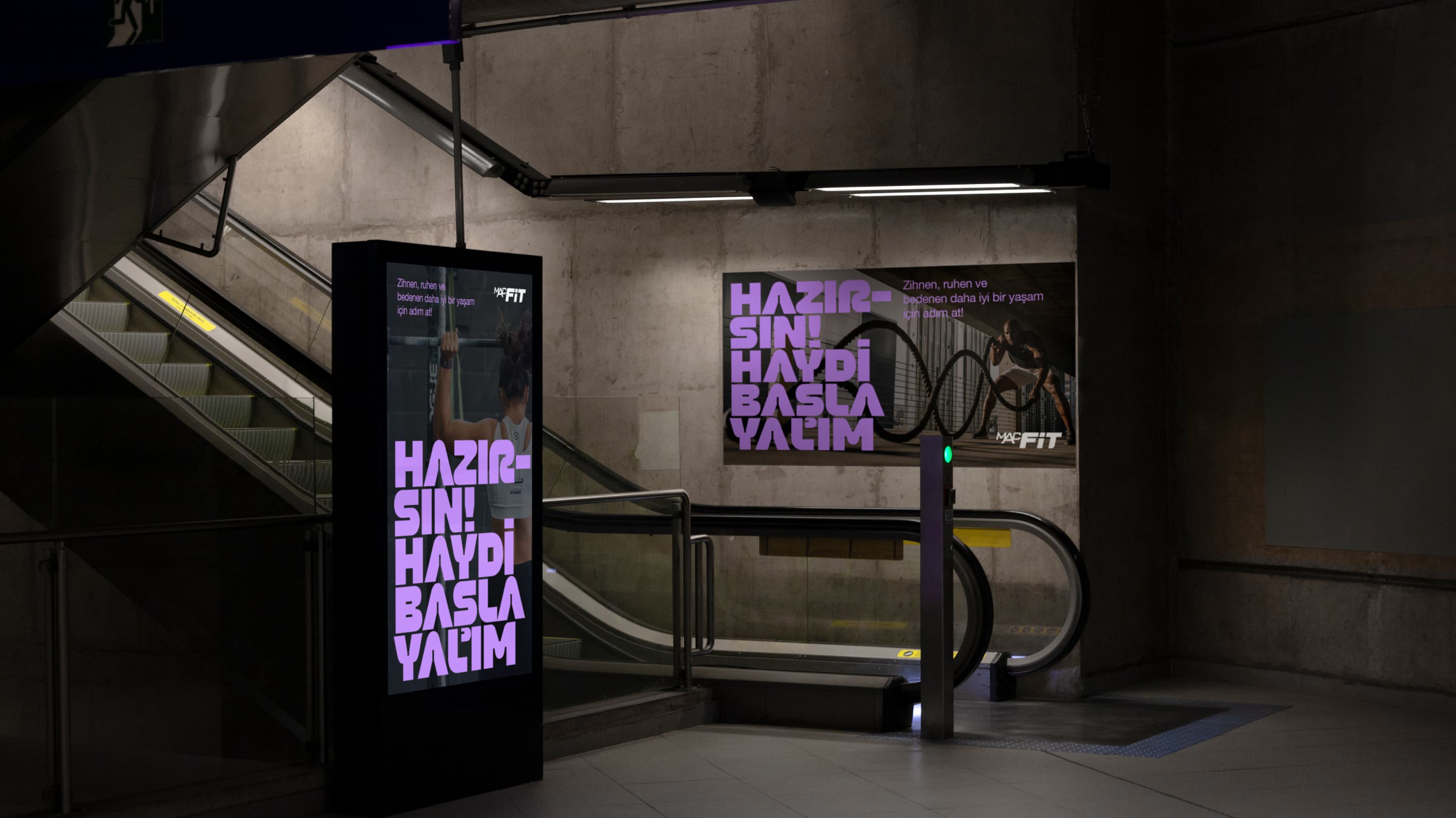
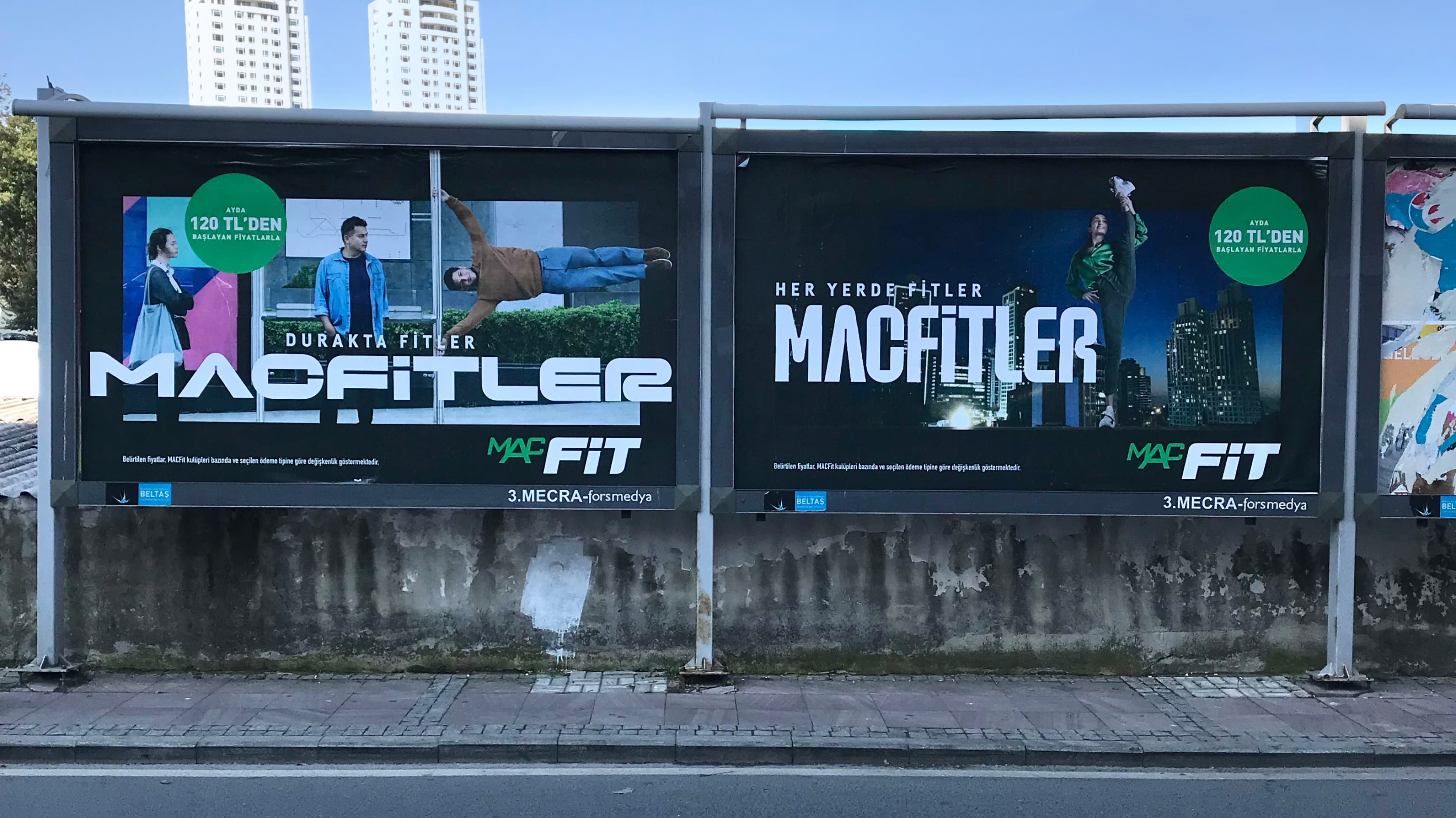
After months of painstaking effort, we had our font ready, available both as individual fonts and as a single versatile variable font. While it may not have been as prominently featured in the advertising film as initially envisioned, the font displayed in larger-than-life dimensions outdoors transformed the visual language of the campaign into a typographic masterpiece. The campaign's bold and typographic character presented a unique opportunity for us to witness our designed font in action. Our font, showcased in colossal proportions outdoors, served as an abundant source of motivation for our team.