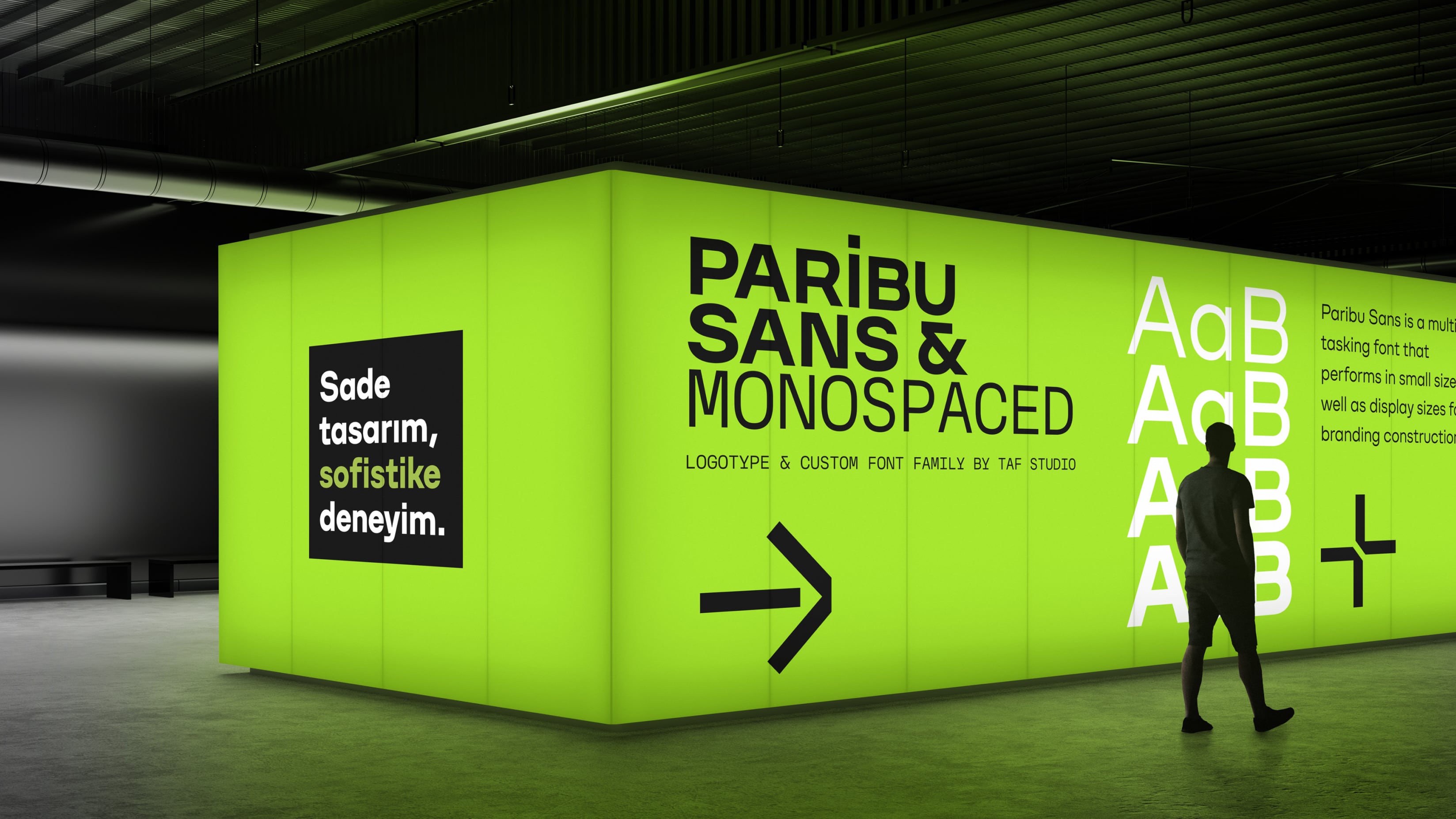

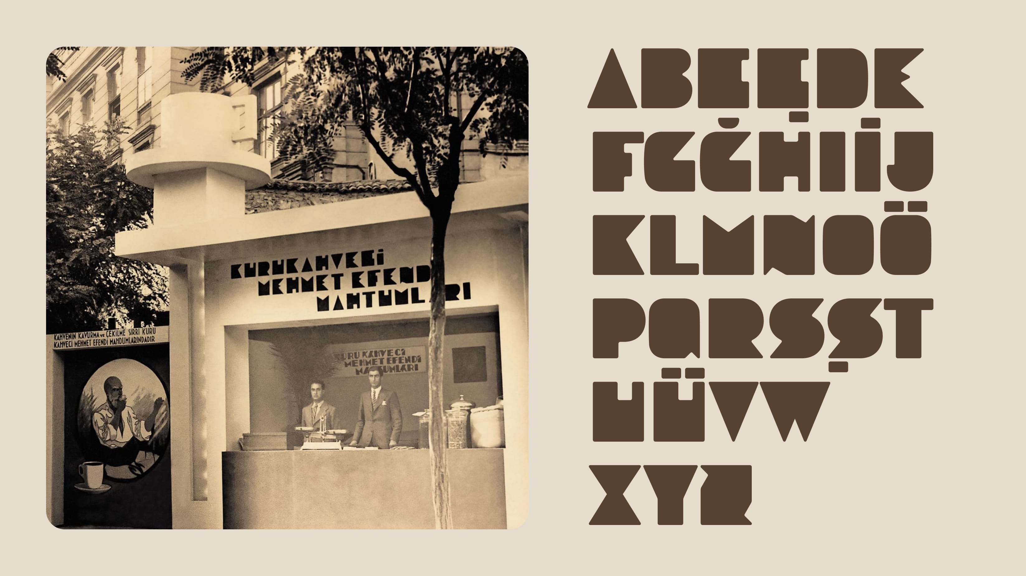
From a low-resolution image dated 1933 to a new display font.
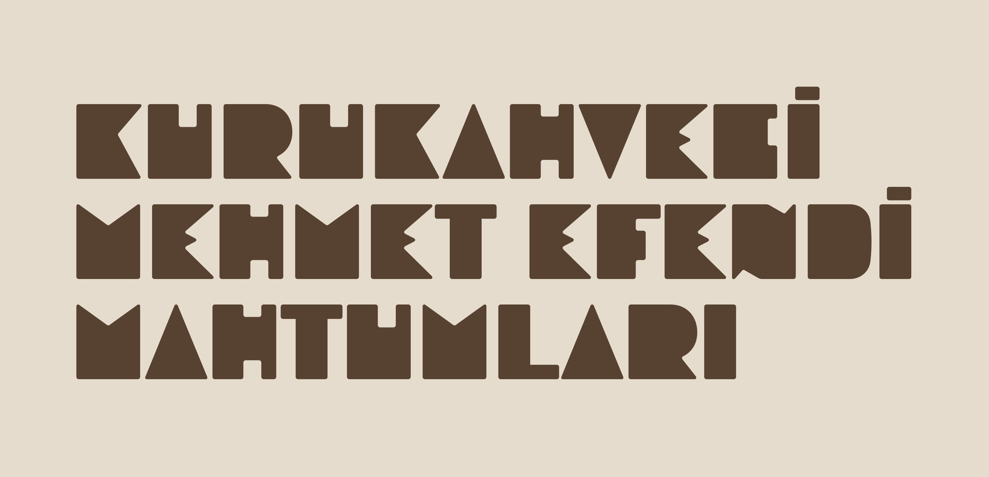
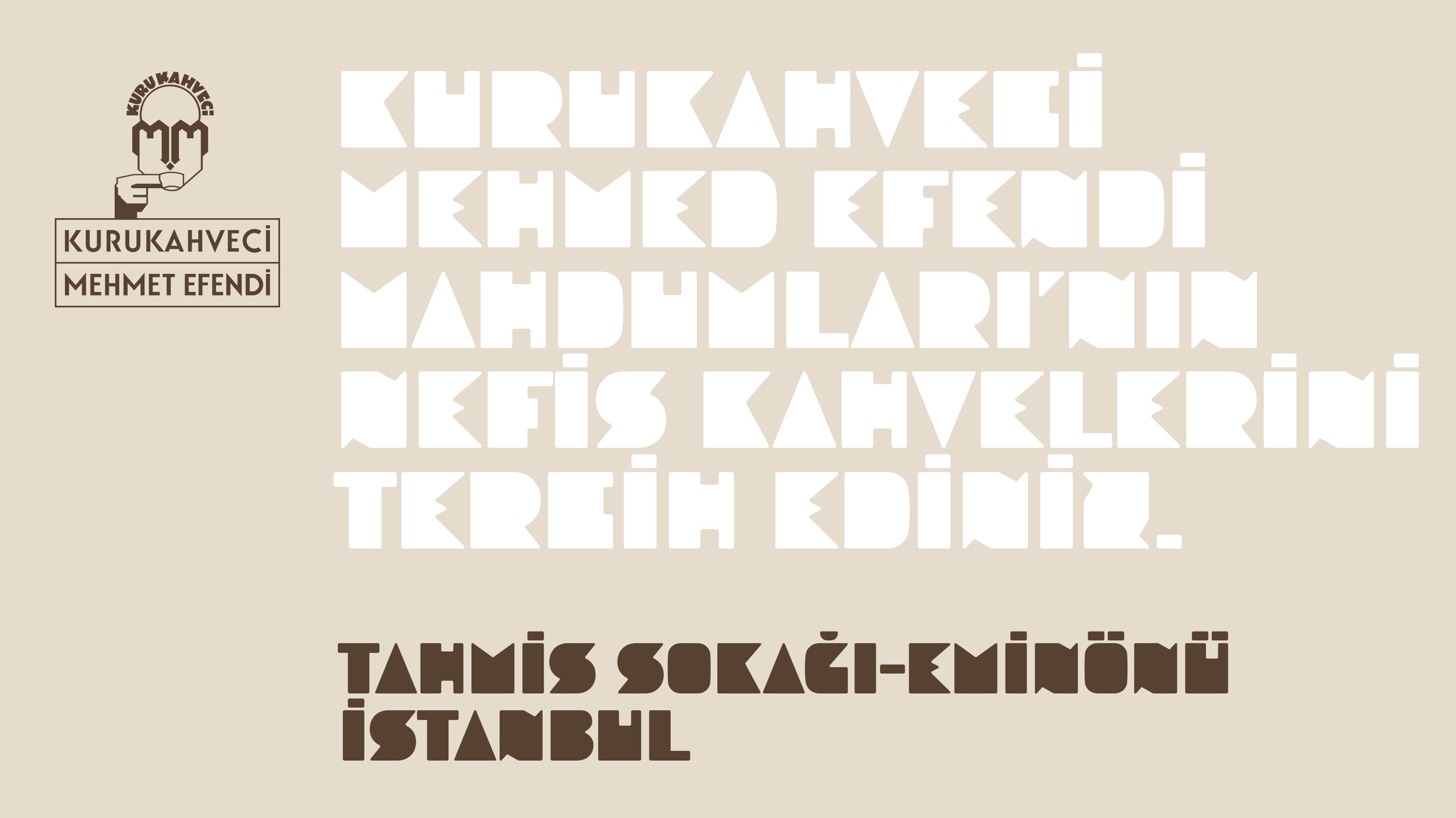
Kurukahveci Mehmet Efendi, founded by Mehmet Efendi in 1871 in Fatih, Istanbul, stands as one of Turkey's oldest businesses and the most iconic brand in the realm of Turkish coffee. Our assignment revolved around the creation of a specialized font for the exclusive packaging of Kurukahveci Mehmet Efendi. The prospect of working with a brand that has left an indelible mark on Turkish design history was nothing short of thrilling. The font project we embarked upon was rooted in an intriguing brief: to fashion a typeface inspired by the letters gracing a signboard designed by the renowned architect Zühtü Başar in 1933. Zühtü Başar, celebrated for his architectural contributions in the 1930s, has bequeathed an enduring legacy through various significant structures for Kurukahveci Mehmet Efendi, characterized by the aesthetics of the Art Deco movement. Our brief tasked us with crafting a font based on the letters from a 1933 trade fair booth signboard, bearing only a few words and designed by Zühtü Başar.
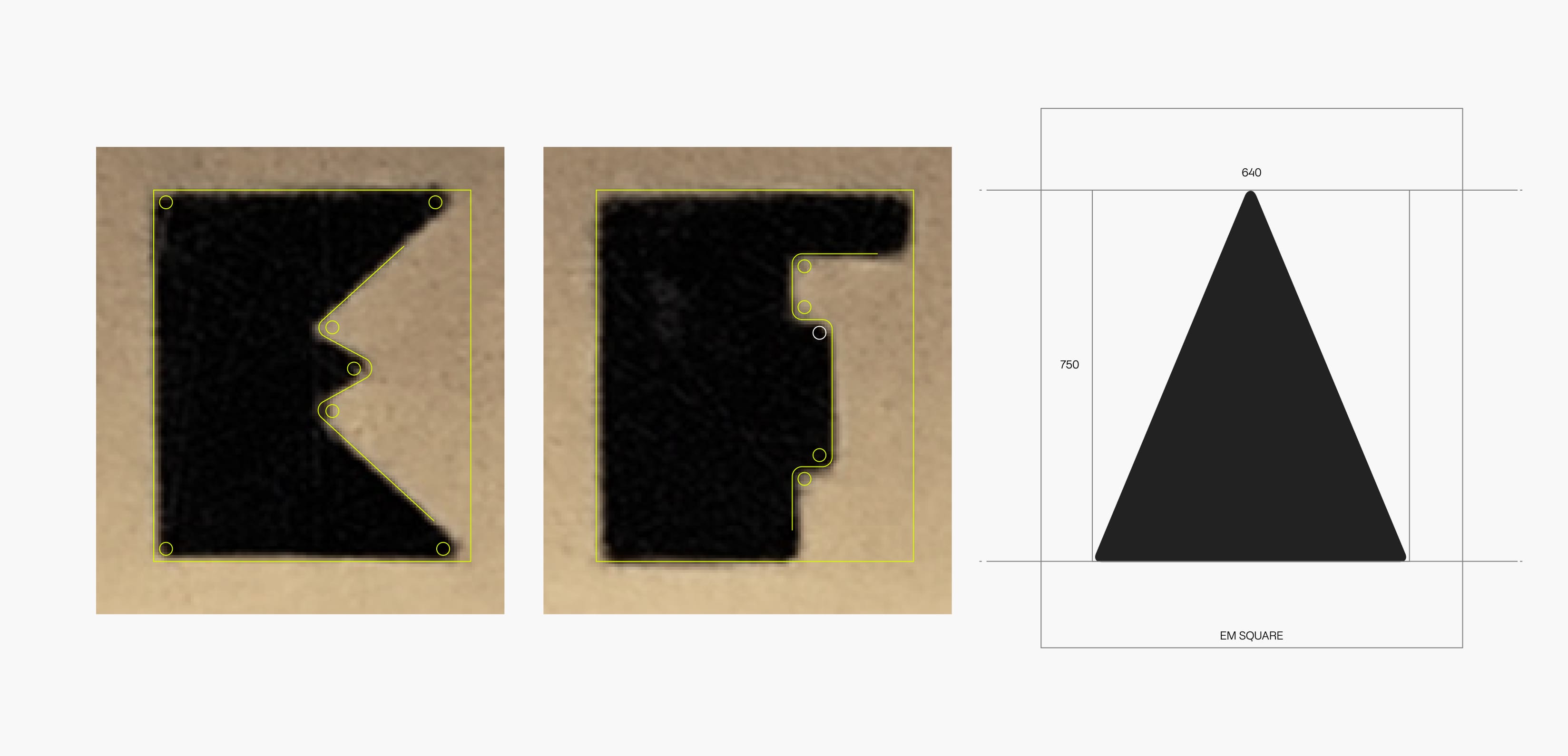
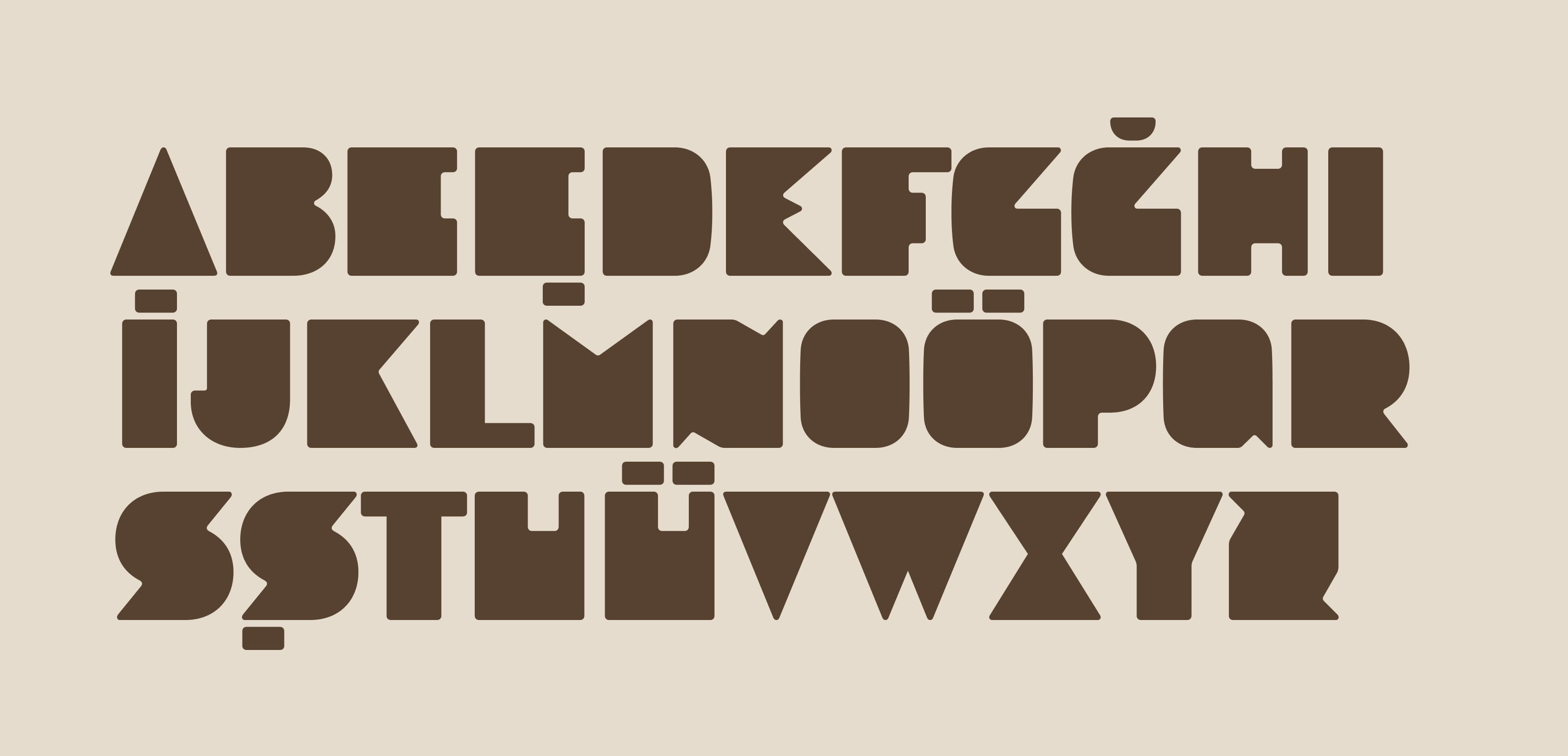
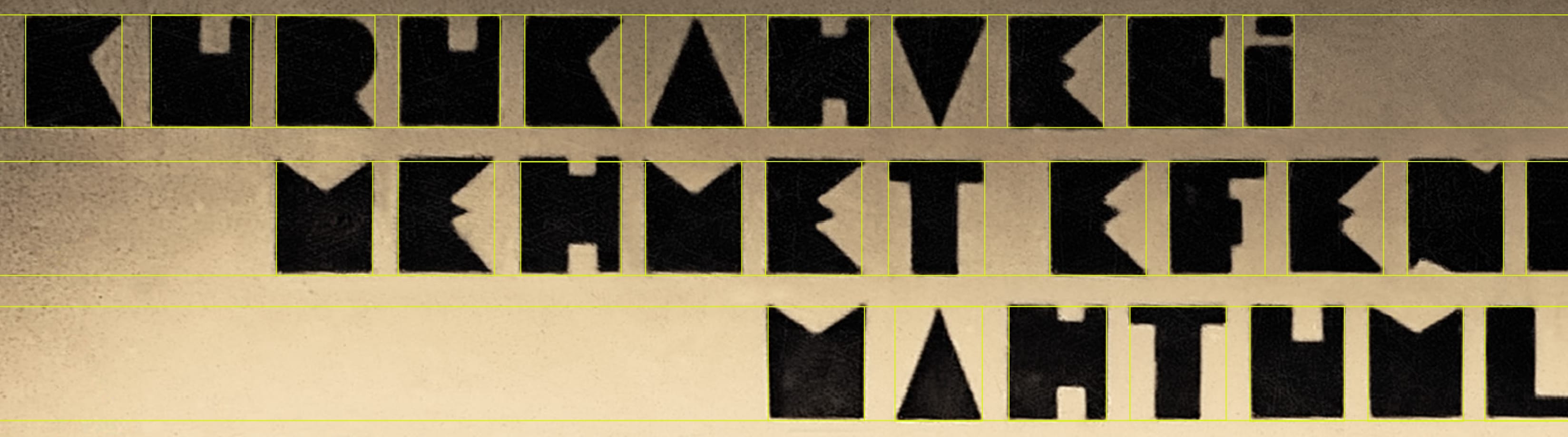
In projects of this nature, comprehensive data collection is paramount. We requested all available visual data from our client, which, regrettably, was rather limited. Our resources comprised just two low-resolution photographs. Besides the dearth of material, there were very few letters visible on the signboard. We were able to reference only a small portion of basic Latin characters. Our approach was to digitize the characters for which we had sufficient data, as faithfully as possible to the originals. We then focused on designing the missing characters to fit in seamlessly with the existing characters.
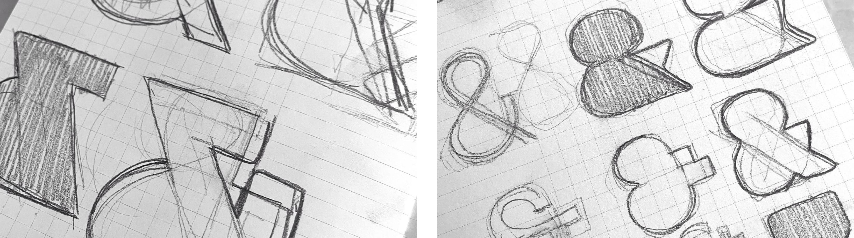
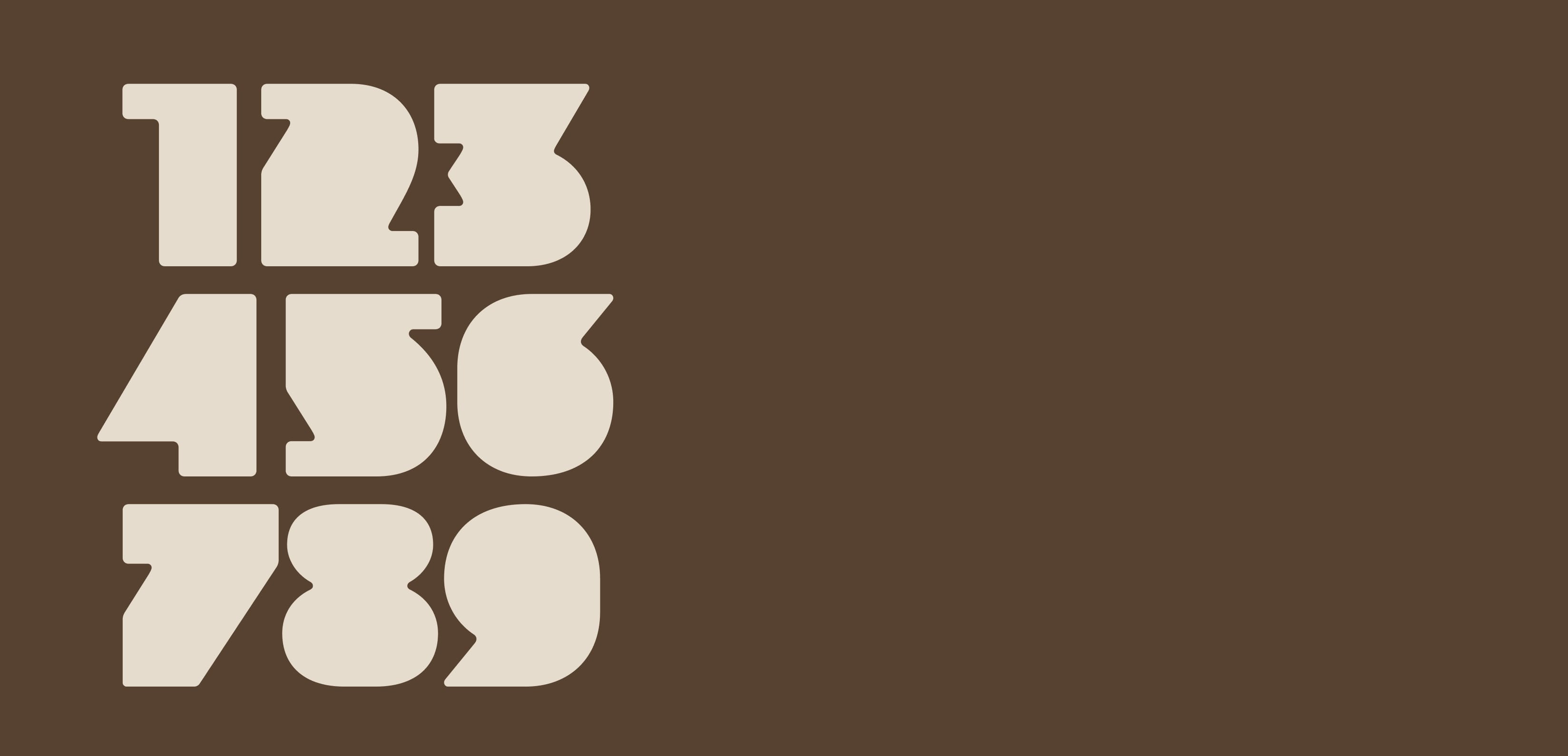
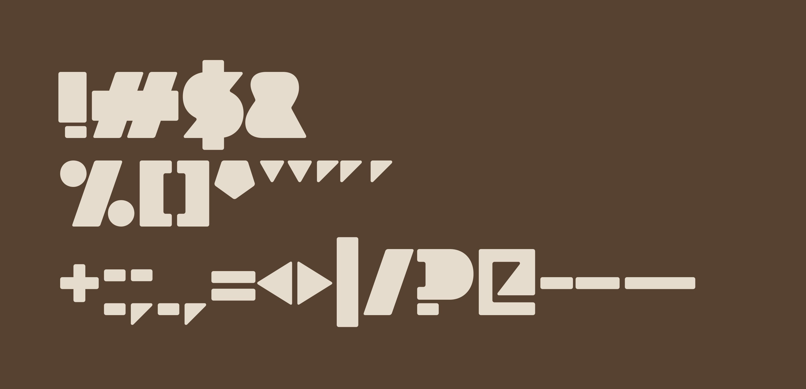
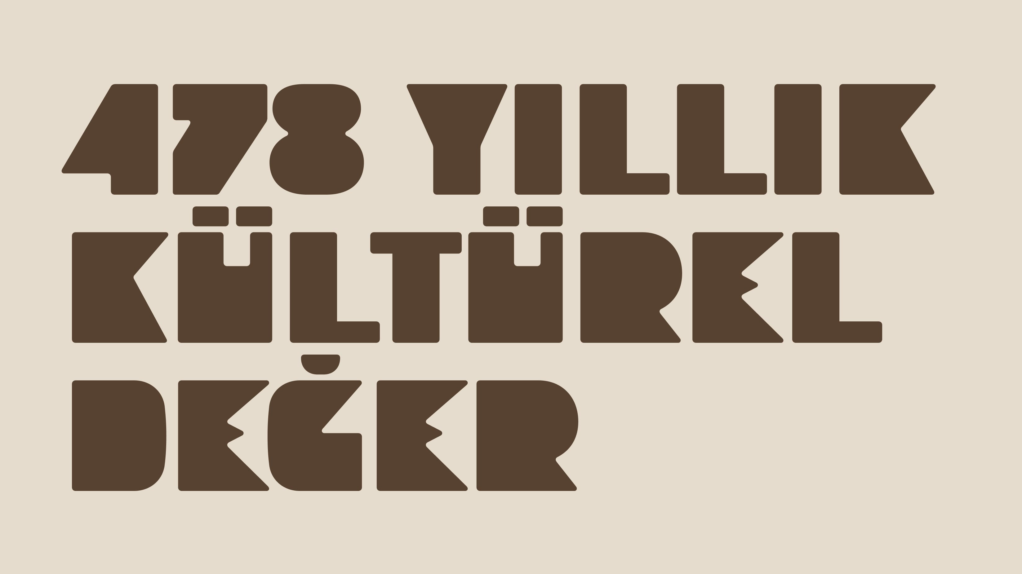
Our journey began with an analysis of the design structure of the extant characters. We endeavored to comprehend not just the geometric underpinnings of the letters but also the design rationale underpinning them. Grasping Zühtü Başar's design philosophy held critical significance for our work on the character set. Categorizing the letters in an analytical framework proved challenging because each letter possessed its unique dynamics, and even analogous letters deviated anatomically. The font was lacked calligraphic approach, making the pursuit of font consistency through anatomical elements an unsuitable approach. The font's structure rested on fundamental forms, with rectangles and diagonals assuming prominence, and the filled areas were dominant within the letter squares. We defined the structure of the continuum based on the interaction between solid and void. While we aspired to institute an algorithmic framework for design decisions, the nuanced dynamics within the existing letters mandated a personalized approach at the level of individual letters. In voluminous regions, we orchestrated gaps that comprised diagonals, horizontals, and verticals. Notably, there were no references to numbers or punctuation marks among the existing characters on the original signboard. As we rounded out the character set, we rigorously adhered to the same design discipline, ensuring that these absent characters adhered faithfully to the established style for the sake of font uniformity.
The KMEM 1933 (Kurukahveci Mehmet Efendi Mahdumları 1933) font emerged as a single-weight typeface encompassing basic Latin characters. Beyond its utilitarian role, what endowed this font with profound value was its status as a revival typeface. Above all, it represented the rekindling of the font from that iconic image etched in the brand's collective memory, and indeed in the hearts of all coffee enthusiasts, nearly a century later, in the context of contemporary technologies.