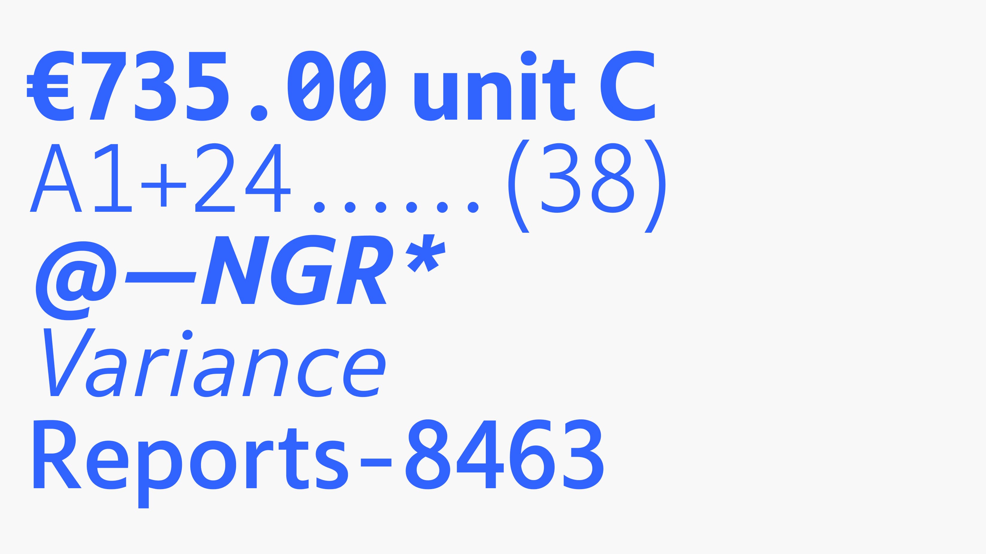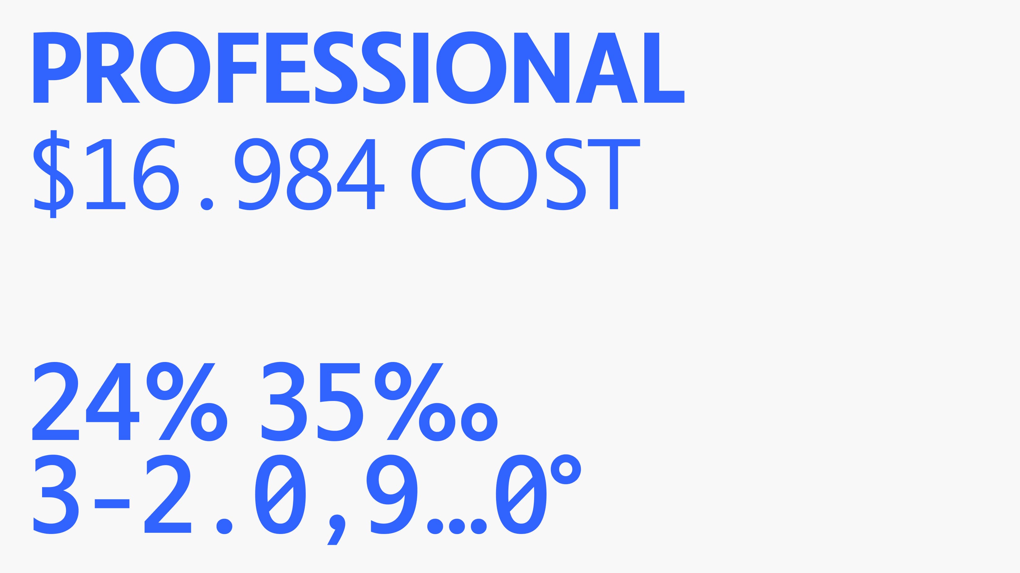
A typeface to enhance the communication between data and users.
InfoRiver is a business management and analytics product developed by Lumel Technologies. In software dedicated to data visualization and analysis, fonts assumes a pivotal role. Software requisites often demand precision, with the balance and density of textual and numerical information significantly impacting software performance. Particularly in solutions tailored for numerical data, the user experience can involve intricate cognitive processes. The implementation of a custom font can alleviate this cognitive burden and enhance information organization. Our journey commenced with the creation of a specialized font for InfoRiver, aimed at elevating user experience and optimizing the effective organization of numerical data.
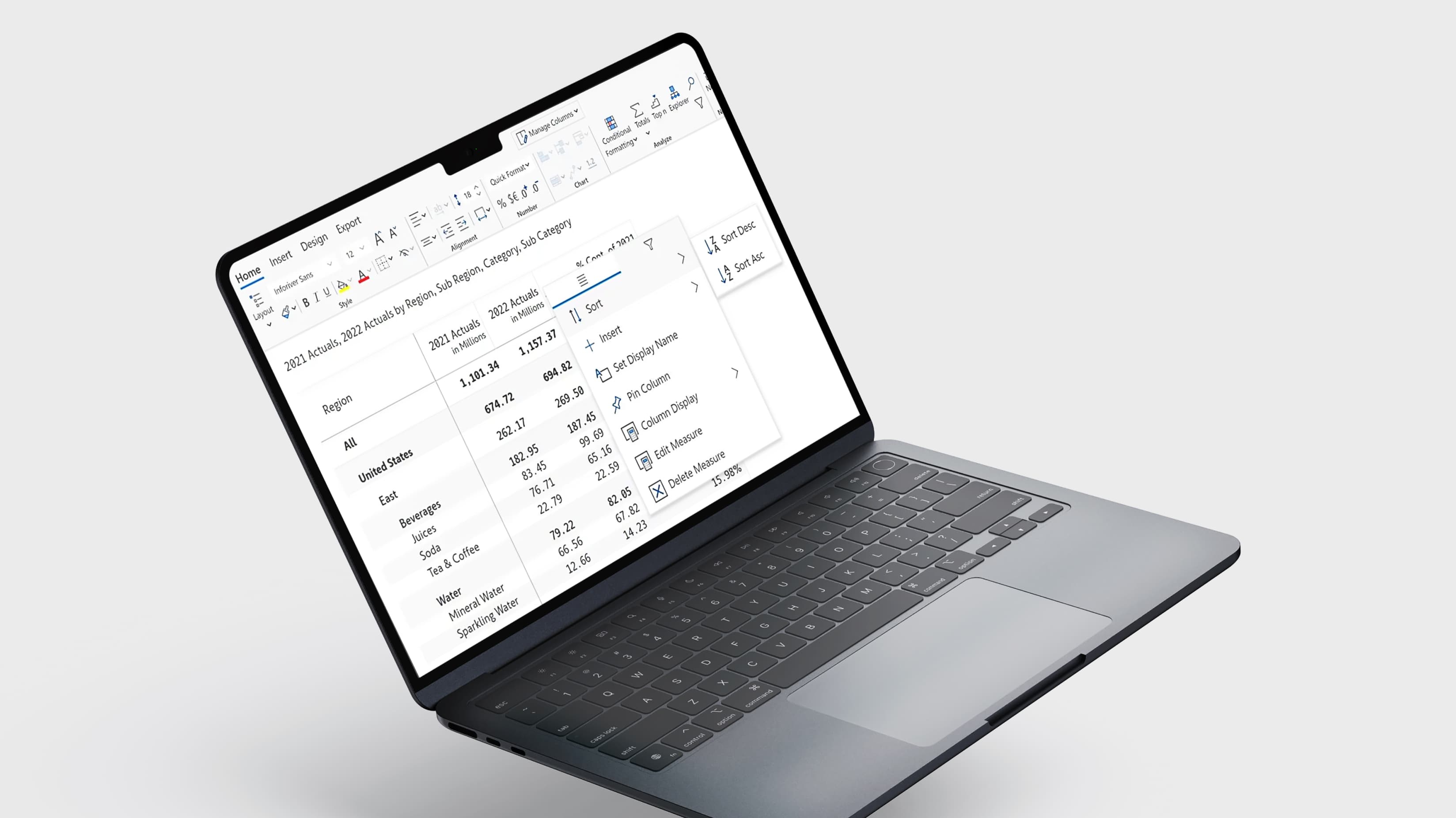
The brand's directive was to craft a font that could present data to users in a more comprehensible manner. While the brand's vision provided a solid foundation, our expertise led us to delve deeper, refining this overarching concept into a meticulously designed font language. Our initial step encompassed a comprehensive analysis of the brand's requirements for textual and numerical content. The product was heavily oriented toward data visualization through analytical tables and schemas, resulting in a dense array of numerical information. Users often encountered multiple numerical comparisons on a single screen, encompassing numerical values of varying lengths. Our primary objective was to mitigate factors such as readability and legibility that could pose cognitive challenges for users.

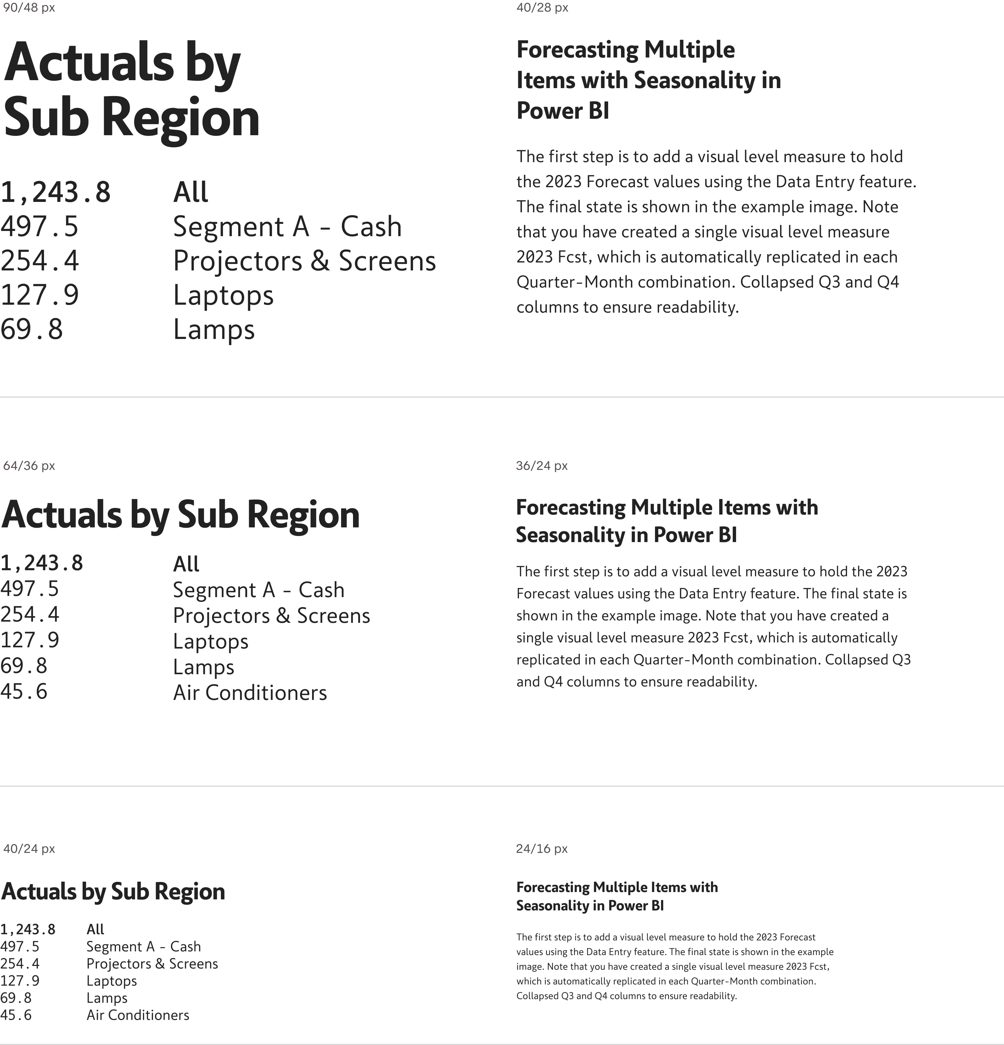
This project was our second font development for the same software platform. In our initial font design, we adapted our geometric sans font "Antikor" into a monospaced and condensed version. Thus, a geometric sans font was already available in the software's library. Our strategy for this font design aimed to enhance legibility on a letter-by-letter basis, focusing on numerical differentiation rather than visual uniformity. Each letter needed to swiftly convey its numerical value to the reader, devoid of ambiguity. To enhance numerical distinctiveness and achieve sharper edges during screen rendering, we opted to work within the anatomy of Humanist Sans. This structural foundation provided vertical-ended terminals, open spaces-apertures, and opportunities for differentiation at the level of individual letters. We aimed to minimize visual similarities between numerals while ensuring harmonious coexistence when displayed together. Throughout this process of differentiation, we remained committed to preserving the legibility of both letters and numerals. Although the font's character set was initially designed with proportional width, numerals were carefully crafted to maintain equal widths. This feature facilitated vertical comparisons in table usage by easing eye tracking. In horizontal reading, it provided a consistent rhythm of eye movement, enhancing overall readability.
The InfoRiver font encompasses eight styles, including four weights and matching italics. It possesses a structural integrity that fortifies the seamless transmission of data between the software platform and its users. This typeface, distinguished by its contemporary design nuances, caters not only to those with aesthetic inclinations but also to users who prioritize swiftness and clarity, particularly within the context of data-centric applications.

