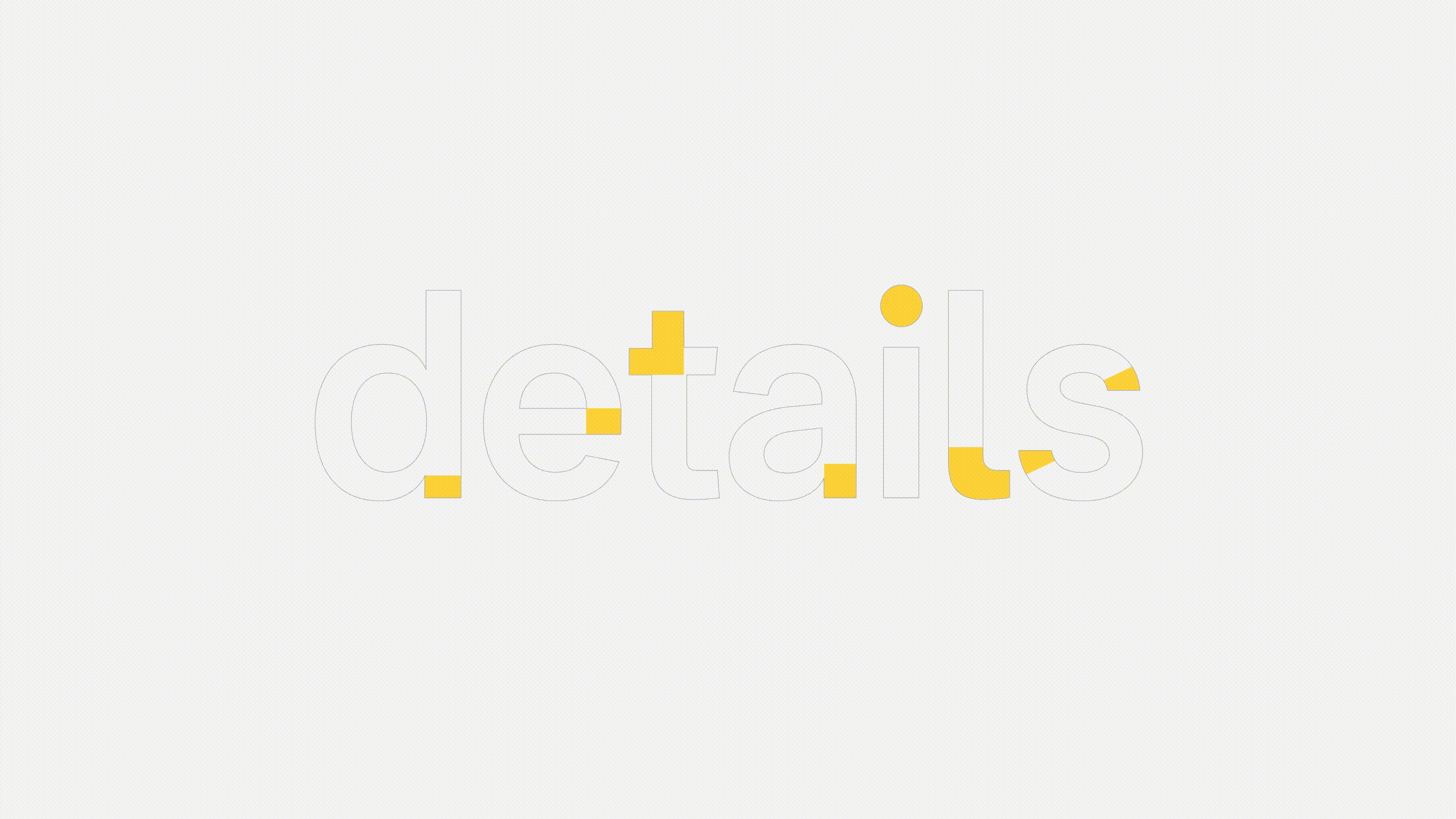

A grotesque structure with humanist touches.
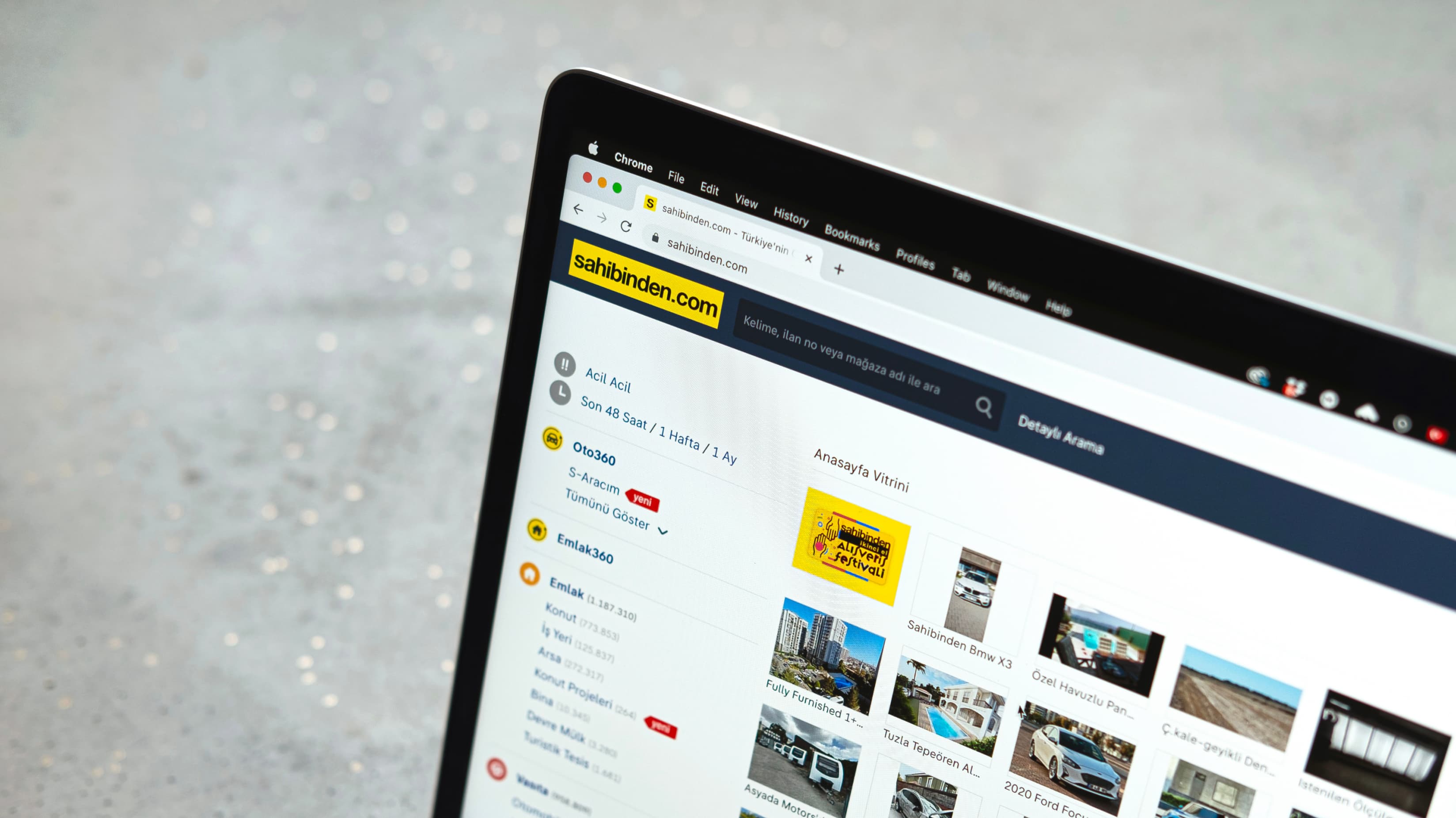
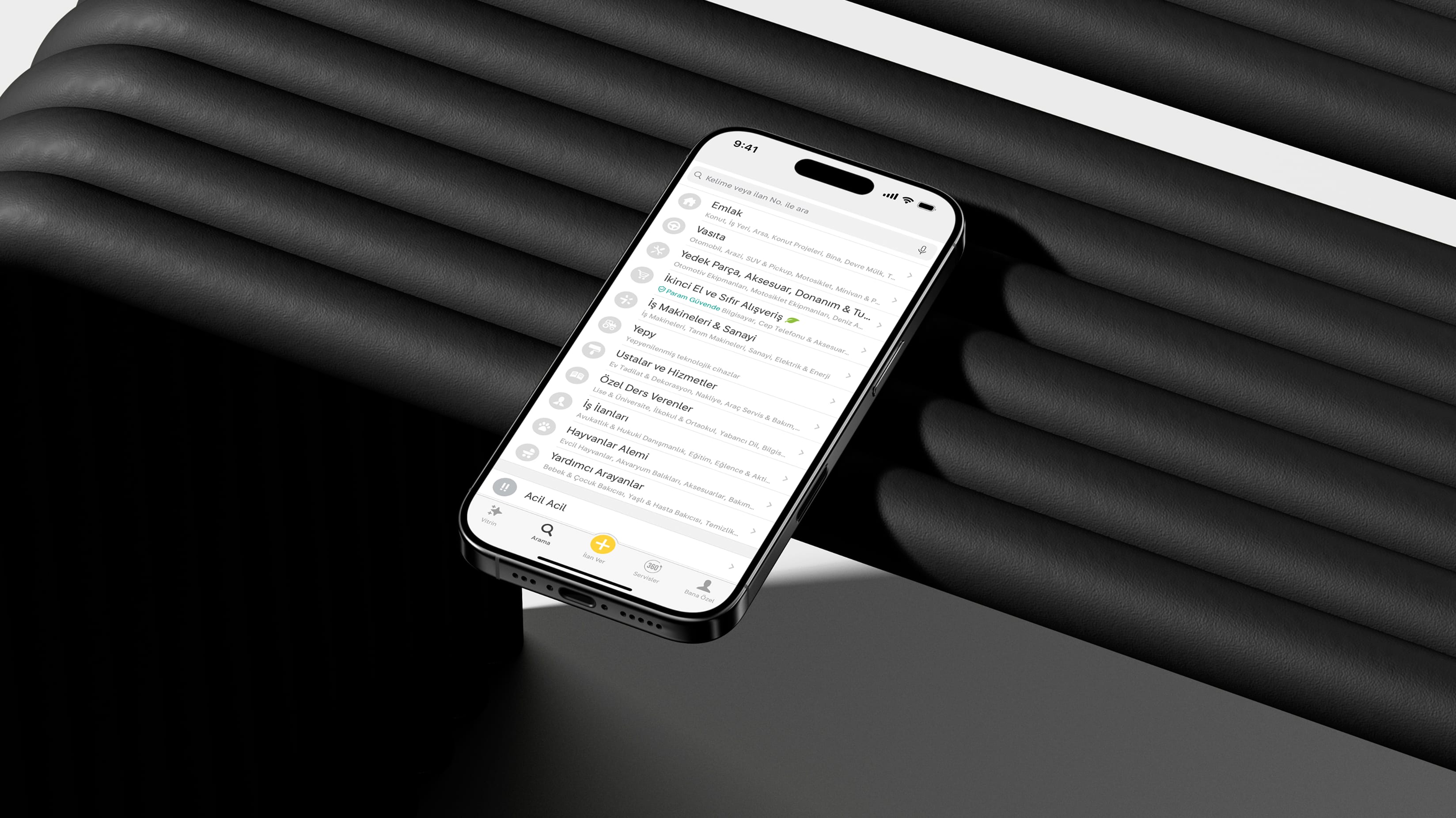
Sahibinden.com, one of Turkey's largest electronic commerce and classifieds platforms, boasting a staggering 61.7 million users and a monthly page view count of 14.6 billion, has not only been a preferred destination for classifieds and shopping but has also stood as one of our most prominent clients. Serving Turkey since the year 2000, Sahibinden.com had not undergone a font change in recent years. The font that had long been in use on their website was designed for older technologies and no longer seamlessly aligned with contemporary media dynamics. Moreover, the use of different fonts across various platforms (web, application, mobile) had created a negative perception regarding brand consistency. The renewal of Sahibinden.com's design system was the opportune moment for a corporate font transition. The corporate font and typography would become fundamental elements of the revitalized design system.
Our close communication with the brand and design team provided us with a unique opportunity to closely analyze the brand and its needs. We uncovered the brand's values and specifically identified technical requirements. We were briefed to create a font that not only represented the brand's character but also enhanced the user experience on web, mobile, and applications. Creating a font for 61 million users meant that fluidity and high legibility were our top criteria. Furthermore, Sahibinden.com had consistently been recognized as the most trustworthy brand for many years. Thus, the persona we imbued into the corporate font was equally as important as the technical specifications. The existing fonts in the system varied significantly in skeletal structure, typographic ergonomics, and style. The use of different fonts across different platforms further exacerbated inconsistencies in the user experience. As a result, drawing inspiration from the brand's typographic legacy was not feasible. Rather than competing with these existing fonts, we aimed to integrate our new font seamlessly with the brand by analyzing its shortcomings and user experience thoroughly. The goal was to strengthen the integration between users and the platform through a corporate font transition without creating alienation.
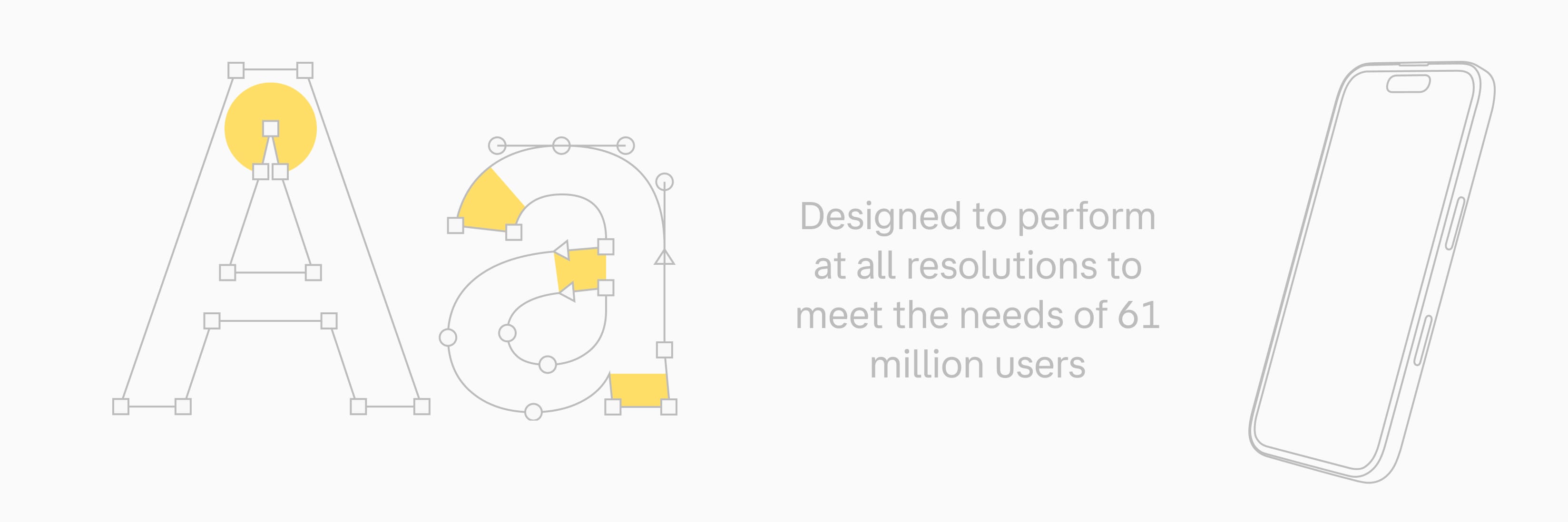
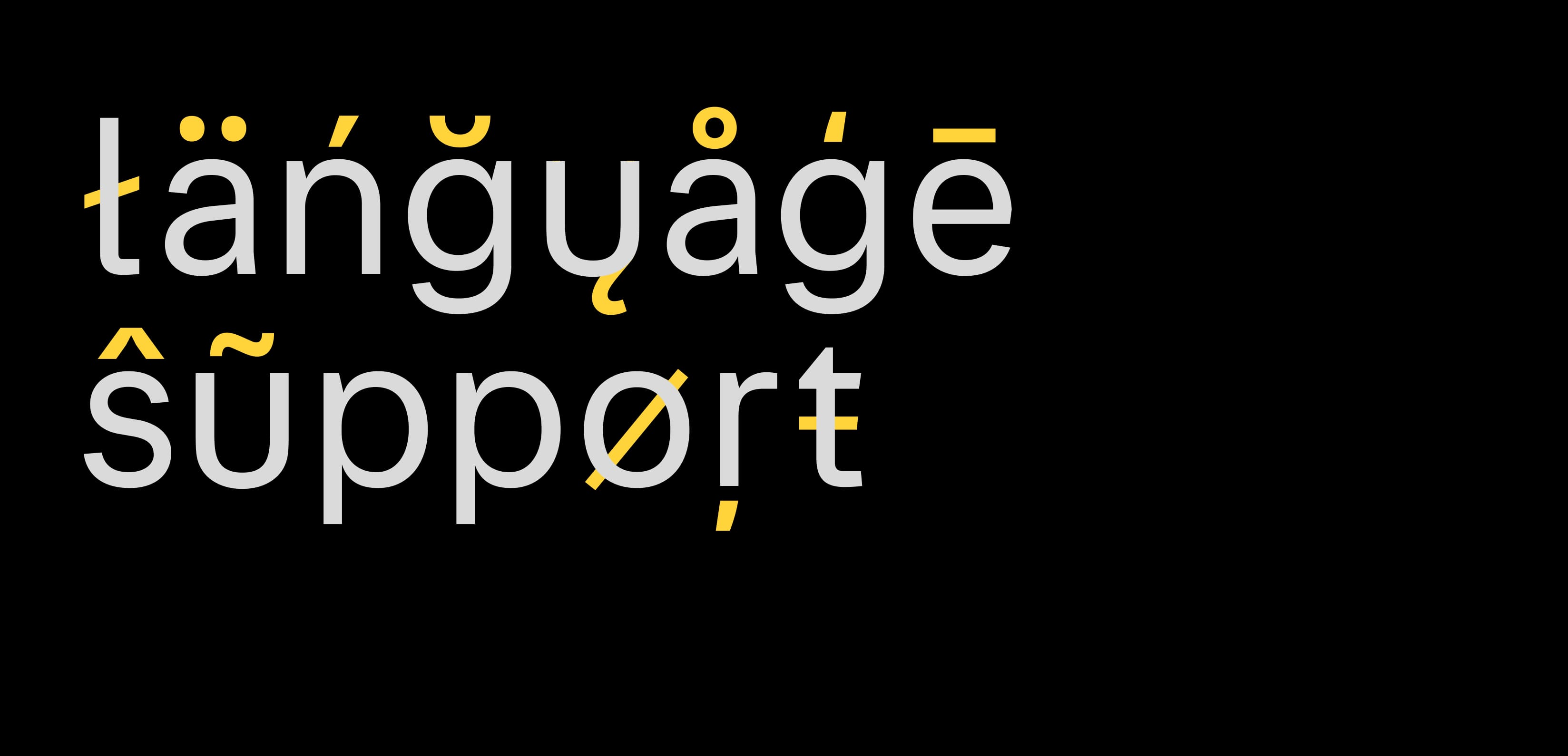
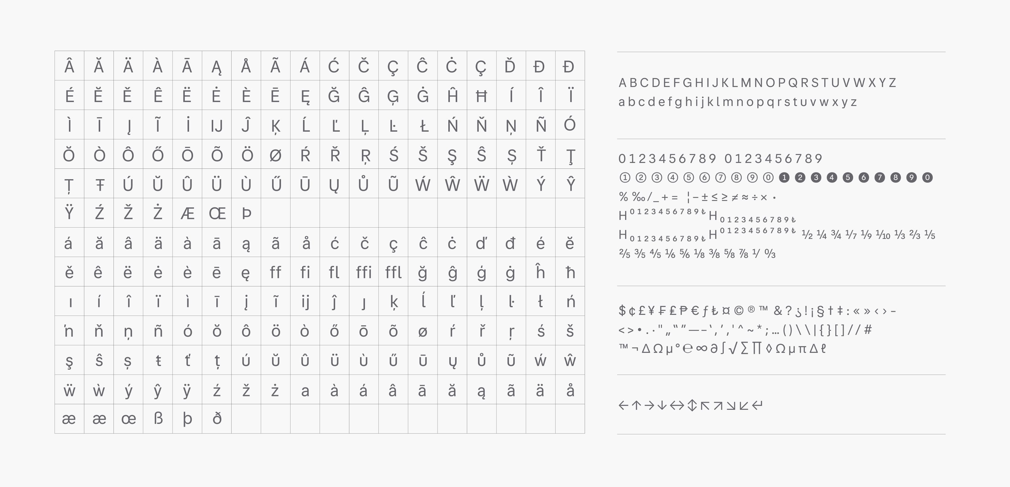
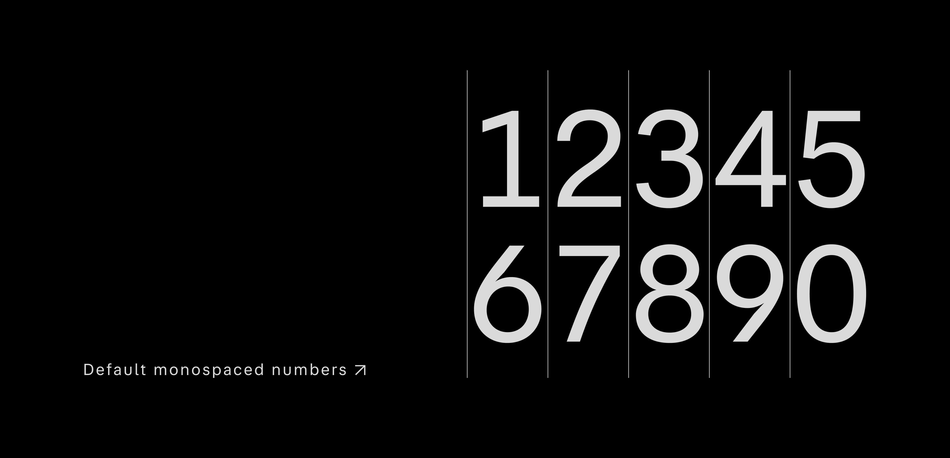
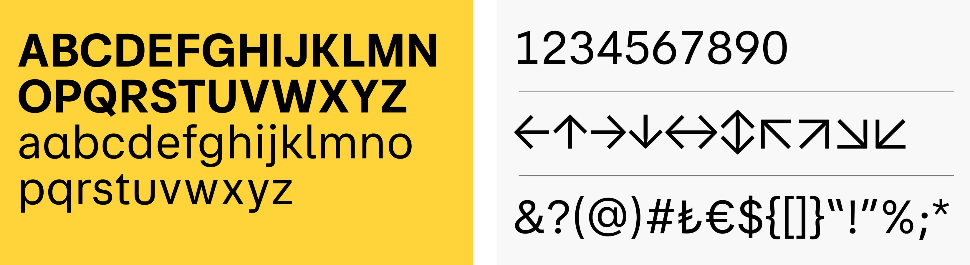
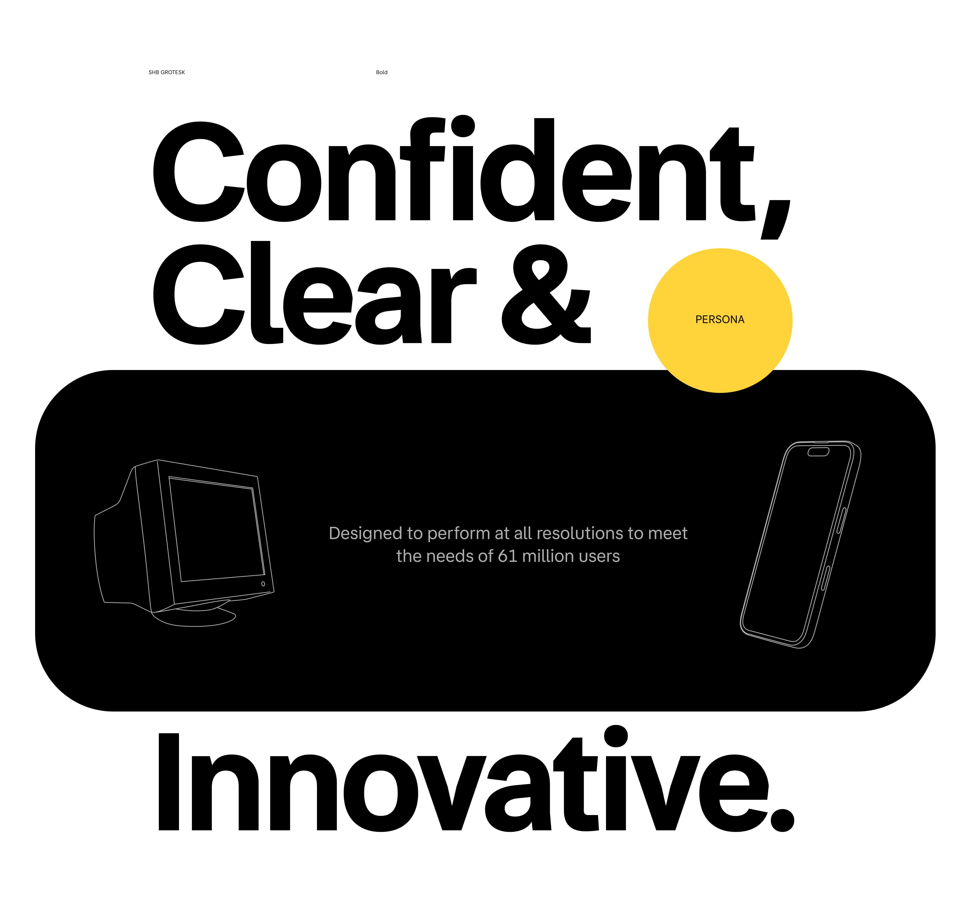
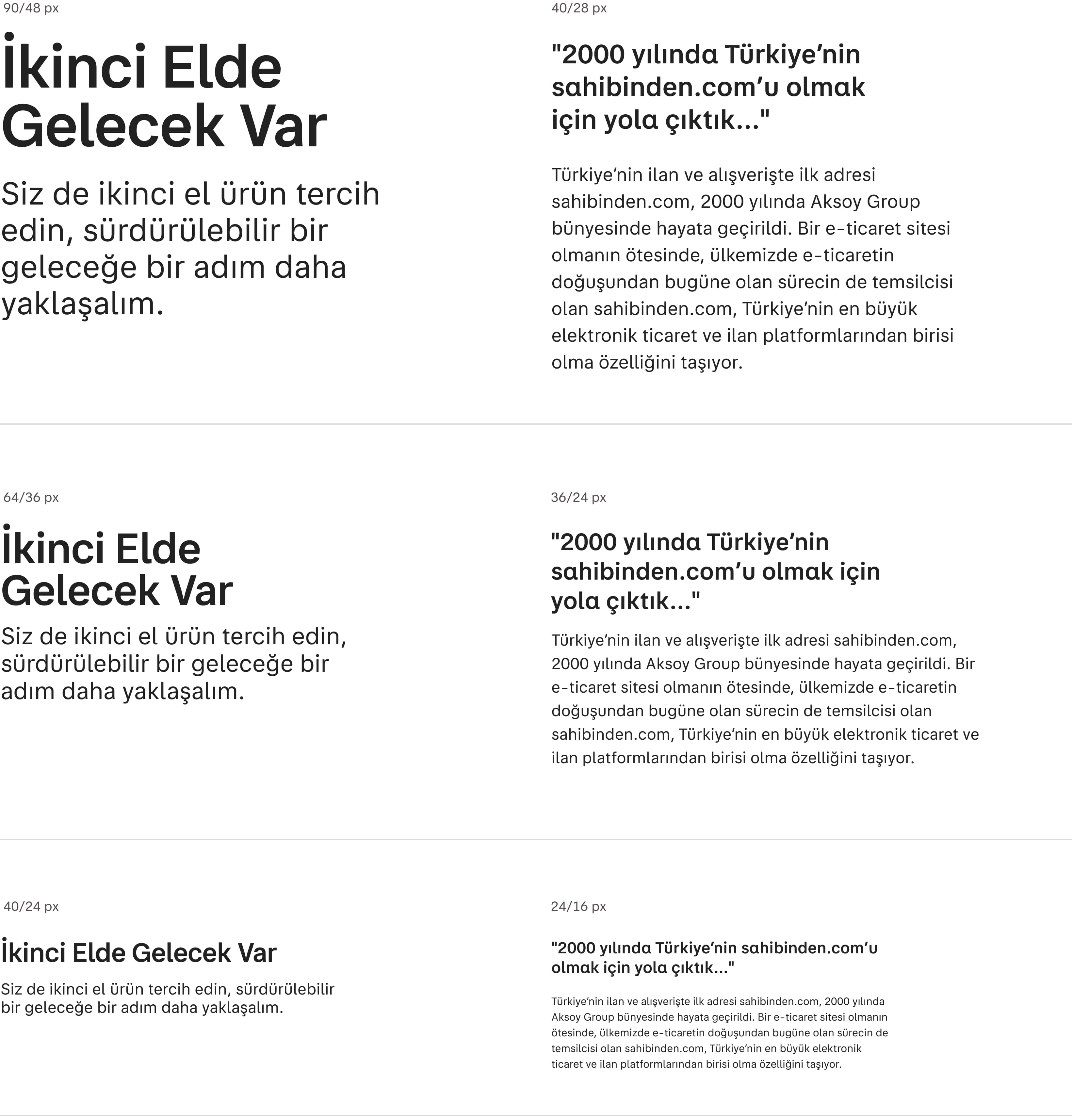
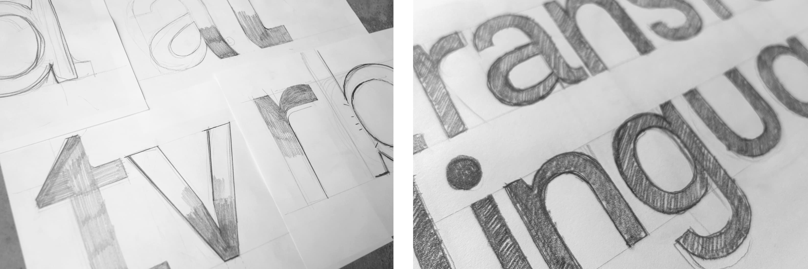
To create a font that delivered the best performance according to user habits, we initiated a preliminary research and development process. This process considered mobile, web, and application usage rates, alongside the evolving screen technologies. Numerous dynamics influenced font preferences, including content and space economics, user habits, and platform design systems. Our preliminary research led us to conclude that a Grotesk font skeleton would best meet the brand's requirements. Following our briefing and preliminary research, our goal became clear: to design a font that not only reflected the brand's personality but also provided comfortable readability. Within this objective, we created a text font that exhibited excellent performance within the 10-16 pixel size range, optimizing both text and headlines. In addition to functional needs, the font's personality reflected the values of Sahibinden.com, including confidence, clarity, reliability and innovation. We introduced specific details to enhance the font's readability. Unlike a classic grotesque font, we integrated certain details from a Humanist font skeleton into our design. This allowed for greater differentiation in letters with formal similarities, improving readability. Generous letter spacing, calligraphic angles at letter terminals, interventions in horizontal terminations, and slightly elevated corner tension in horizontal-vertical intersections were some of the adjustments made to enhance reading comfort. Measurable values, such as vertical and horizontal metrics, were determined with specific needs in mind. Heights of uppercase, lowercase, and numbers were meticulously adjusted to accommodate various reading distances across different devices. Relationships between uppercase letters, lowercase letters, and numbers were optimized to ensure complete harmony. Furthermore, the personality traits inherent in core characters were consistently reflected across the entire character set, including symbols and punctuation marks.
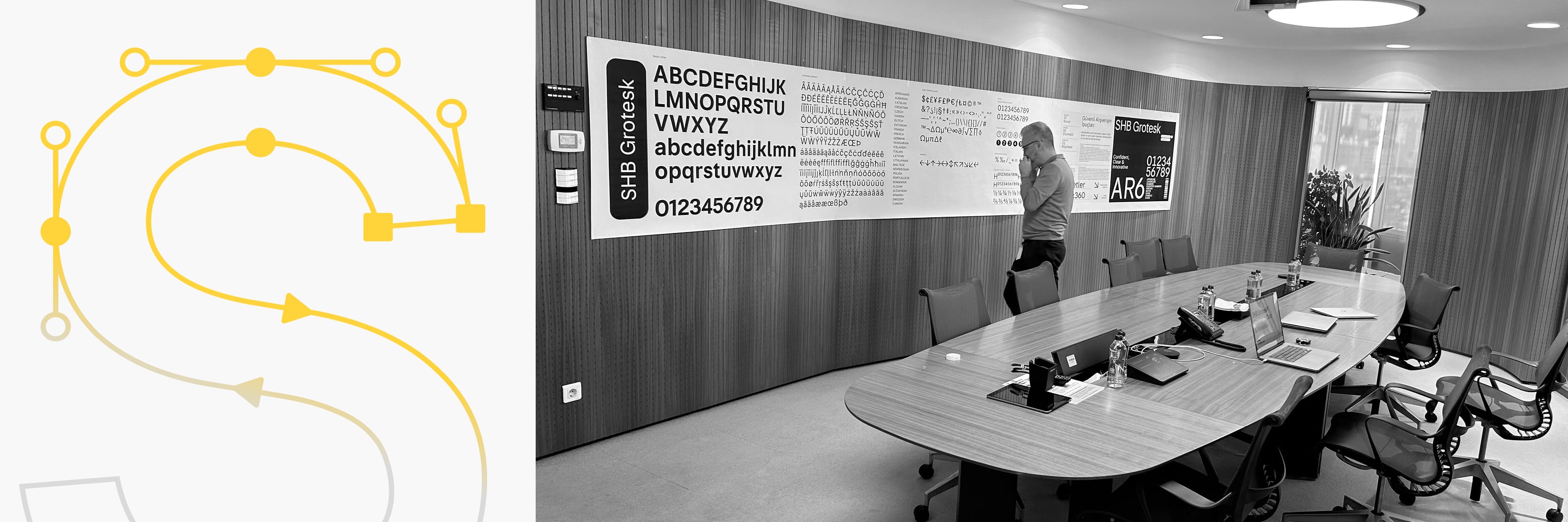
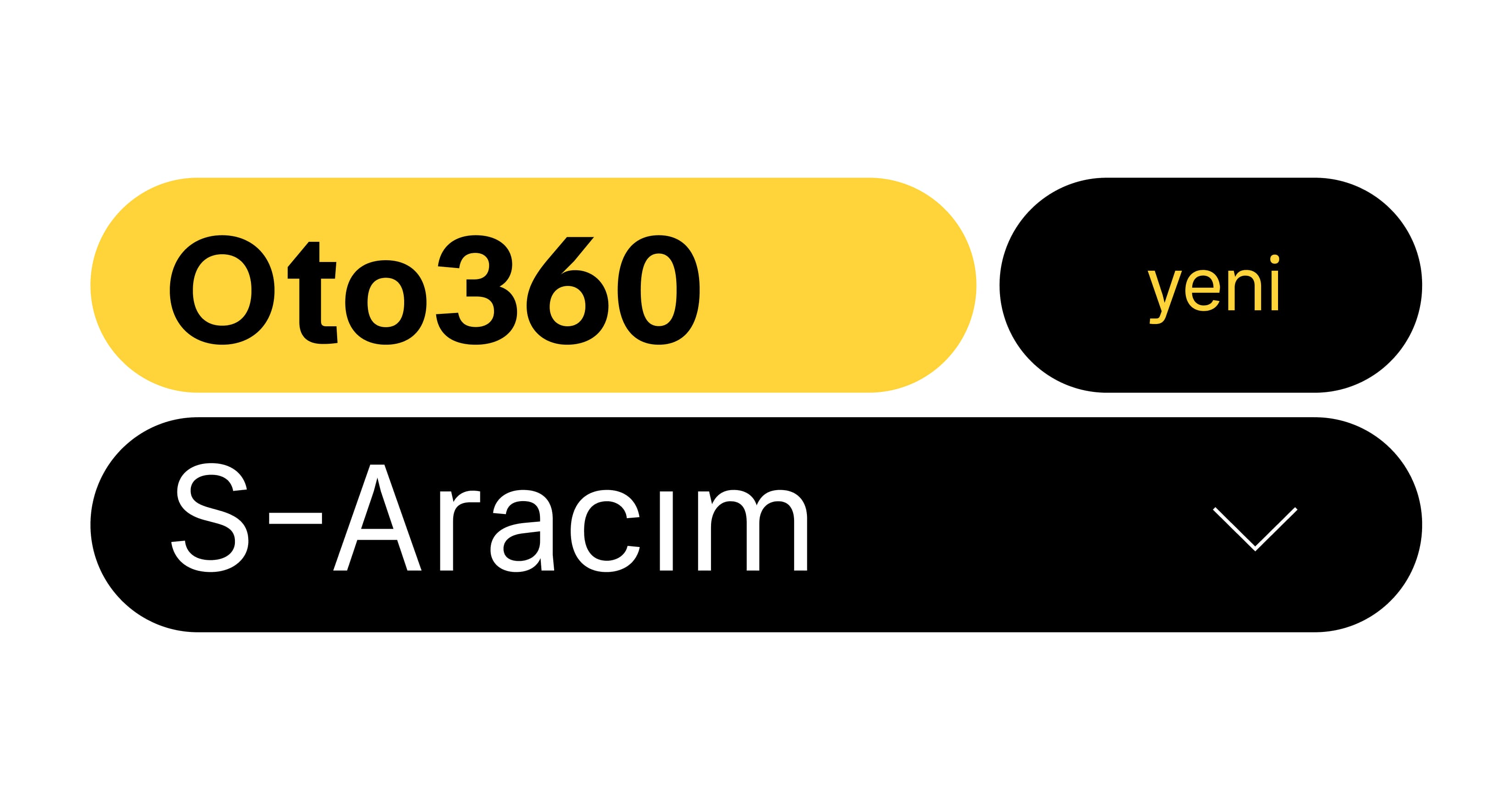
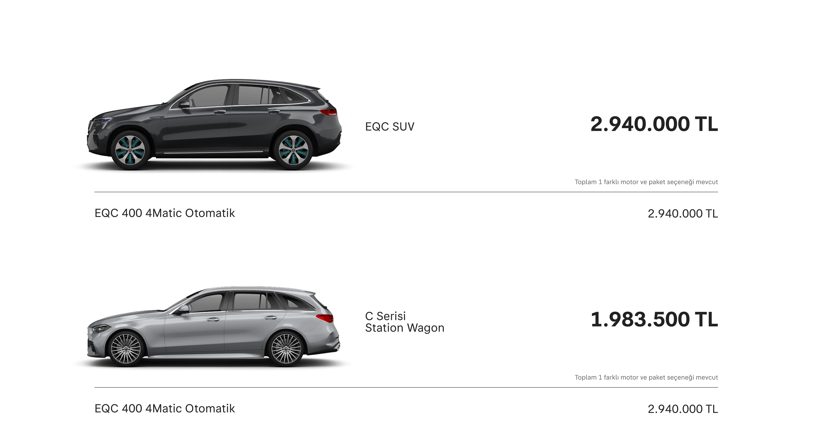
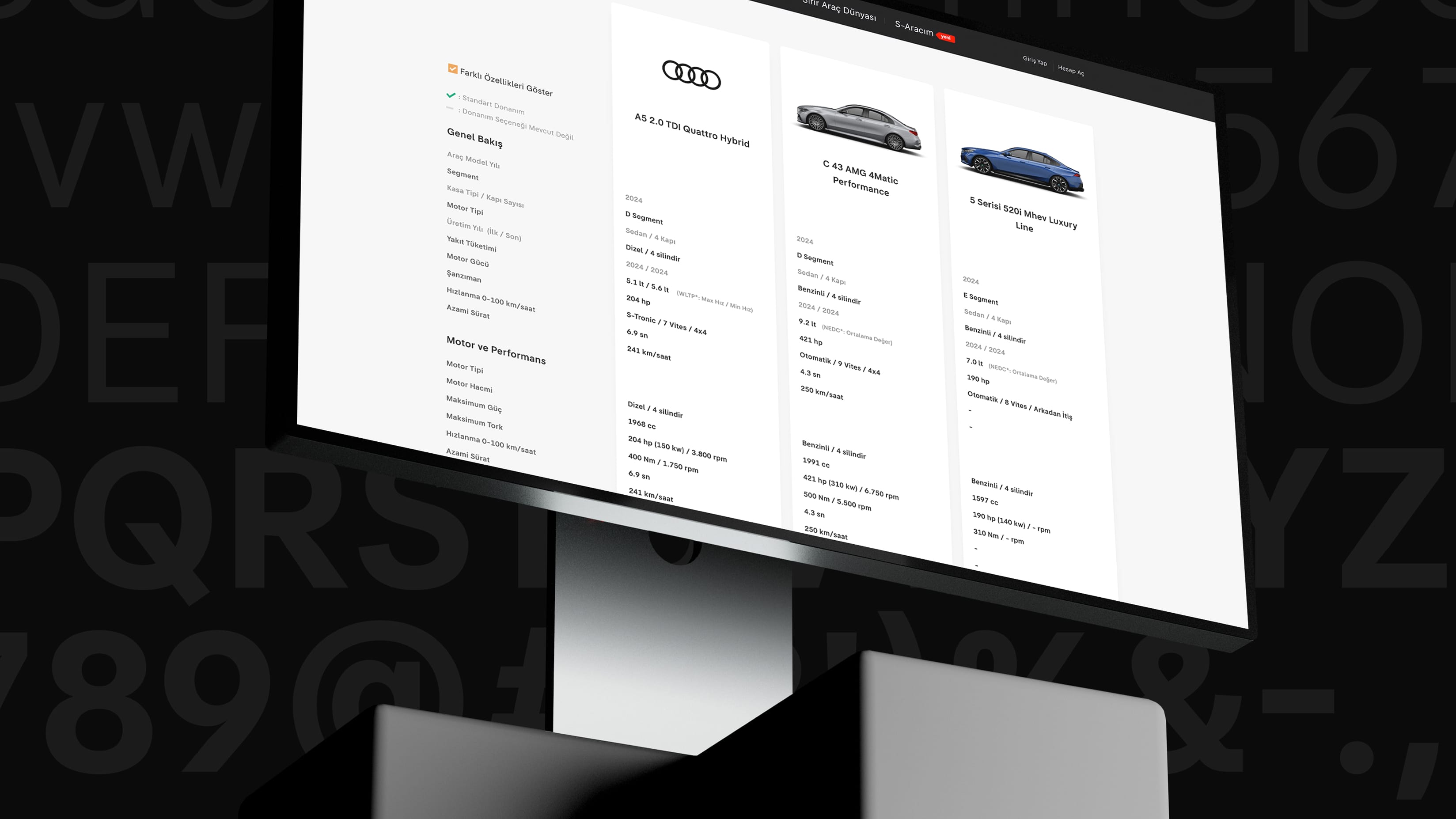
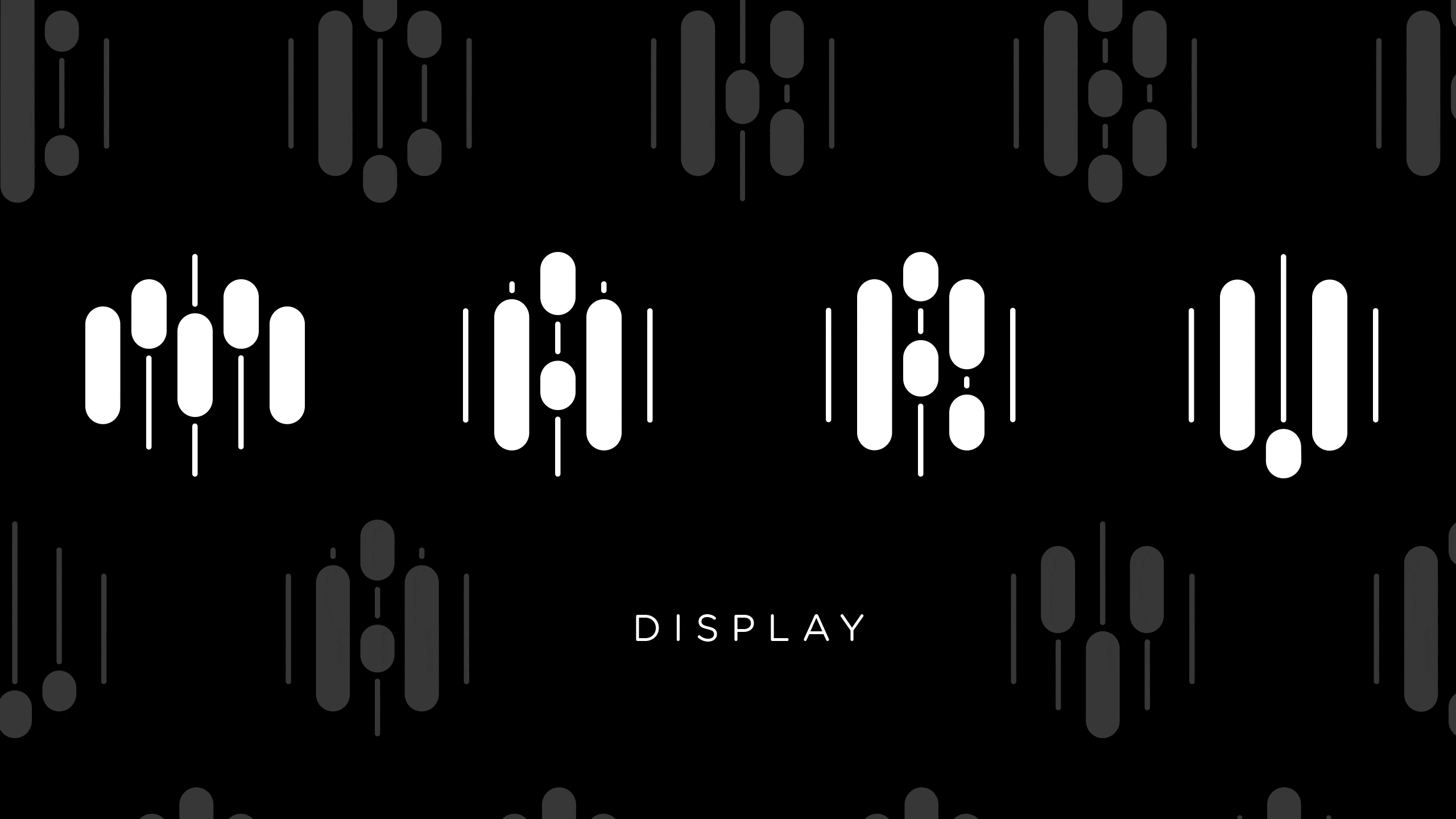
SHB Grotesk Font, comprising eight fonts, was meticulously designed to cater to all typographic requirements of the brand. It was engineered to align seamlessly with user habits and technical needs, facilitating a smooth integration with the platform while reinforcing the brand's identity as a reliable and innovative entity. SHB Grotesk draws its personality of trustworthiness from the grotesque skeleton, its innovative dynamism from proportions, and its clarity and transparency from humanist influences. SHB Grotesk is being used as a corporate font on the sahibinden.com website, mobile application and all promotional channels, reinforcing its feature as a symbol of consistency, trust and innovation.