
A typeface engineered to alleviate the burden of information density and visual complexity.
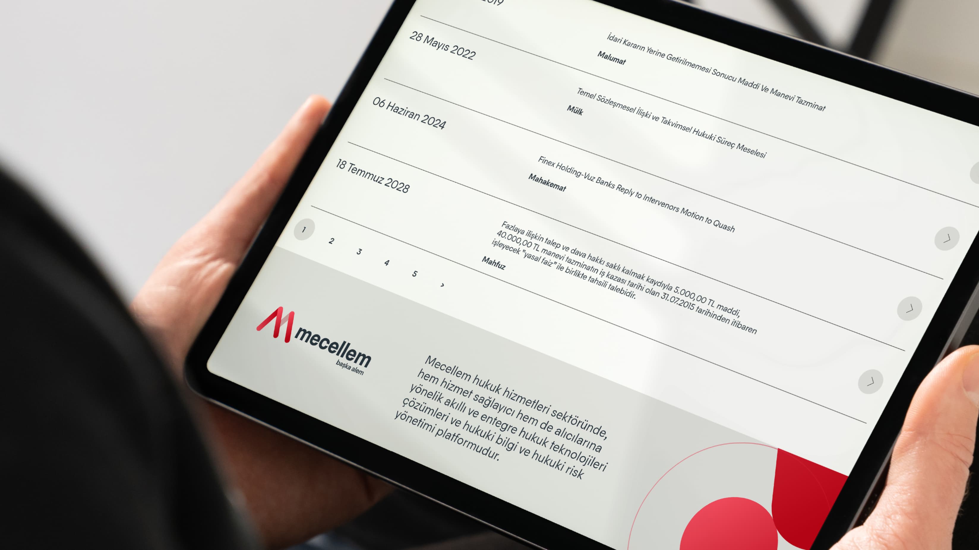
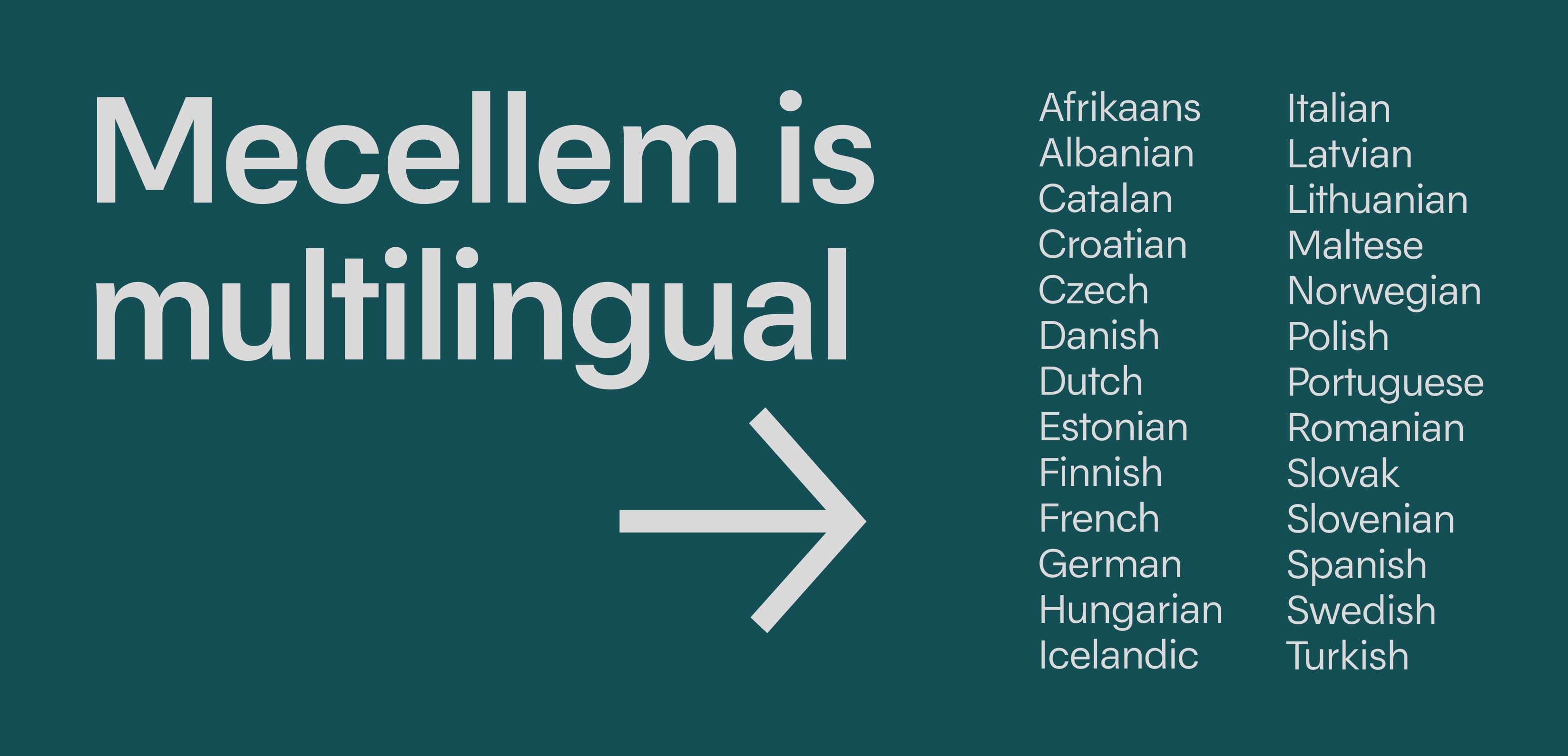
"Mecellem," produced by New Mind Inc, is an integrated and intelligent platform for legal technology solutions, legal information, and legal risk management. It stands out as the world's most comprehensive legal technology ecosystem and the most intelligent platform for legal information and legal risk management, unmatched in its field. Within the realm of "Mecellem," a Legal Technologies platform, a prominent challenge lay in the platform's inherent propensity to overwhelm users with the sheer density of information. The profusion of unorganized data precipitated an initial bias, tarnishing the user experience. Given the platform's inherent text-heavy nature, the font's principal mission became the optimization of information organization, rendering voluminous content more fluid and reader-friendly.
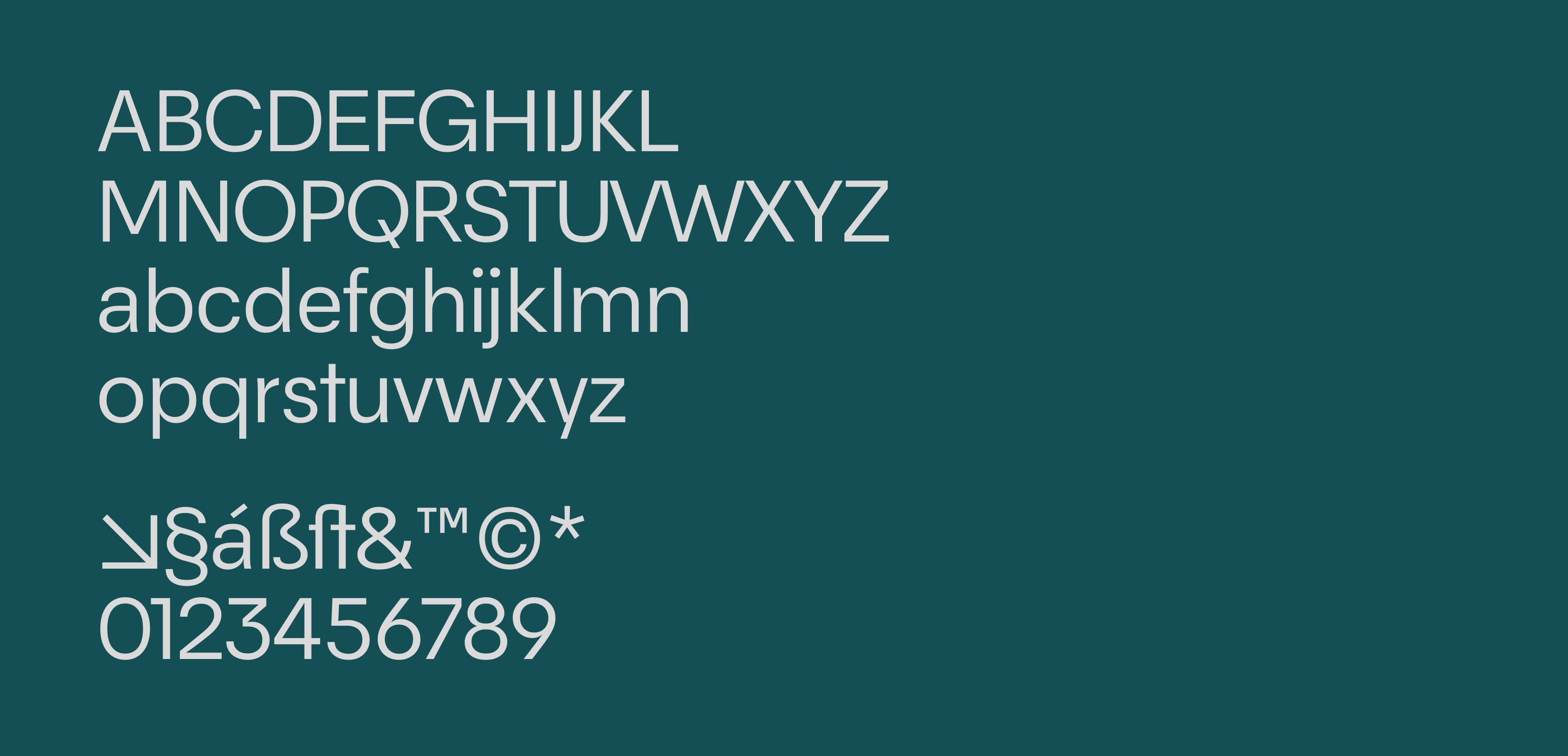
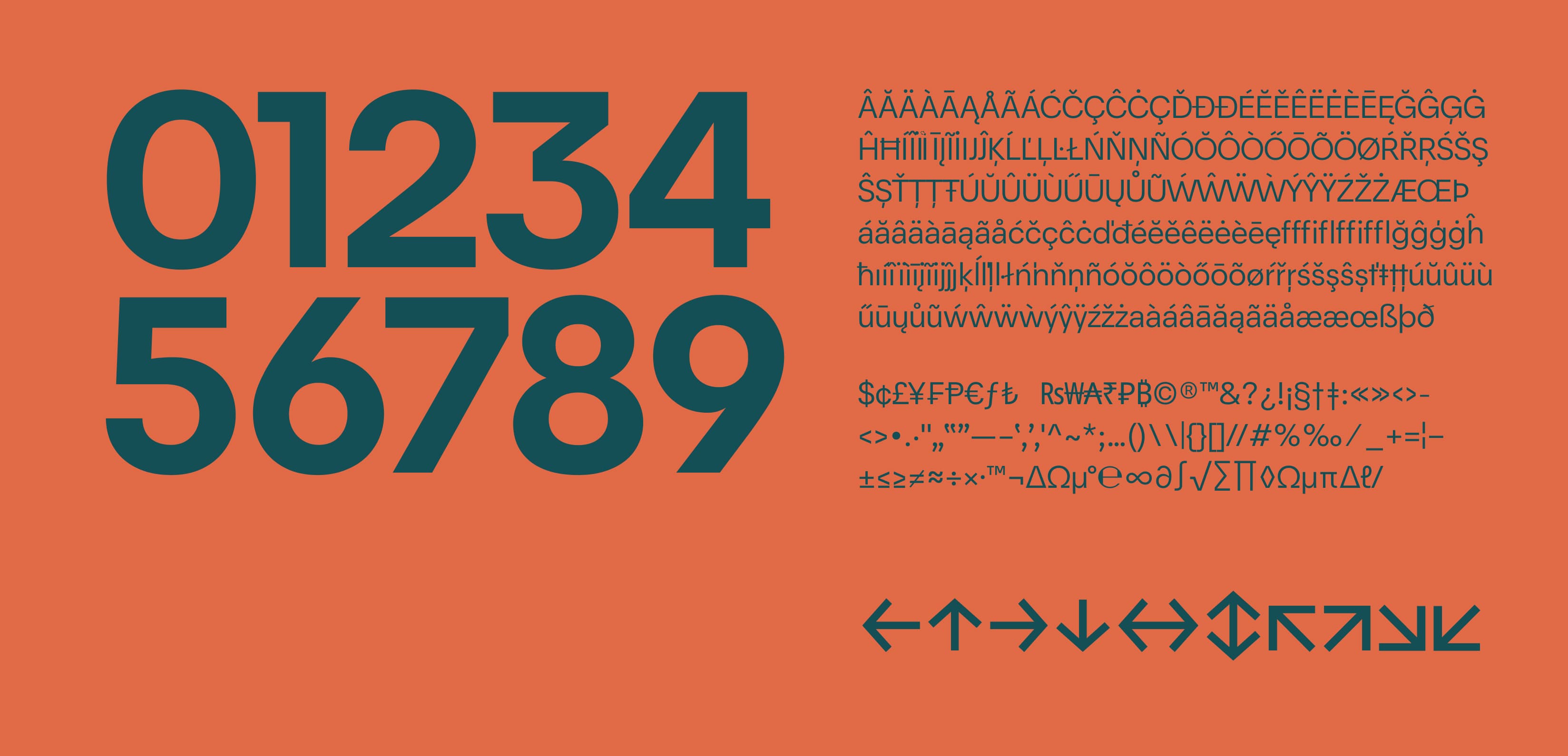
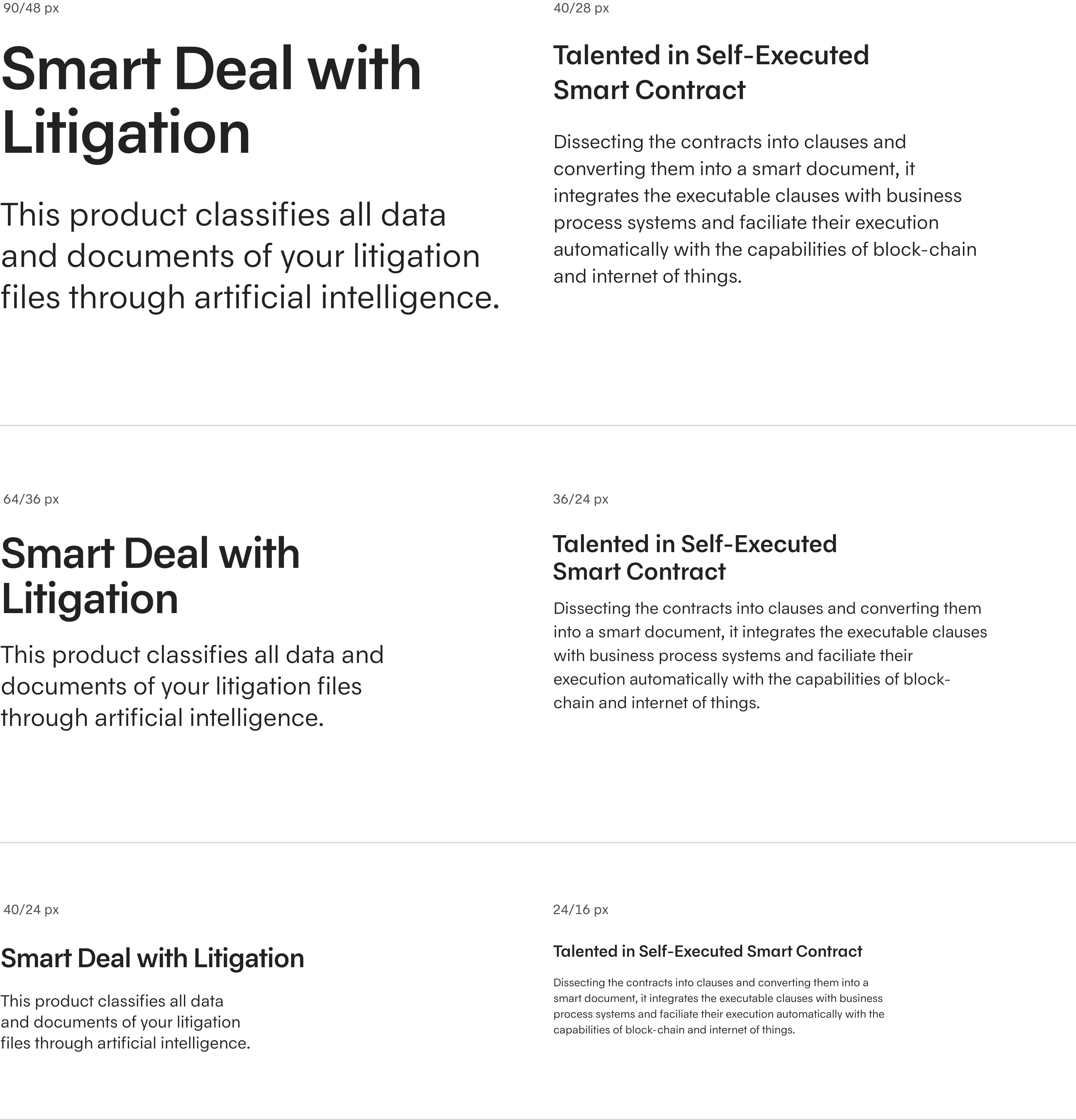
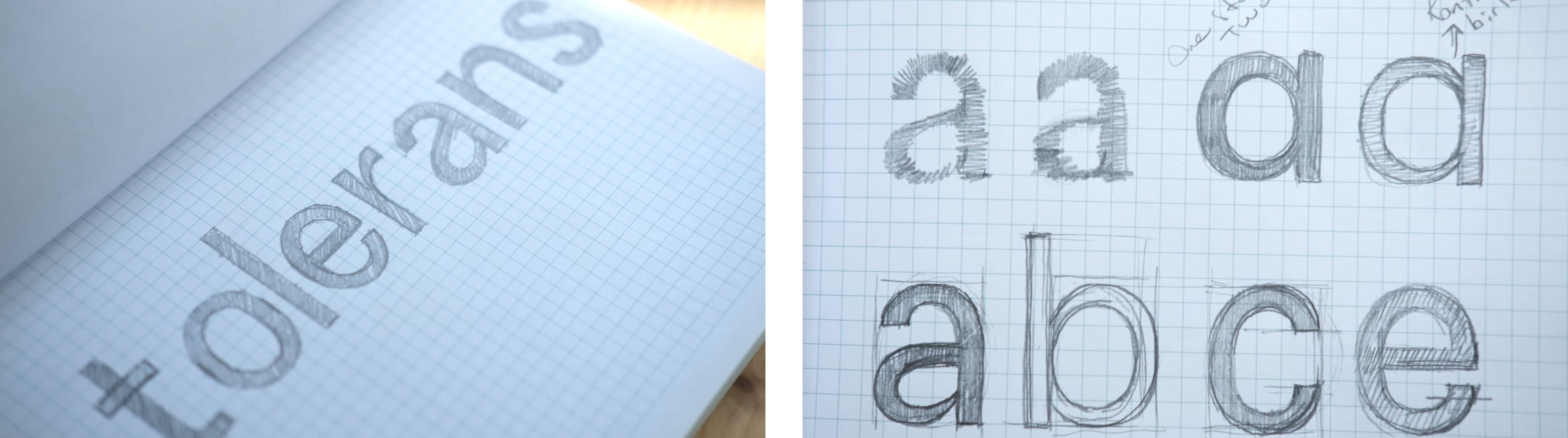
To accomplish this, our initial focus was directed toward the font's width and the artful manipulation of its skeletal structure. We envisioned a font rooted in the grotesque tradition, yet endowed with the organizational prowess that exceeds the conventional. In essence, we aimed to condense the text, thus engendering disciplined text blocks.
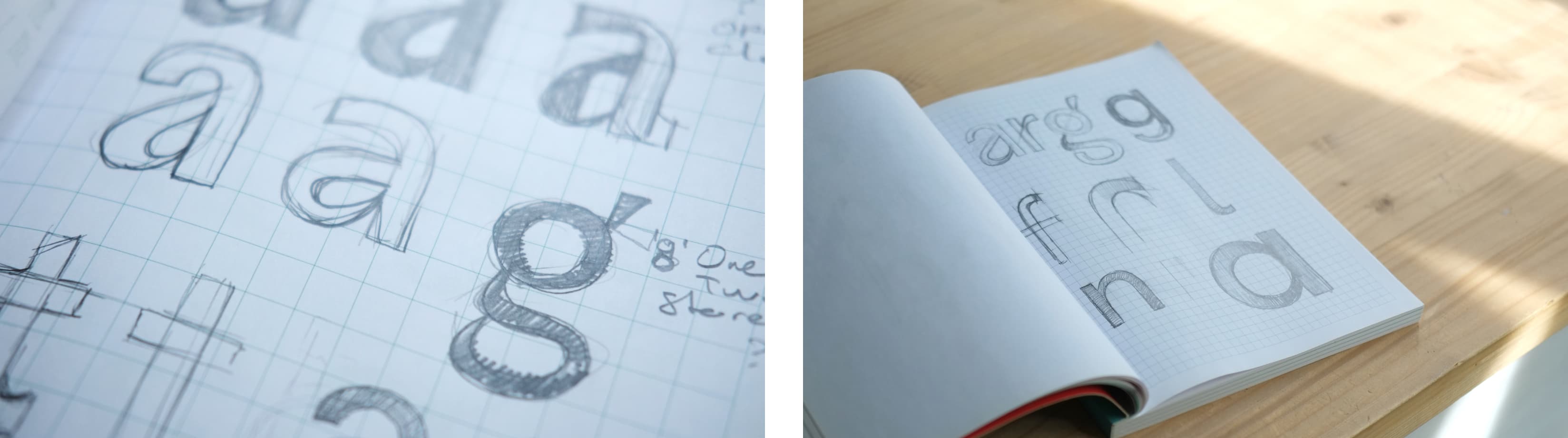
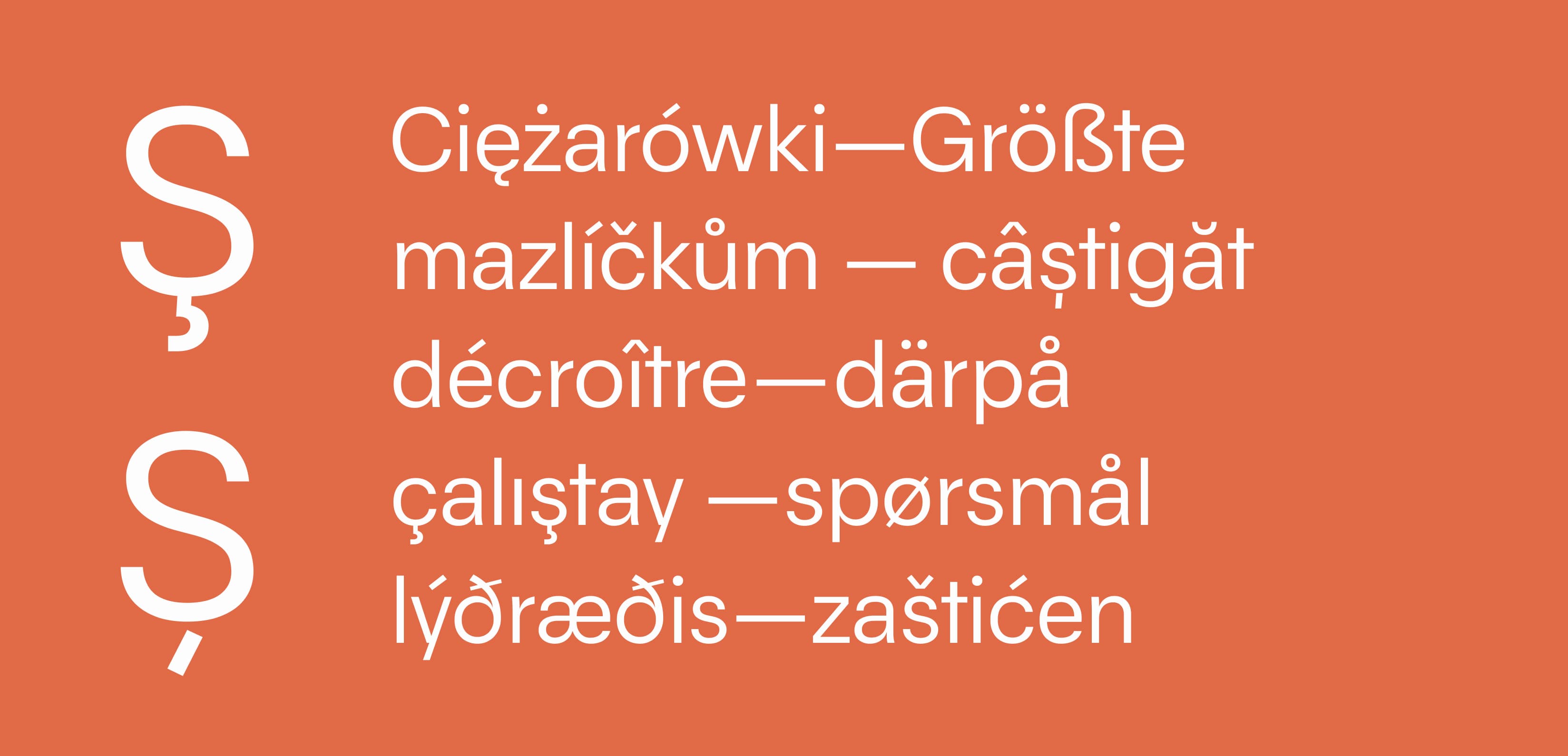
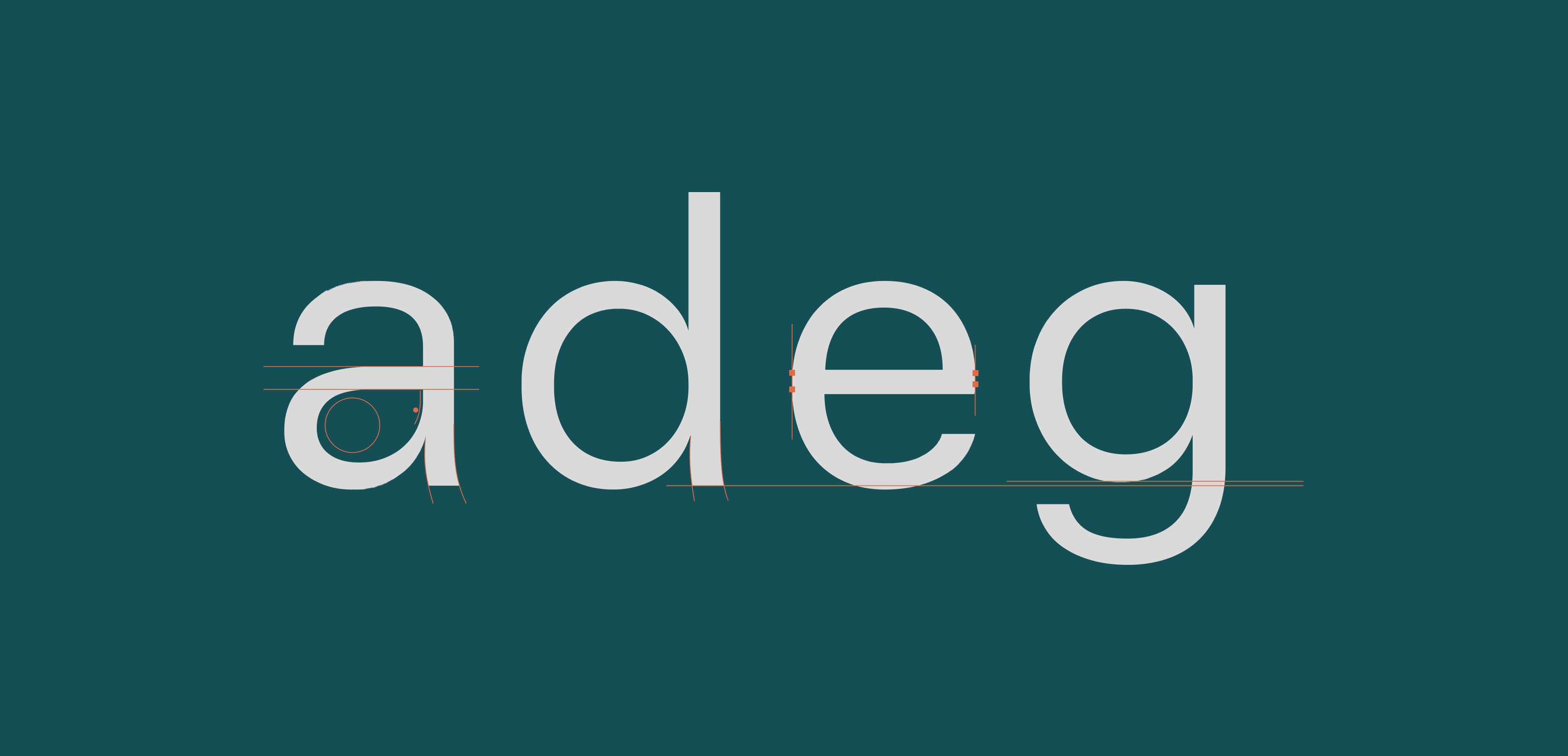
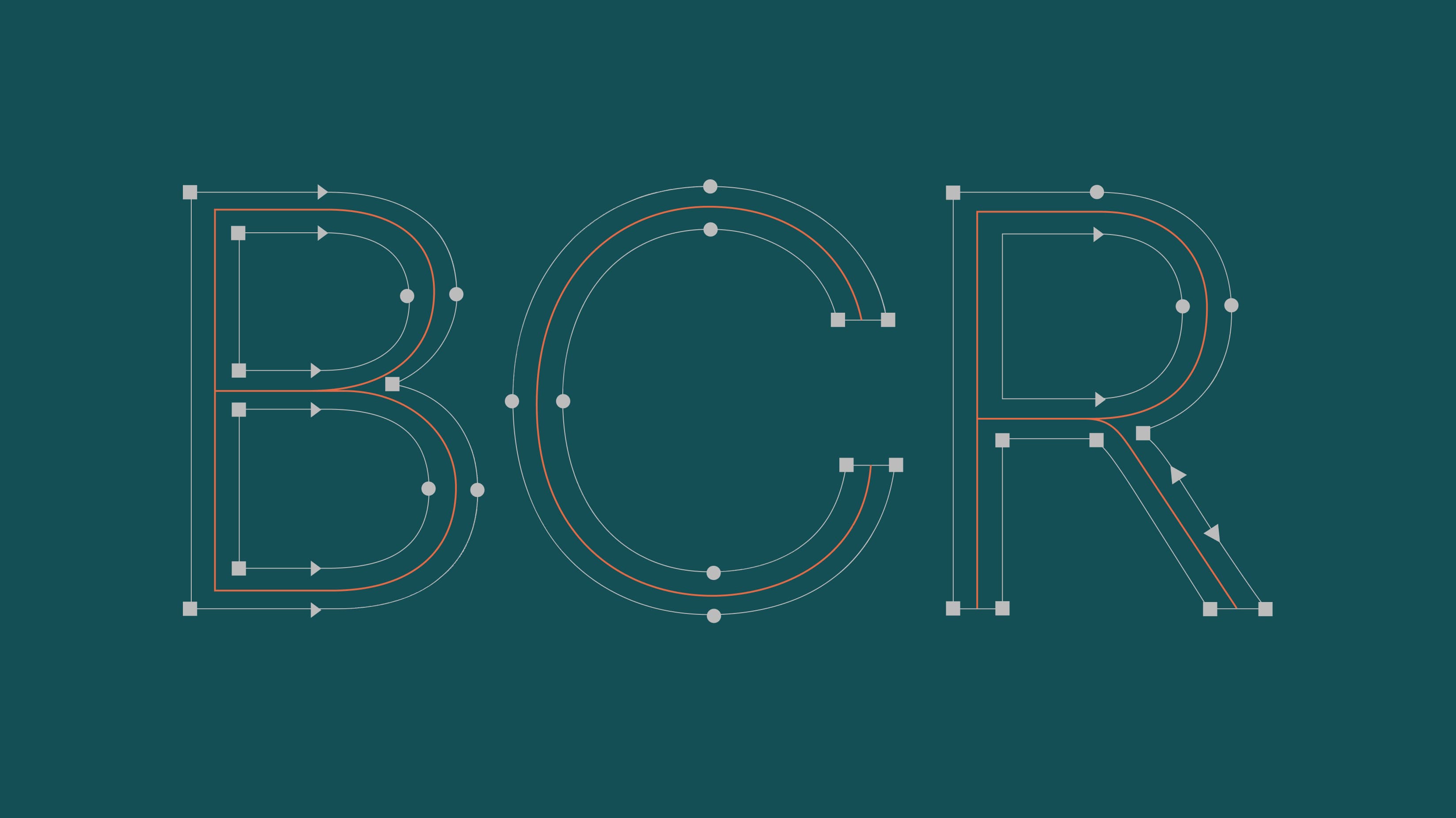
As we gradually completed the character set, we became aware of an unintended rigidity permeating the font's character. Our pursuit of a function-driven font instilled concerns regarding its perceived lack of personality and affability. It became evident that, at a certain juncture, we must imbue the font with increased fluidity and a more intimate disposition. Inspiration from the art of calligraphy prompted us to infuse the font with increased allure and fluidity. By introducing sinuous contours on anatomical components, we breathed greater vitality into the font. The bended curves at the terminals of the strokes, designed to complement the reading direction, endowed the font with a pronounced intimacy transcending mere functionality. In our quest to enhance the font's efficacy, we fortified letter combinations and bolstered the harmony among consecutively arranged letters. An innovative solution involved the creation of short vertical details within the left and right portions of letter bowls, even within rounded characters. Thus, irrespective of the juxtaposition of letters, these verticals invariably assumed a 90-degree orientation. This refinement ushered in greater regularity to letter arrangements and enhanced text compactness.
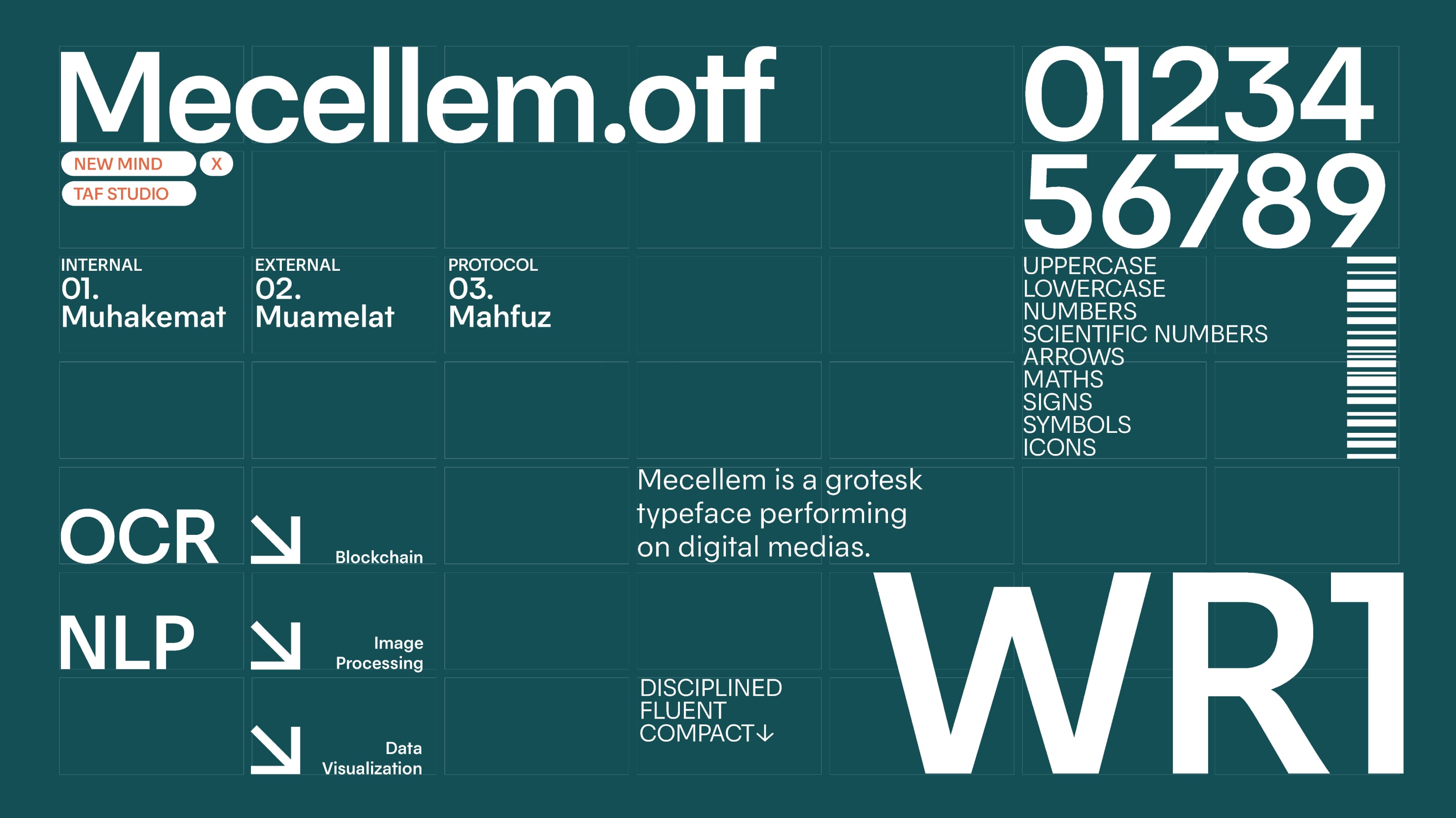
The Mecellem Typeface stands as an artful testament, meticulously tailored to meet the precise requisites of the brand. With its robust dynamics and fluid structural integrity, it excels in accommodating dense textual blocks and paragraph utilization. Furthermore, its expansive character set comprehensively addresses the demands of technical text. Additionally, through rasterization features fine-tuned for screen technologies, it bestows multifaceted functionality for user interfaces and all-encompassing content deployment.