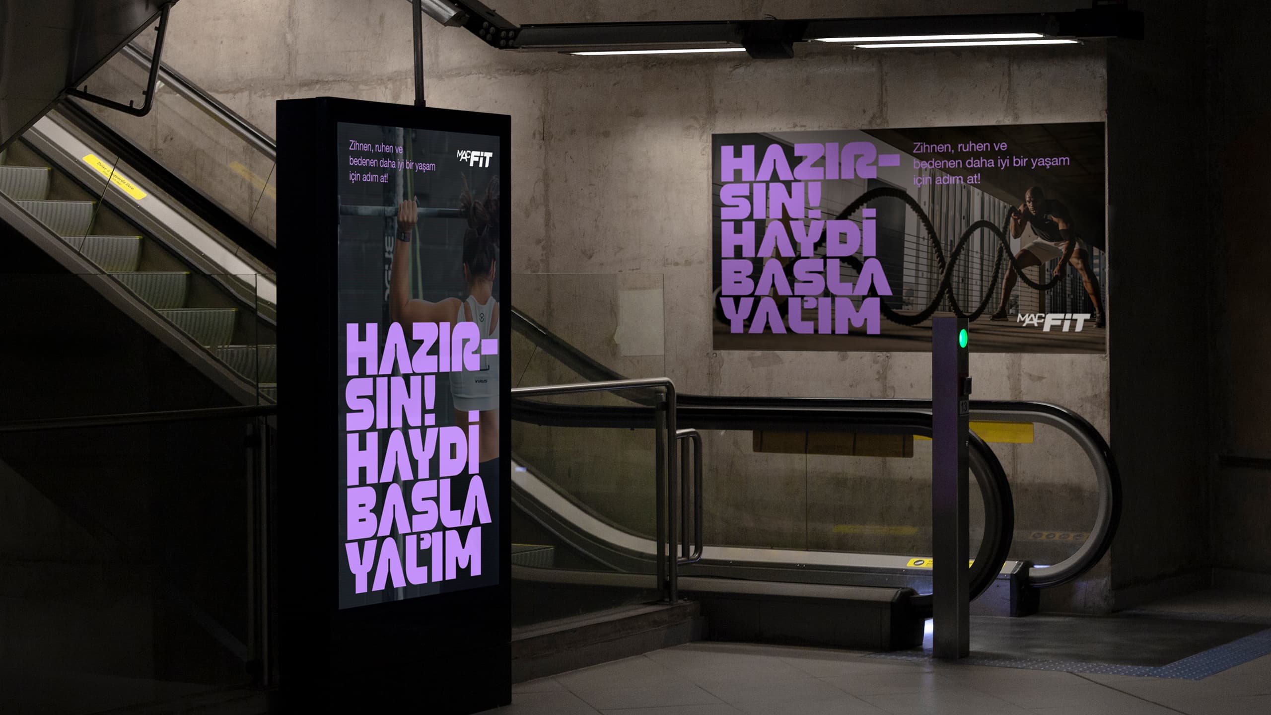

Eliciting positive emotion with typeface.
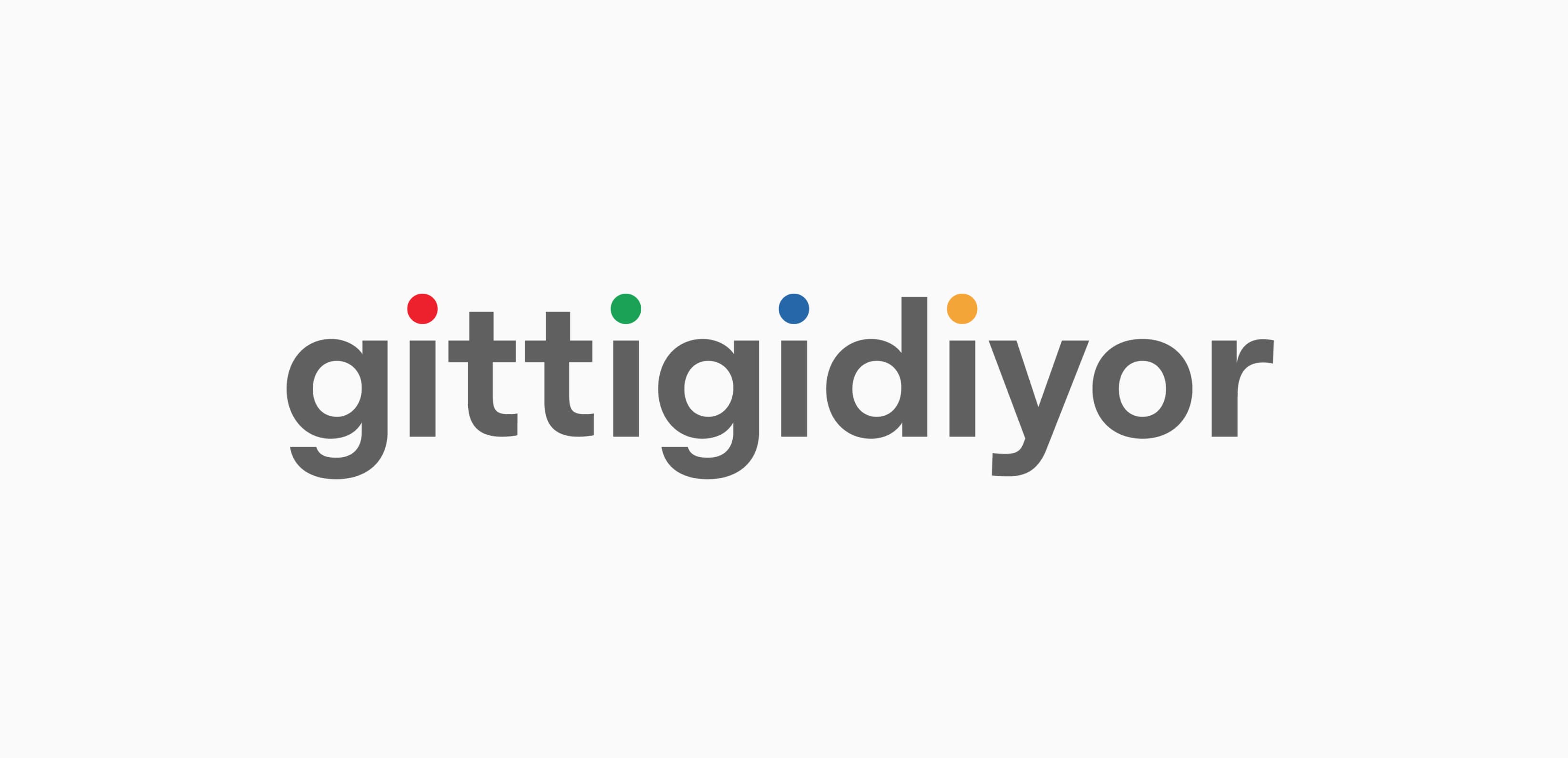
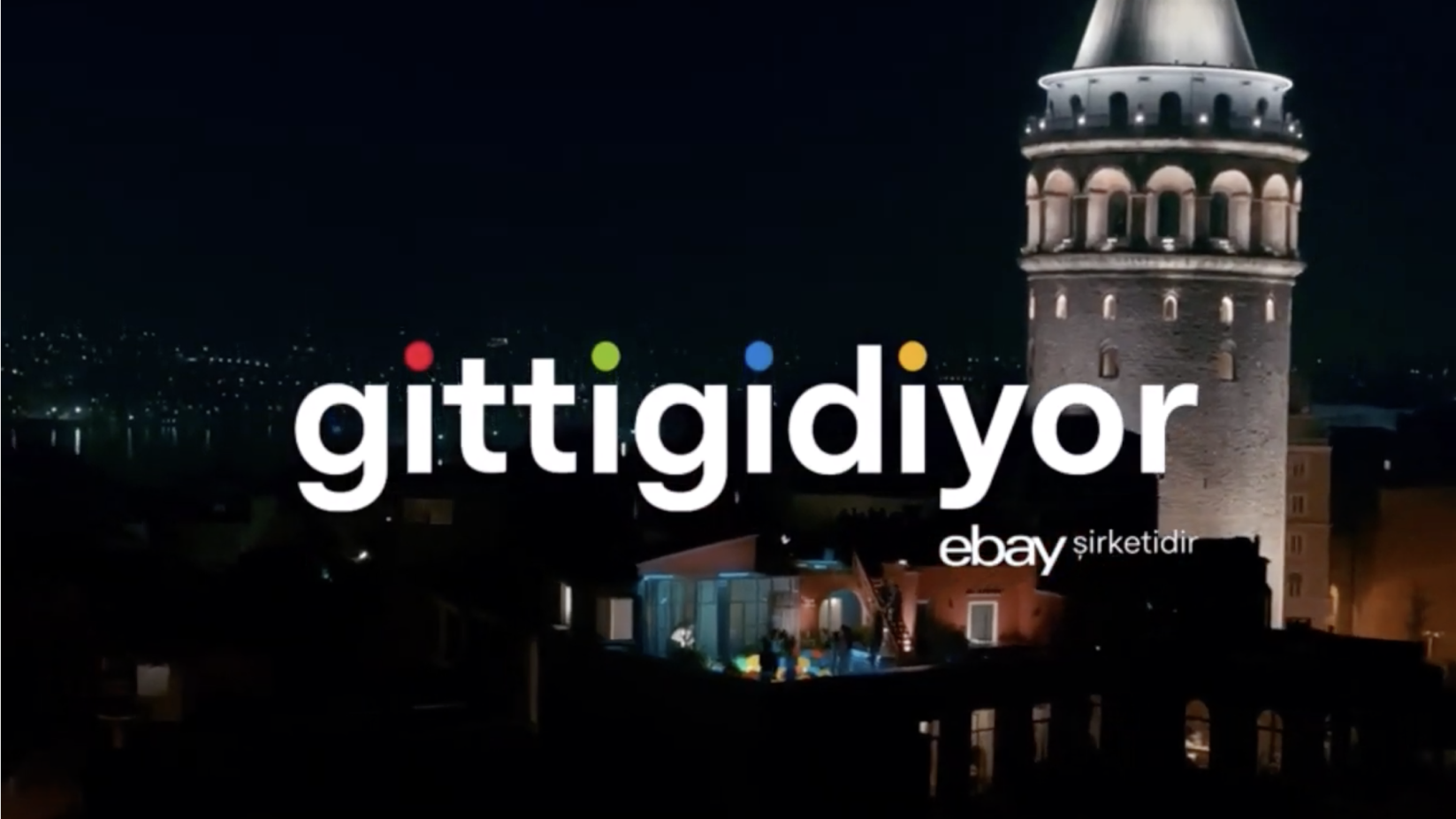
Since its establishment in 2001, GittiGidiyor.com was a stalwart in Turkey's e-commerce landscape. It's collaboration with eBay thrust the brand into the limelight, prompting a strategic overhaul of corporate identity and marketing efforts. A pivotal aspect of this brand transformation lay in our hands: the creation of a new font, slated for use in both the logo and all communication channels, wielded significant influence in crafting the brand's fresh image.

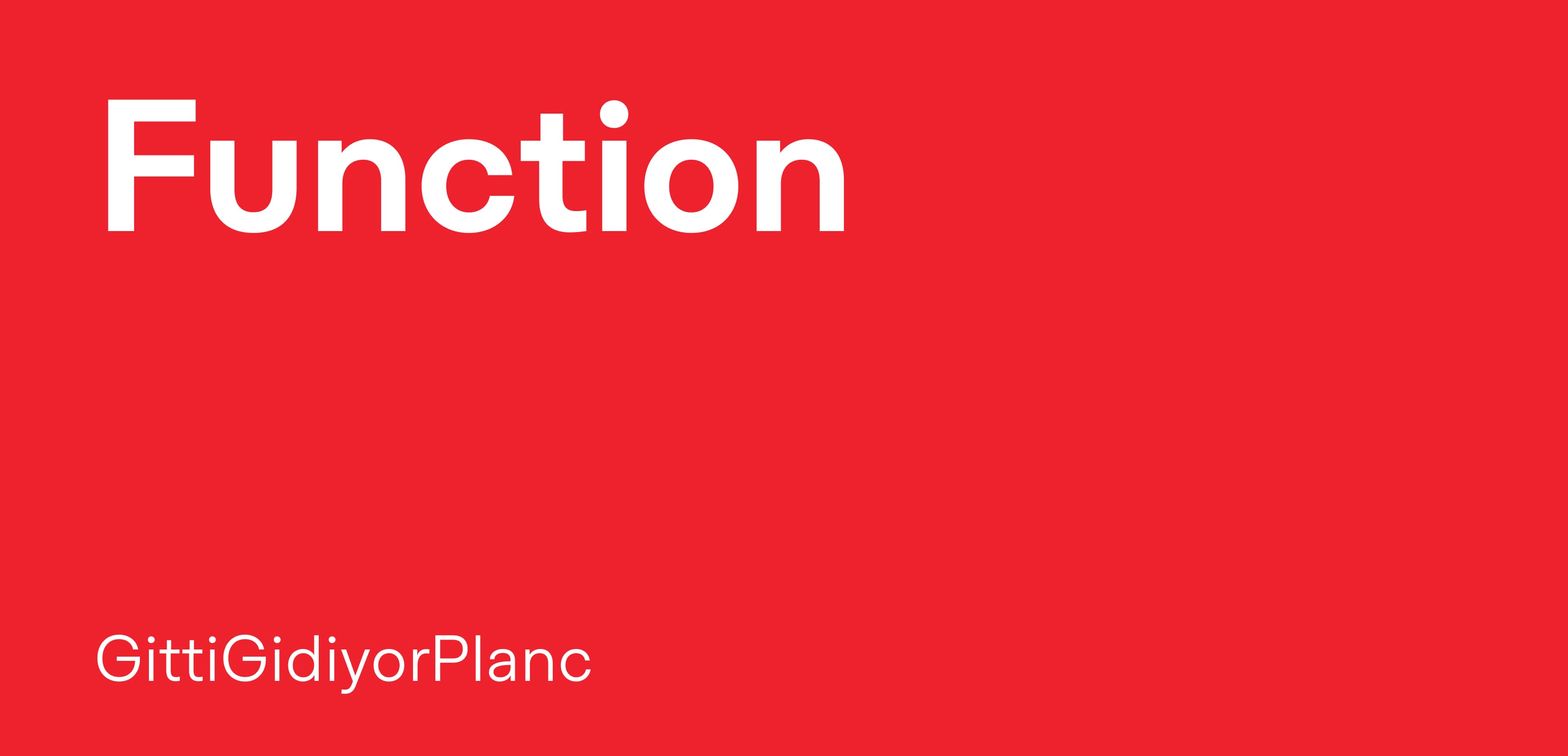
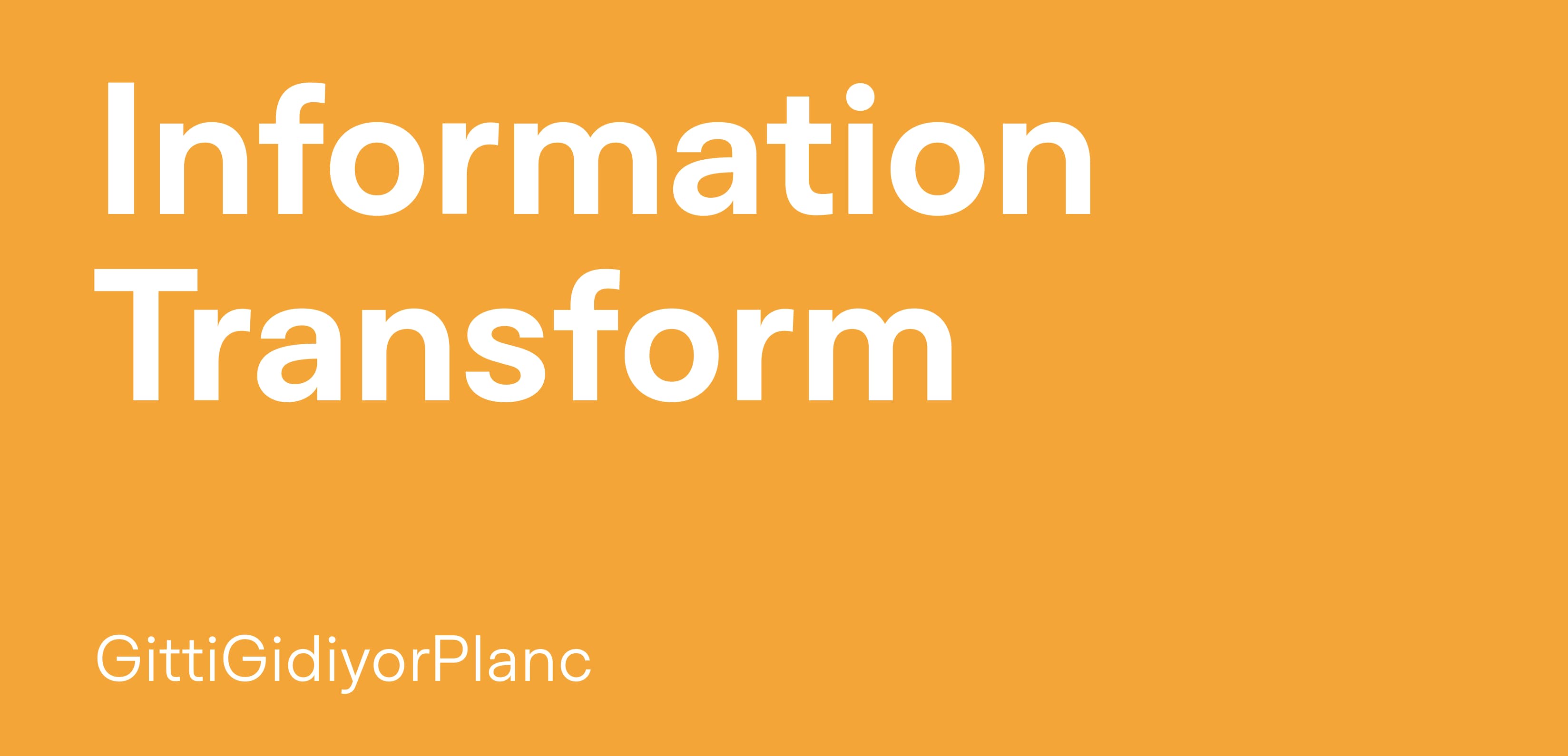
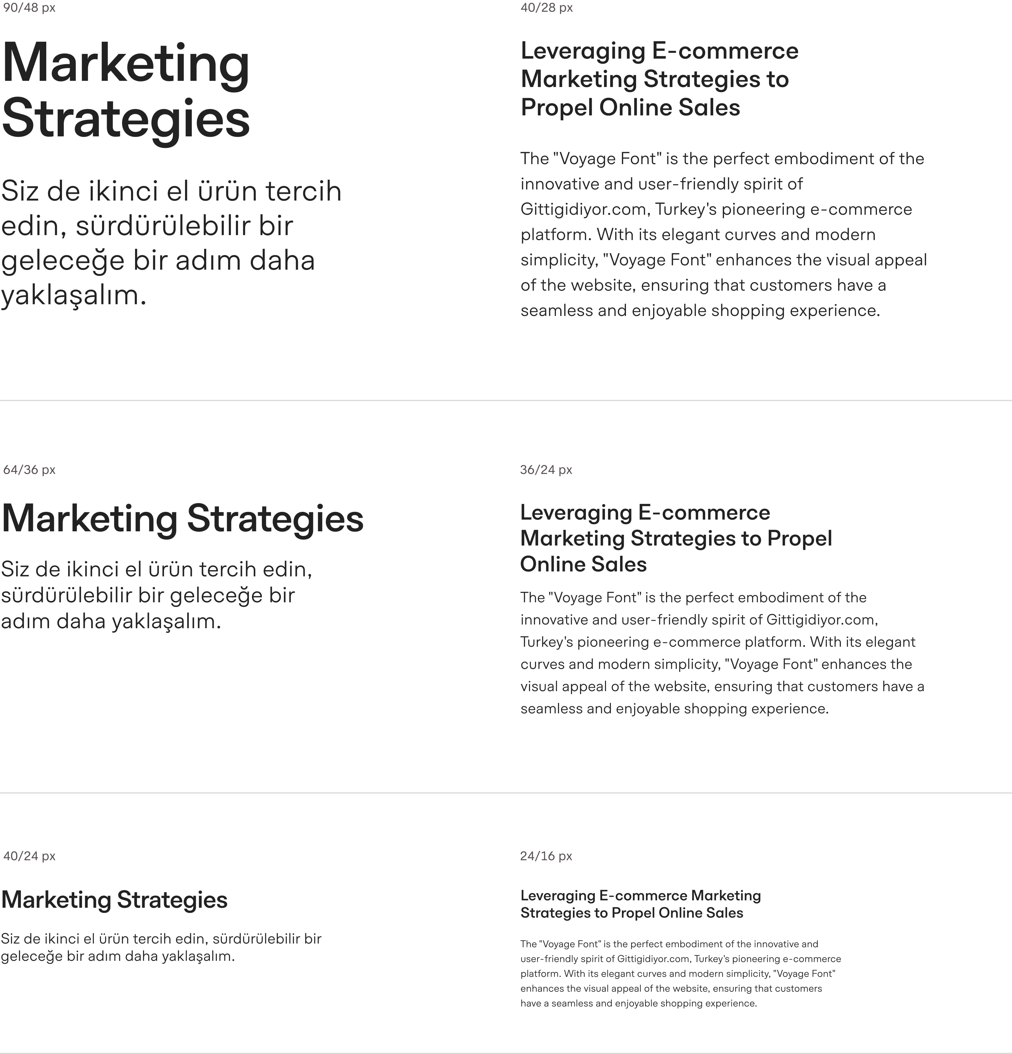
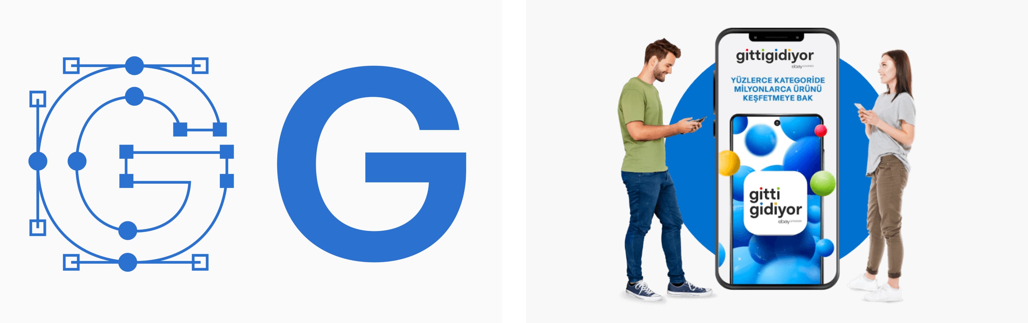
The brand's strategic vision was initially cast in broad strokes, with the aim to enhance the shopping experience. However, for us, this broad objective needed refinement into a more nuanced and compelling directive. Breathing new life into the brand's identity through typeface, and seamlessly integrating it into the shopping experience, was an ambitious undertaking. Progress: Our creative journey prioritized emotional resonance over mere functional utility. Functionally, we embarked on an innovative path, drawing inspiration from the Planc Grotesk font, concurrently under development in our studio. The classical aesthetics of this grotesque font seamlessly fulfilled our functional requirements. Emotionally, our goal was to infuse the font with positive emotions and a warm, welcoming ambiance, leveraging our design expertise. We incorporated subtle touches that appealed to diverse perceptual levels, focusing on fortifying both the initial impact and the enduring user experience of the font. Differentiations were meticulously crafted at both macro and micro levels, guiding us towards our desired destination. Beyond the technical aspects, it was the nuances born from intrinsic insights that proved instrumental in enhancing humanistic and positive sentiments. Following the font's design phase, we undertook the creation of the brand's logo, harmoniously aligning it with the new typographic aesthetic, and optimizing it specifically for the application icon and website.
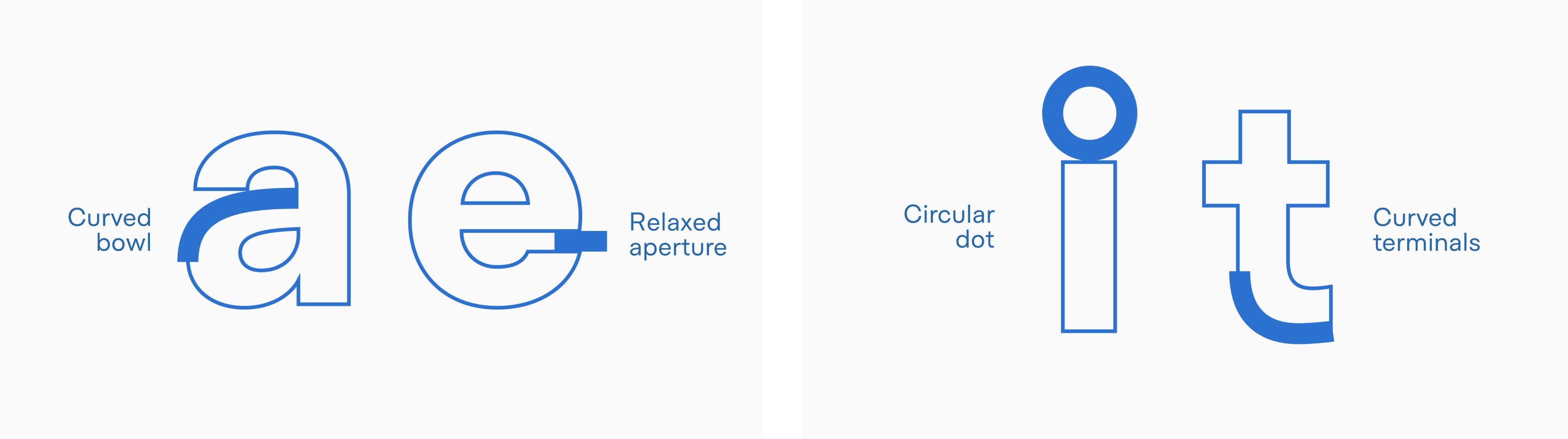
Our creative journey prioritized emotional resonance over mere functional utility. Functionally, we embarked on an innovative path, drawing inspiration from the Planc Grotesk font, concurrently under development in our studio. The classical aesthetics of this grotesque font seamlessly fulfilled our functional requirements. Emotionally, our goal was to infuse the font with positive emotions and a warm, welcoming ambiance, leveraging our design expertise. We incorporated subtle touches that appealed to diverse perceptual levels, focusing on fortifying both the initial impact and the enduring user experience of the font. Differentiations were meticulously crafted at both macro and micro levels, guiding us towards our desired destination. Beyond the technical aspects, it was the nuances born from intrinsic insights that proved instrumental in enhancing humanistic and positive sentiments. Following the font's design phase, we undertook the creation of the brand's logo, harmoniously aligning it with the new typographic aesthetic, and optimizing it specifically for the application icon and website.
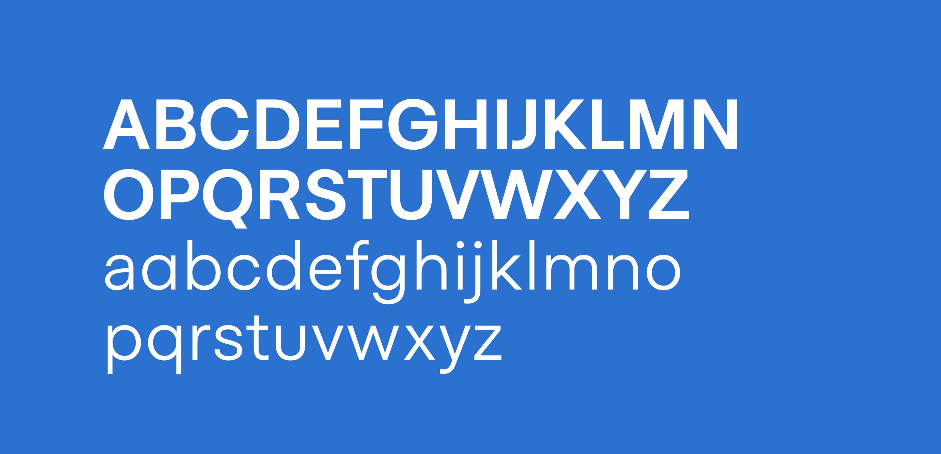
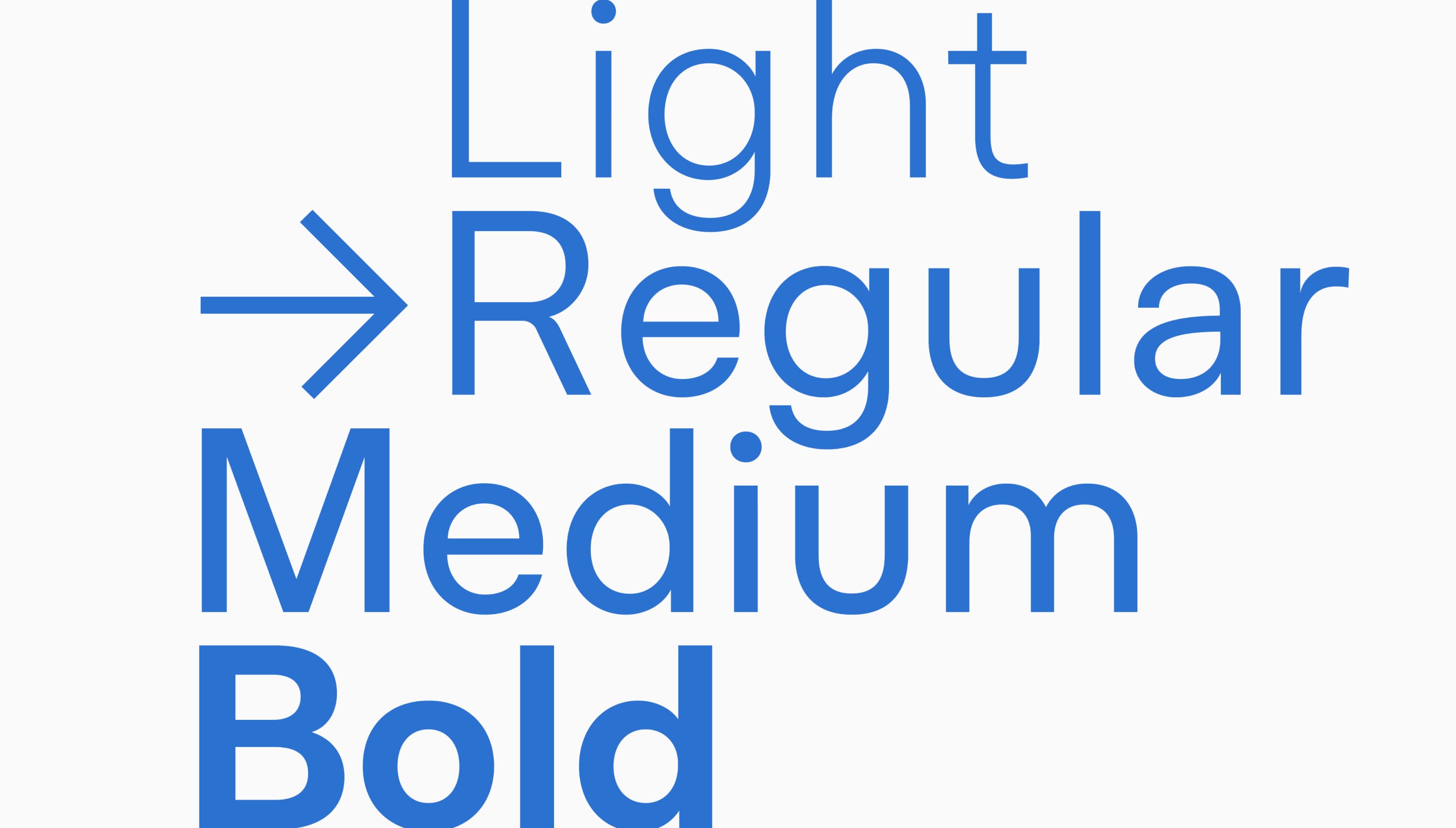
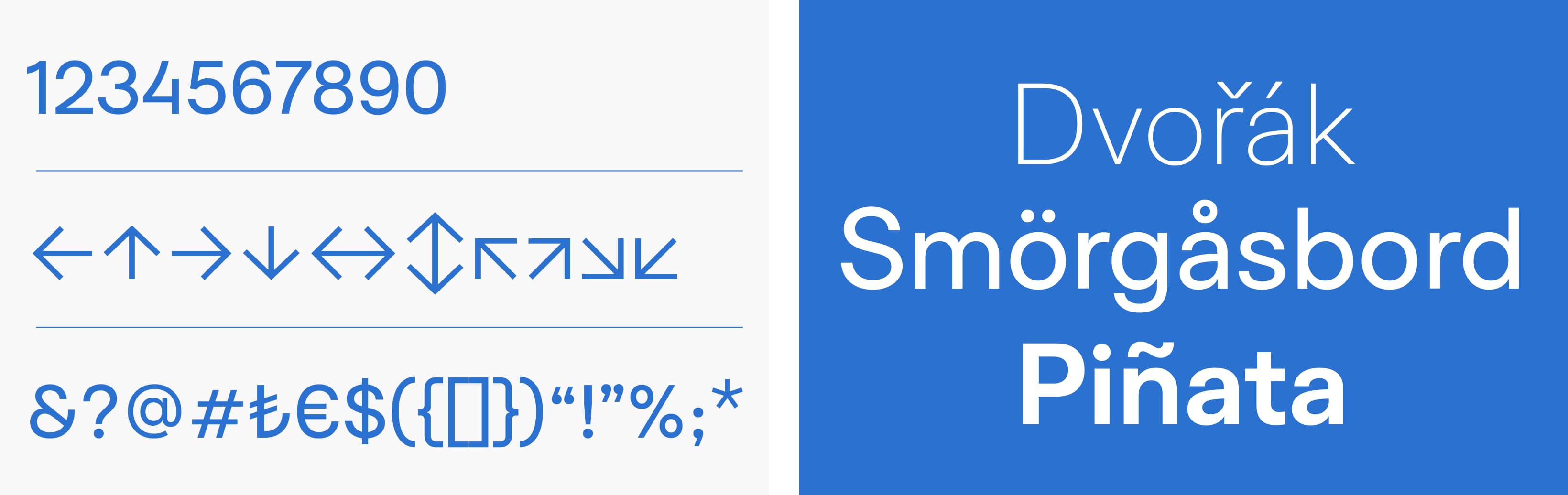
GittiGidiyorPlanc was unveiled in tandem with the brand's launch, making its presence felt across advertising channels. Subsequently, with 10 weights and matching italics, the font seamlessly became a part of the user experience for millions across all e-commerce platforms.