
Font design as the cornerstone of branding.
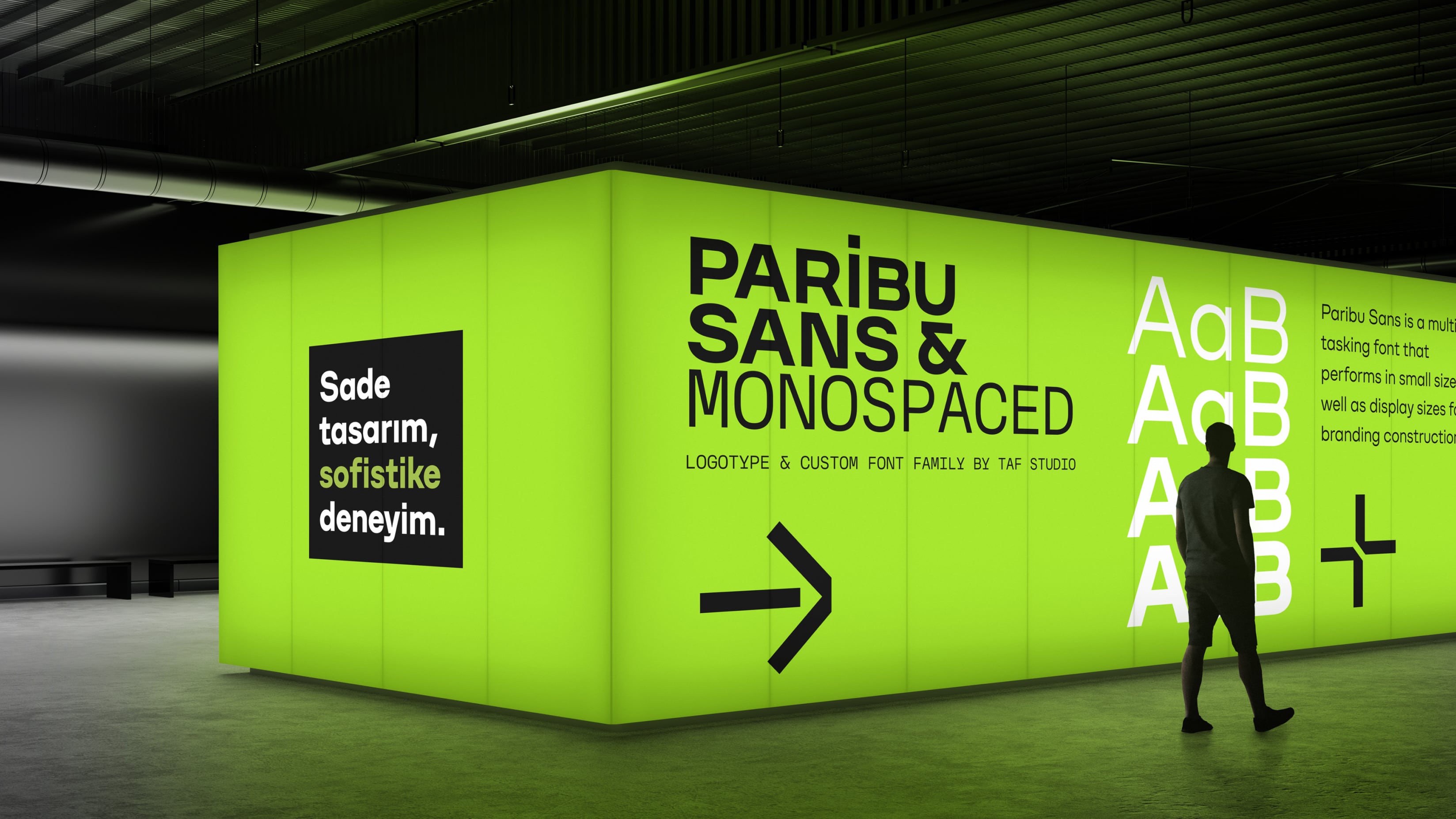
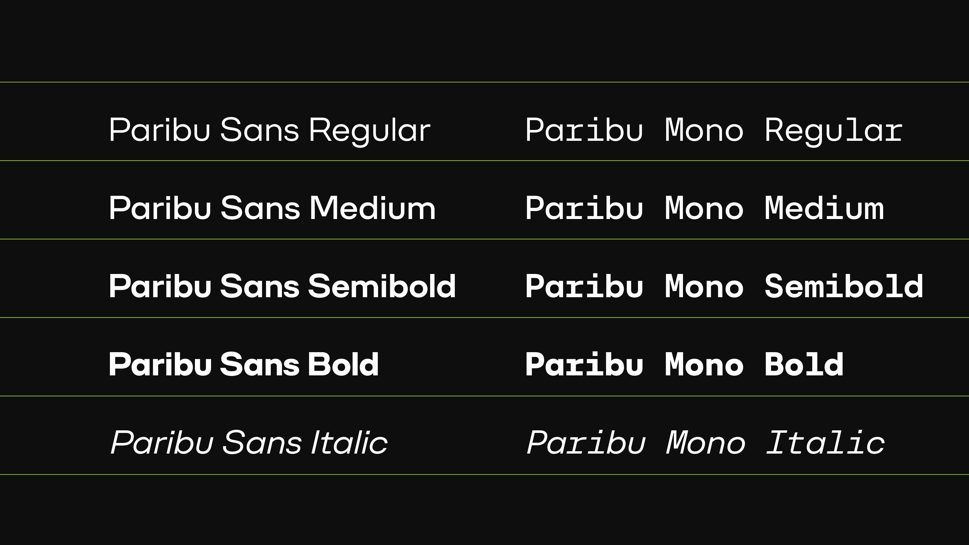
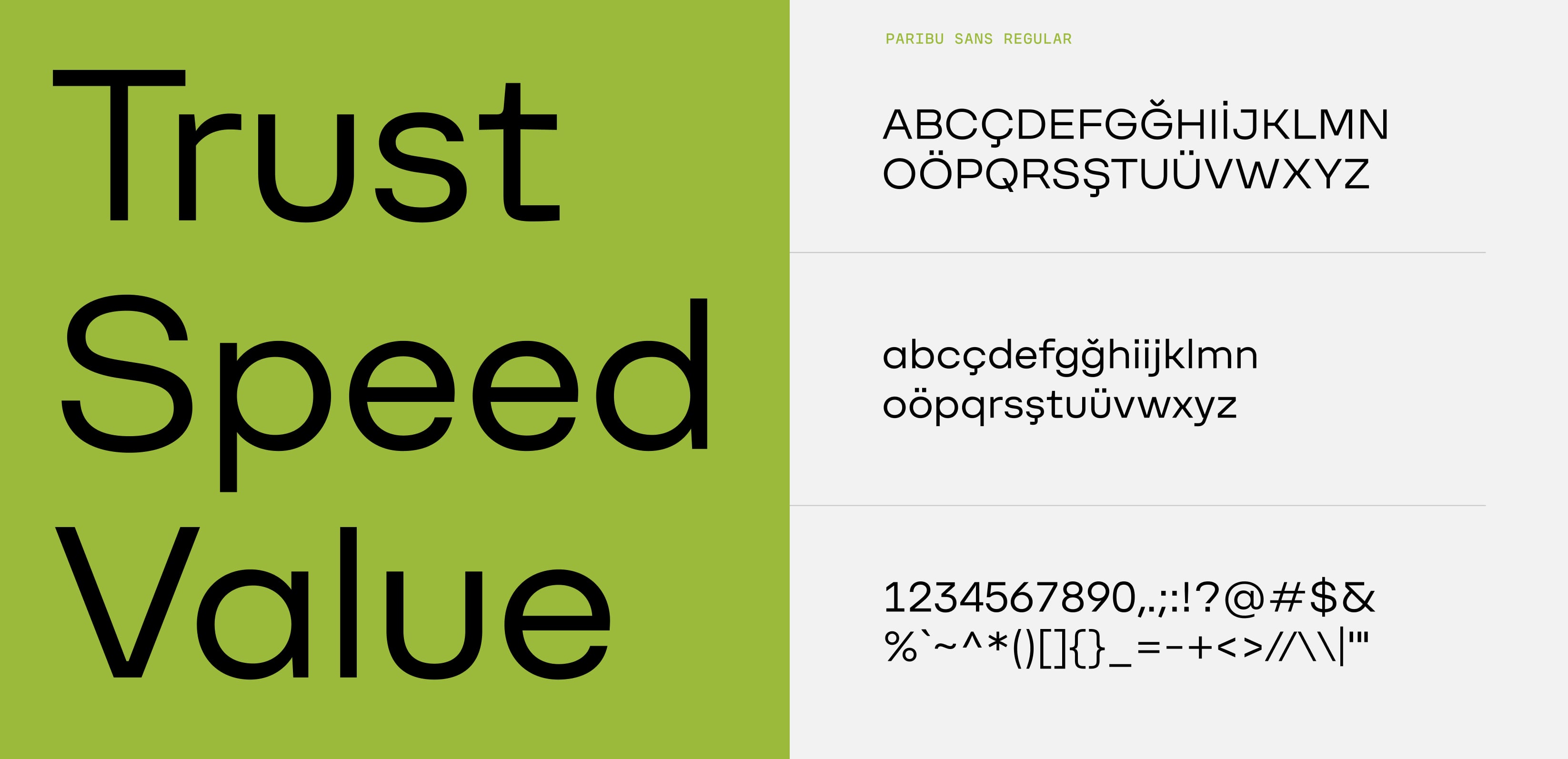
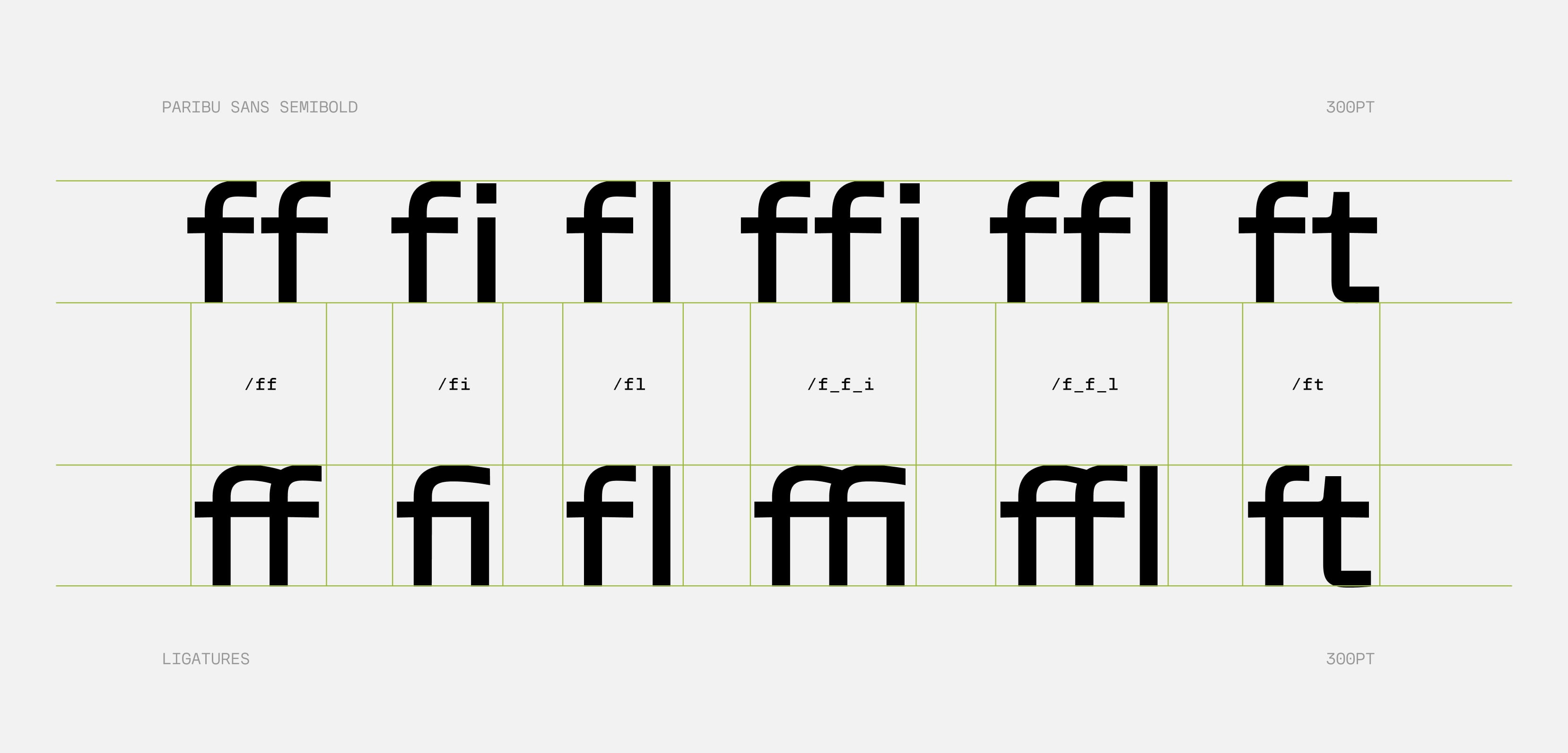
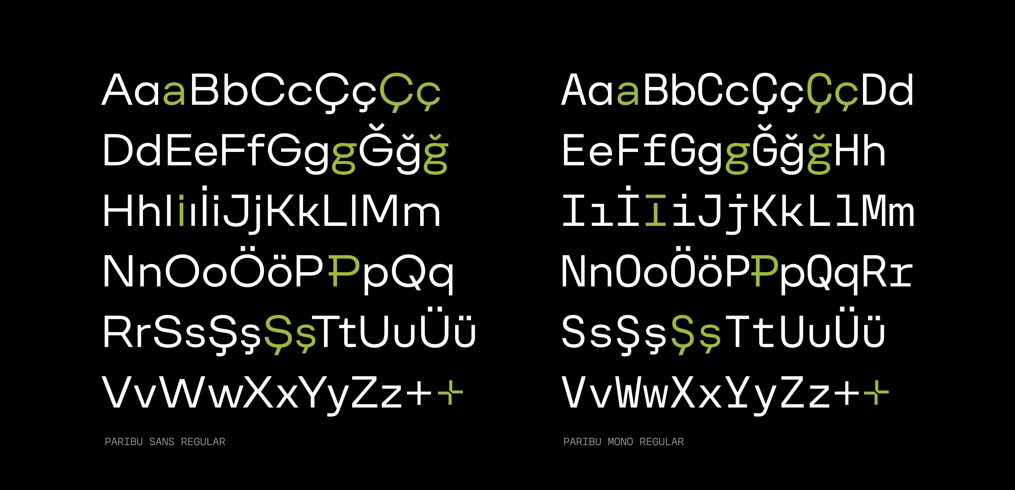
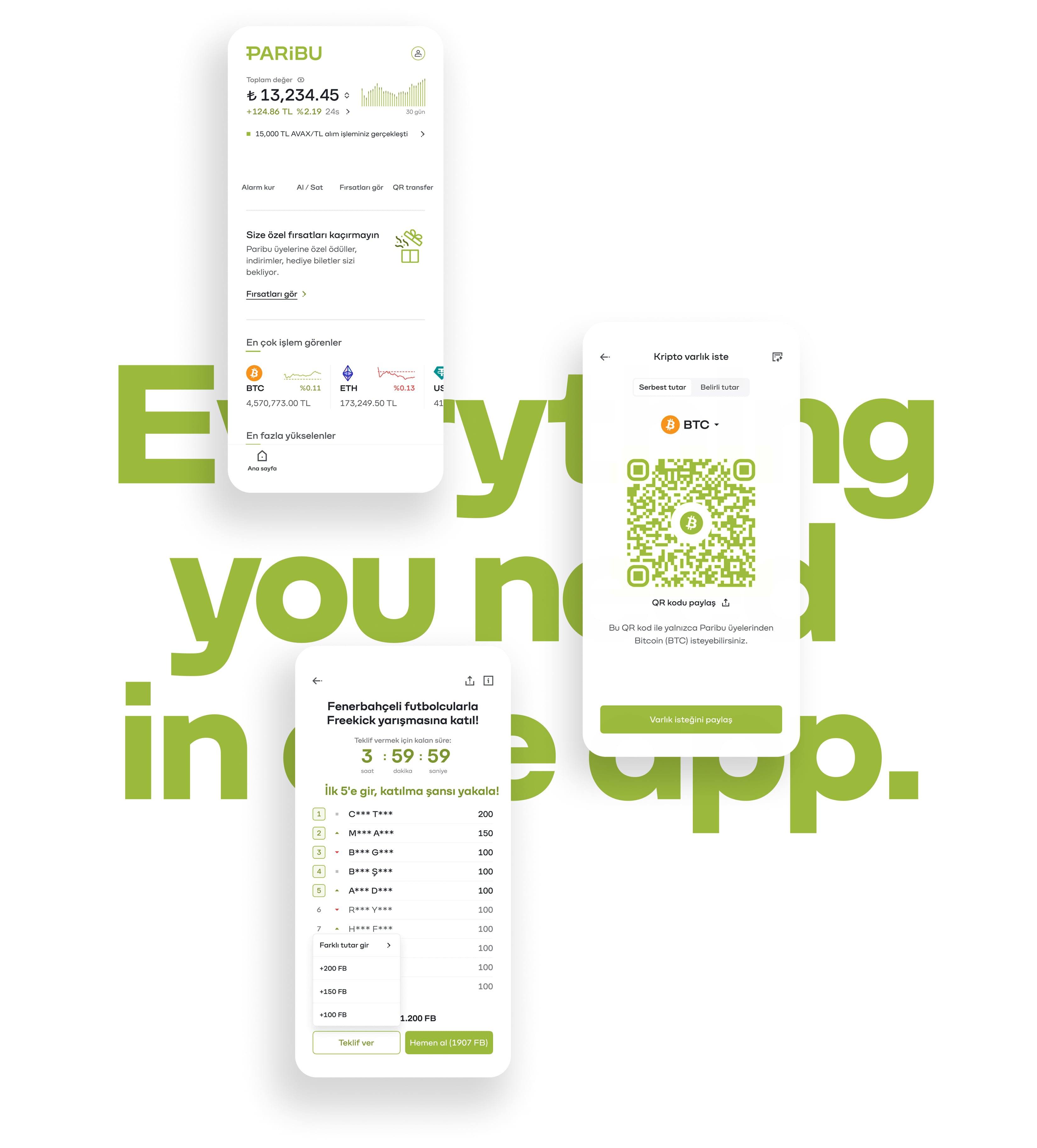
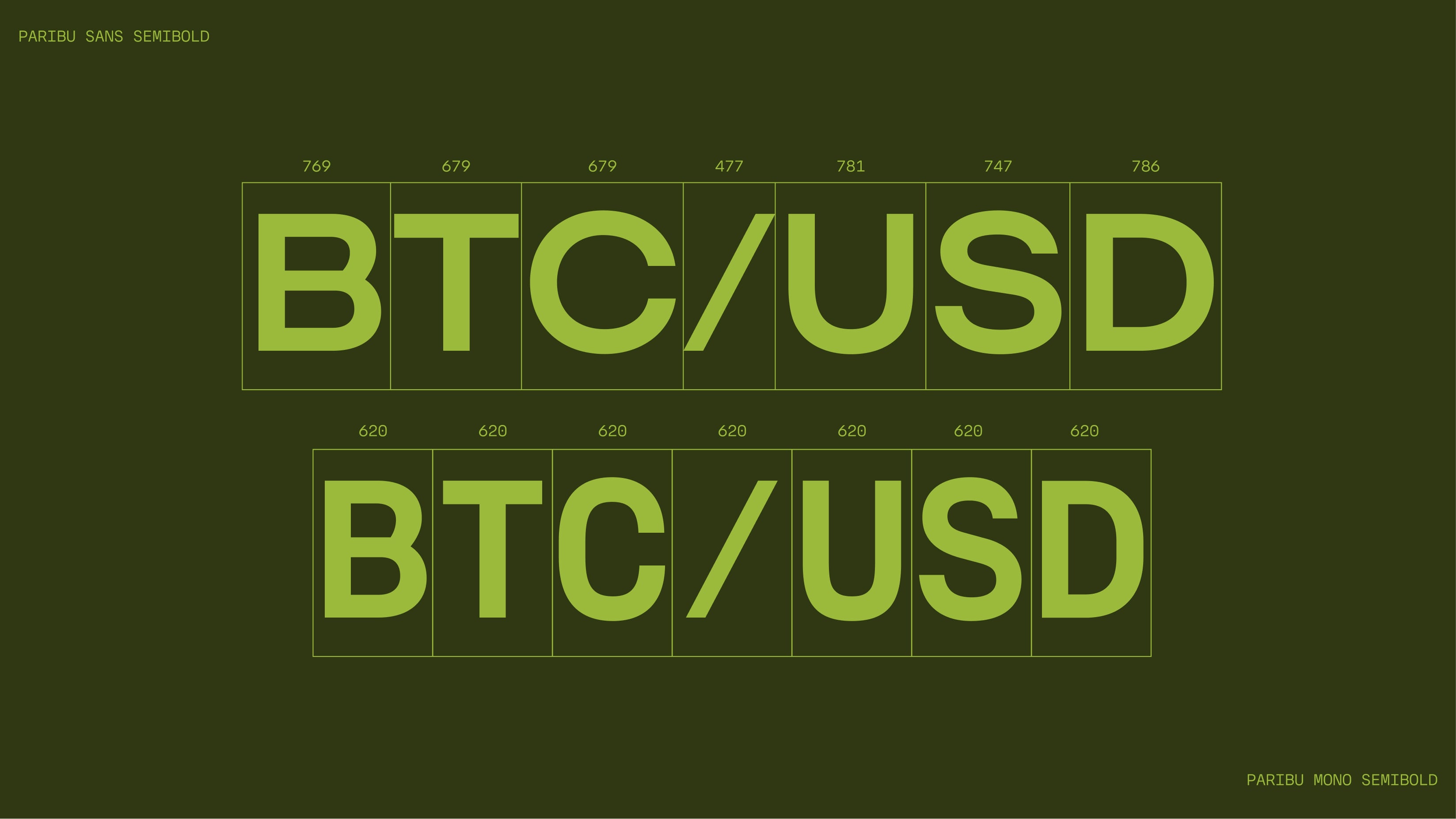
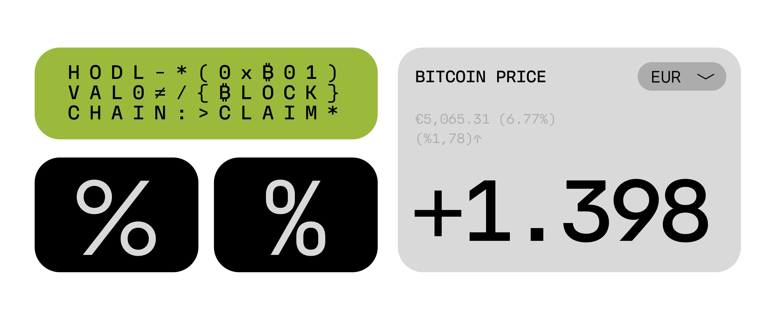
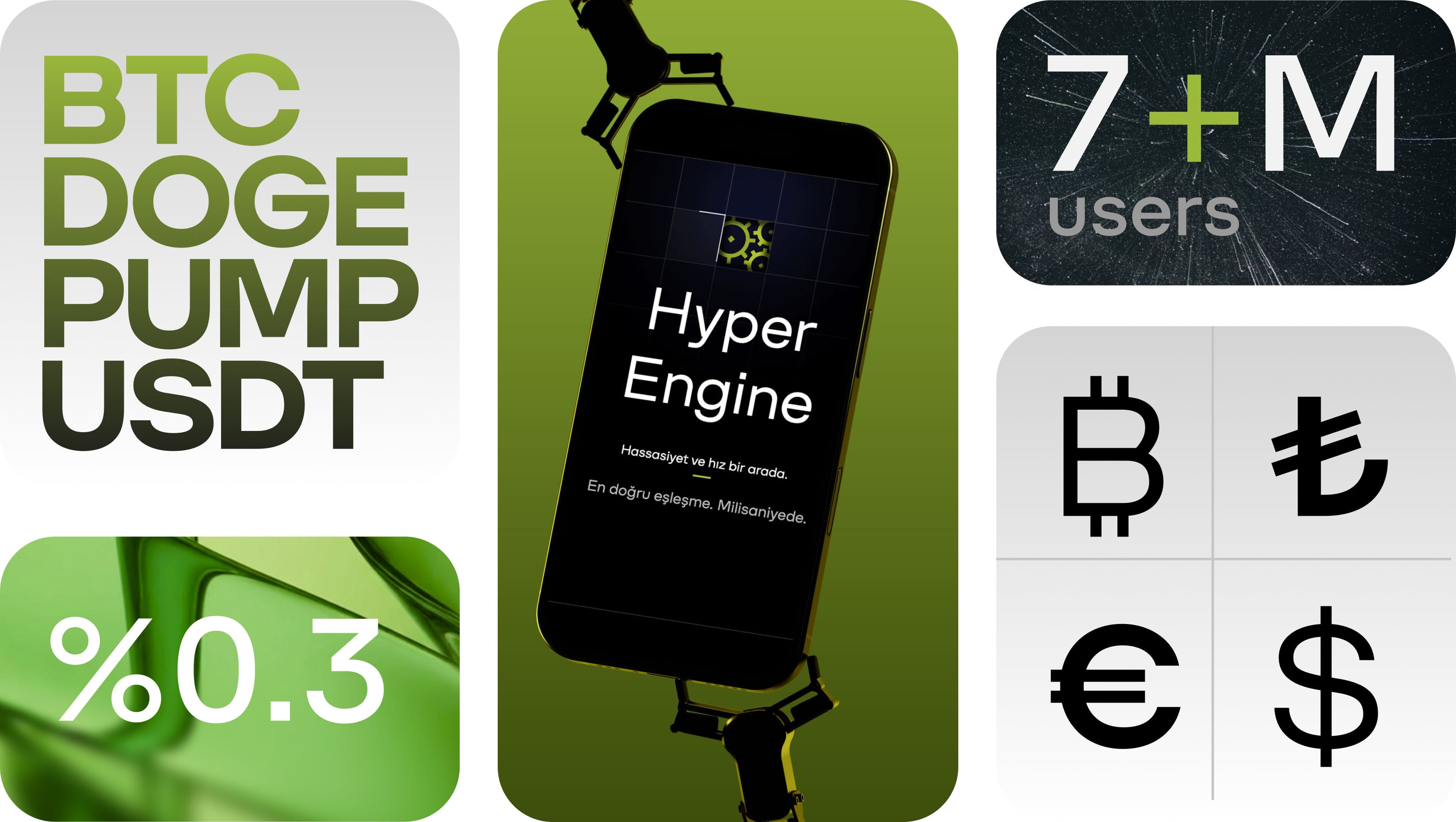
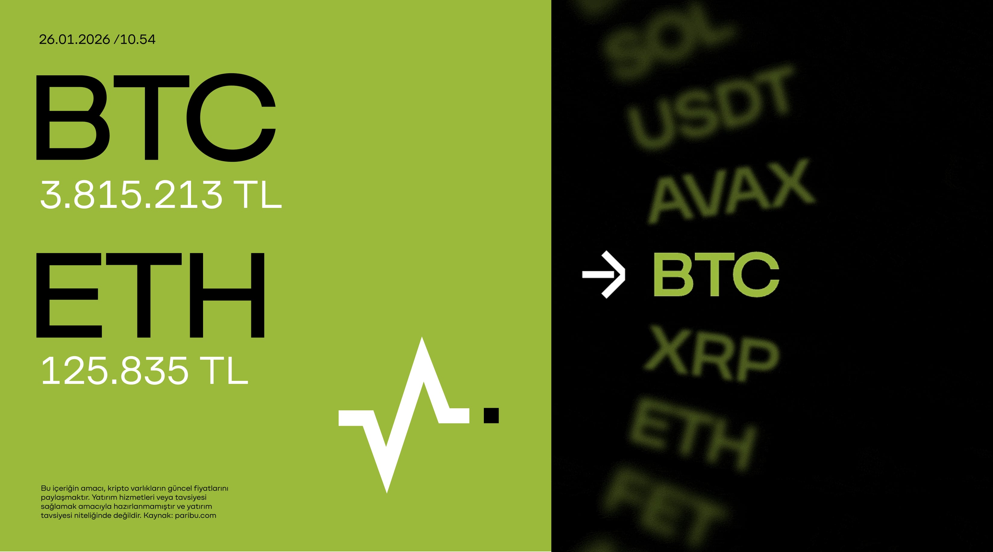
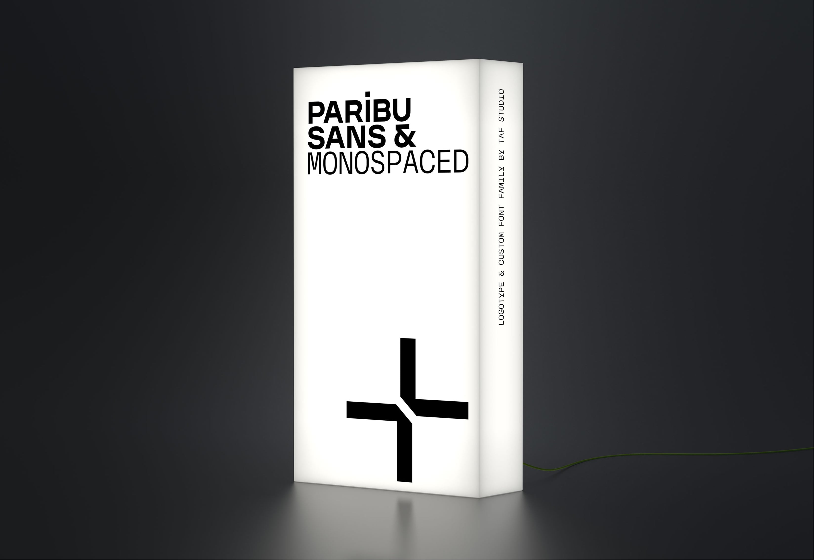
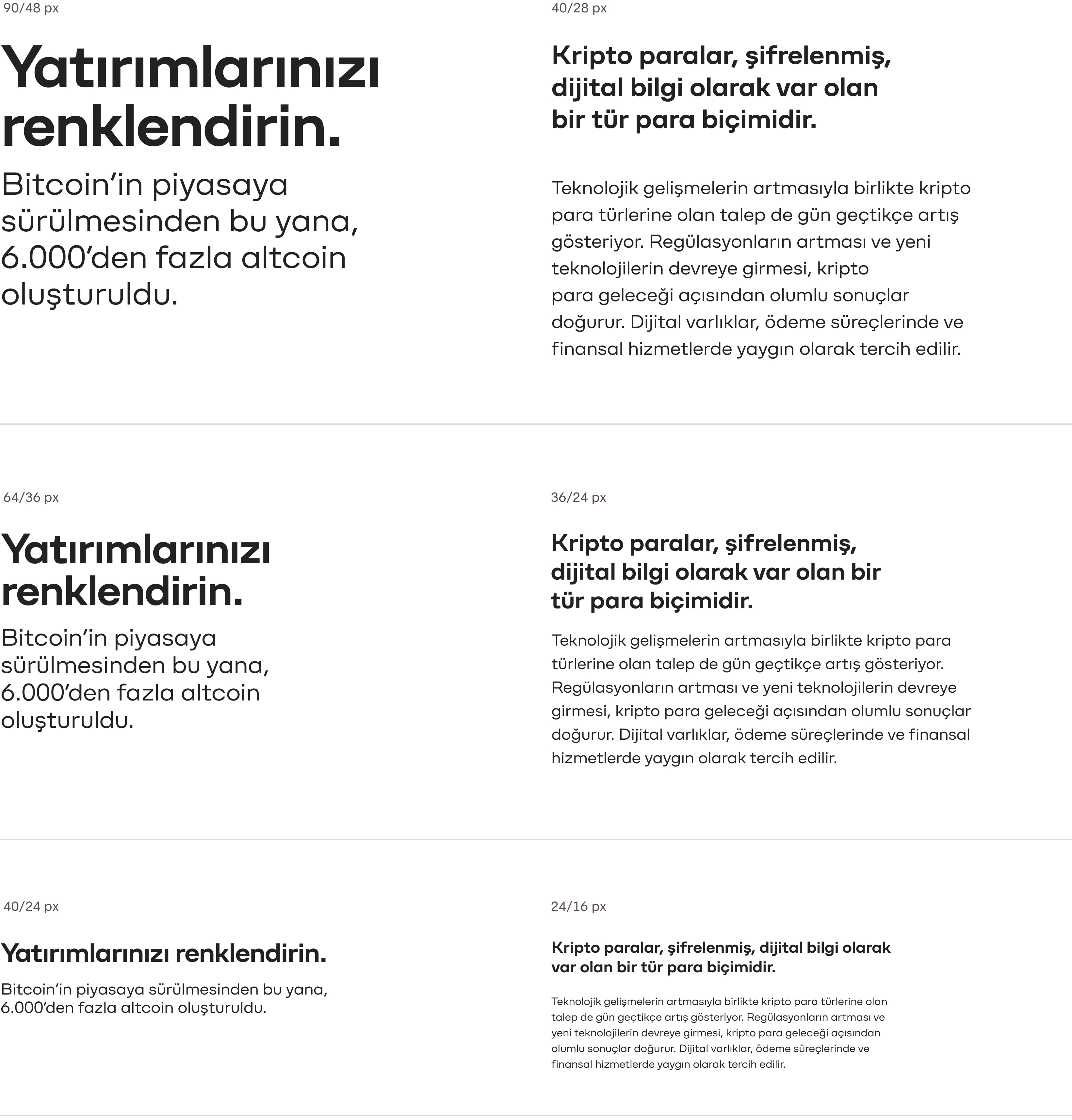
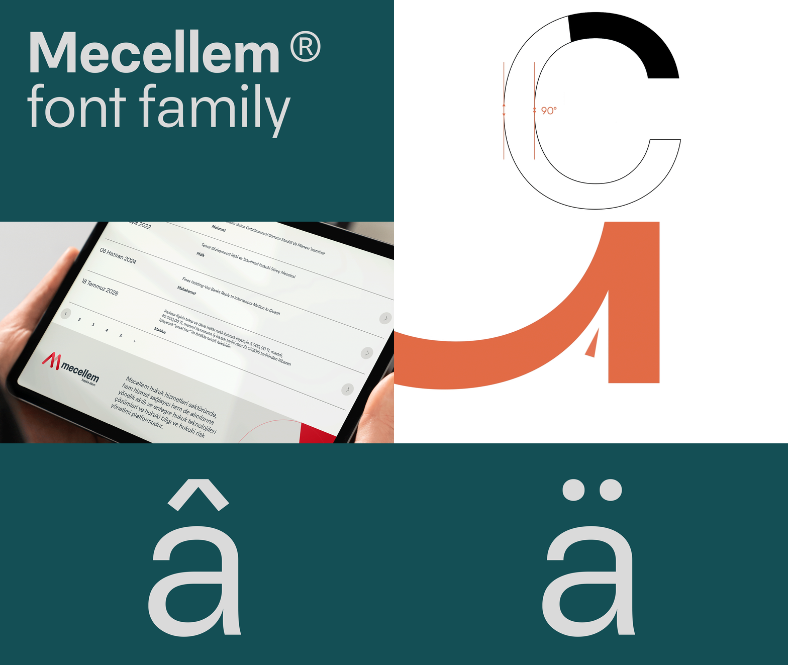
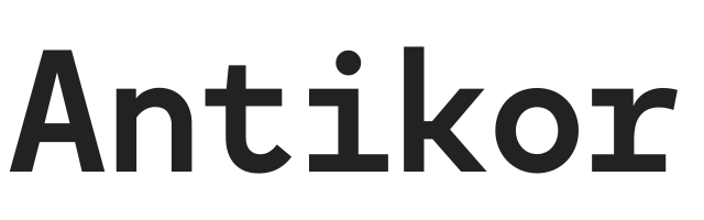
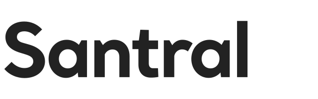
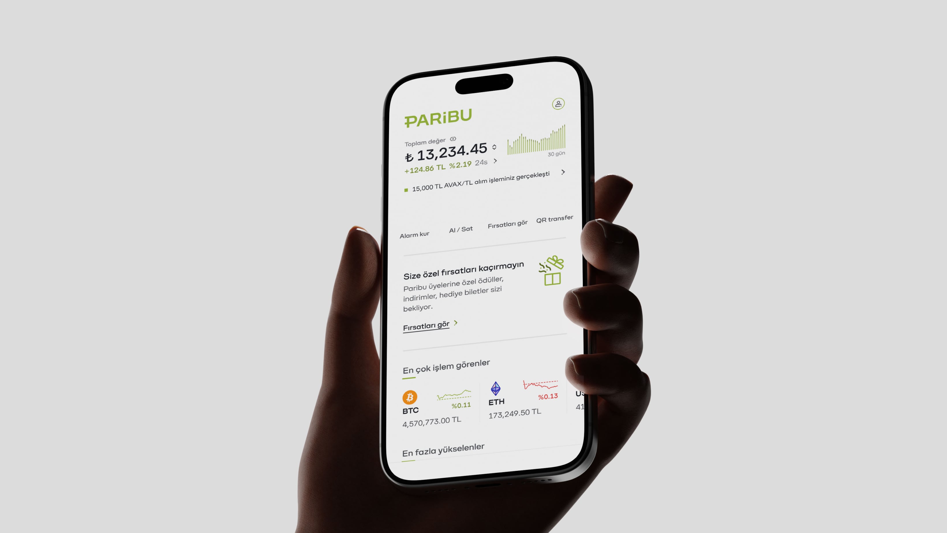
As Turkey’s leading cryptocurrency trading platform serving over 7 million users, Paribu operates at the intersection of finance and technology. Paribu Sans is a custom typeface family comprising Standard and Monospace versions, developed specifically for this digital asset ecosystem. It is designed as a core element of the brand identity, serving all text-oriented needs while enhancing reading performance and user experience. The anatomical structure of the typeface was developed in alignment with Paribu’s design language to ensure a cohesive visual identity. Combining Geometric Sans proportions with its monospaced counterpart and auxiliary glyph sets, the font addresses the brand's diverse communication requirements. Paribu’s philosophy of simple and intuitive design is reflected in the font through minimalist geometric solutions. Without compromising legibility, Paribu Sans serves millions of users as a typeface that both harmonizes with the brand’s aesthetic and embodies its core spirit.
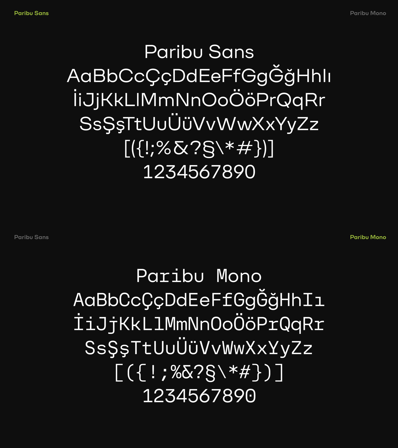
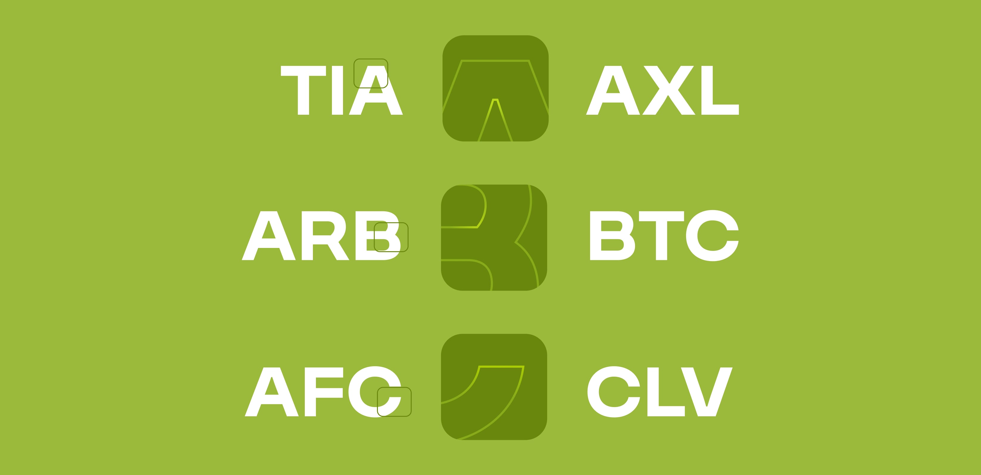
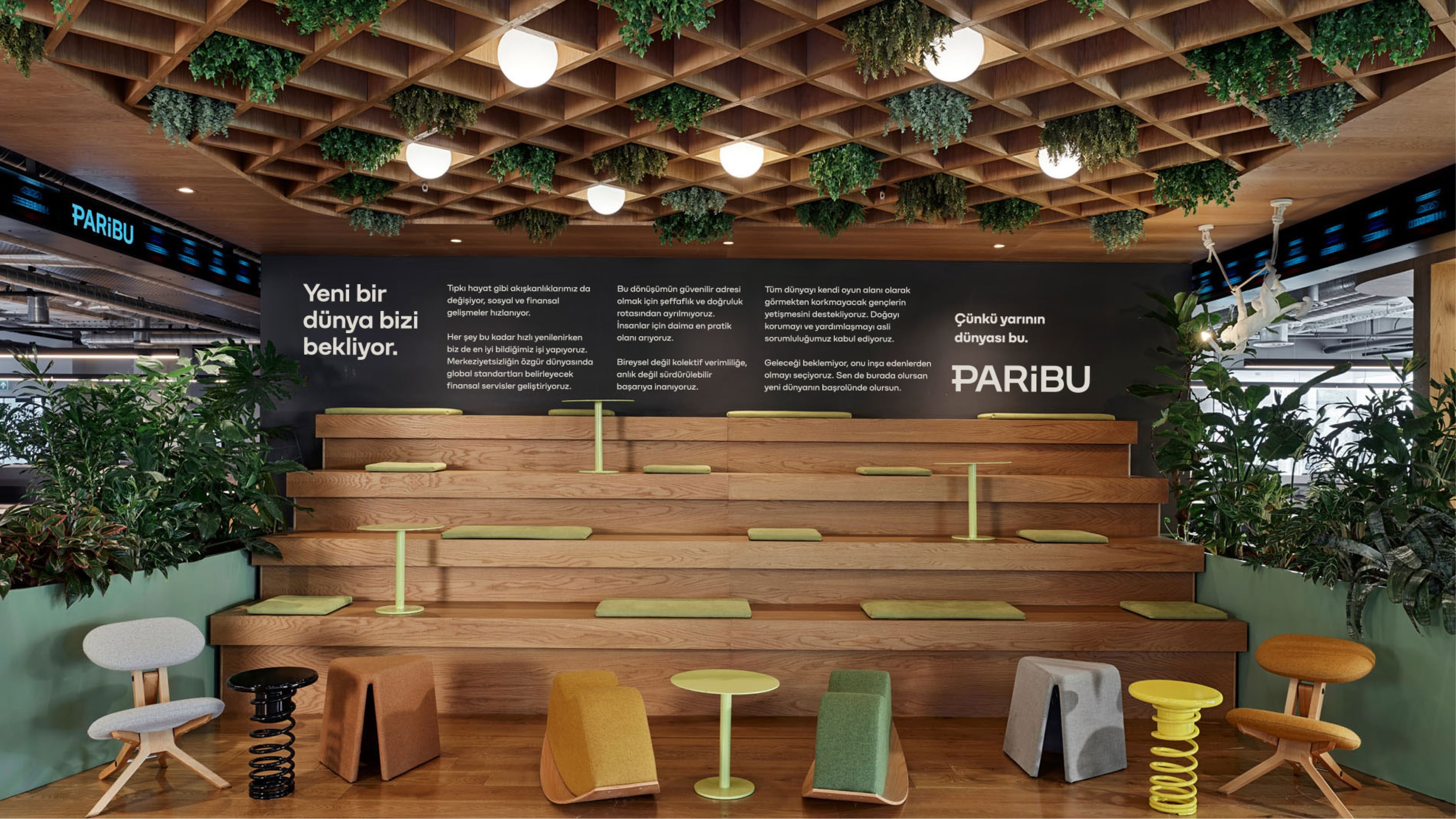
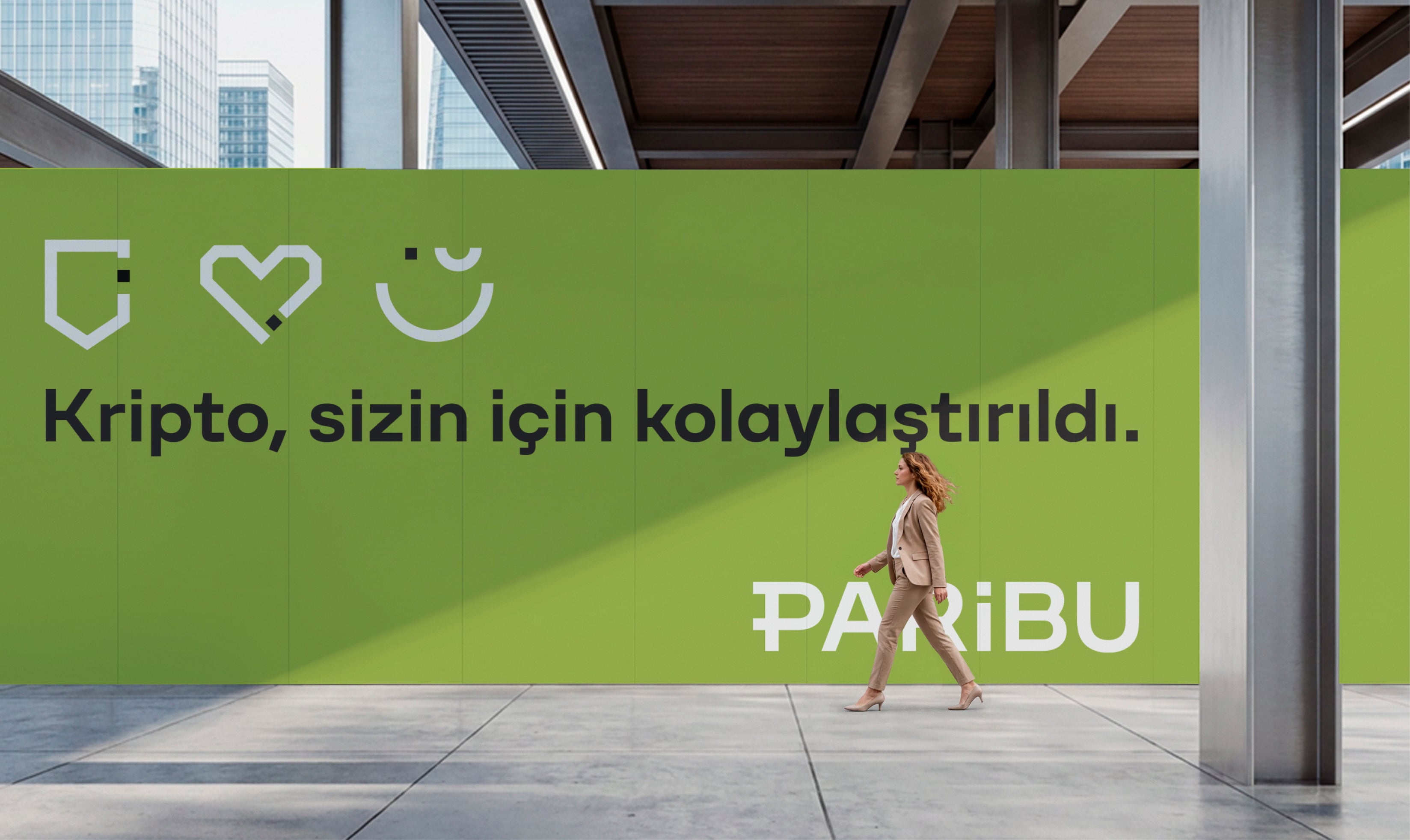
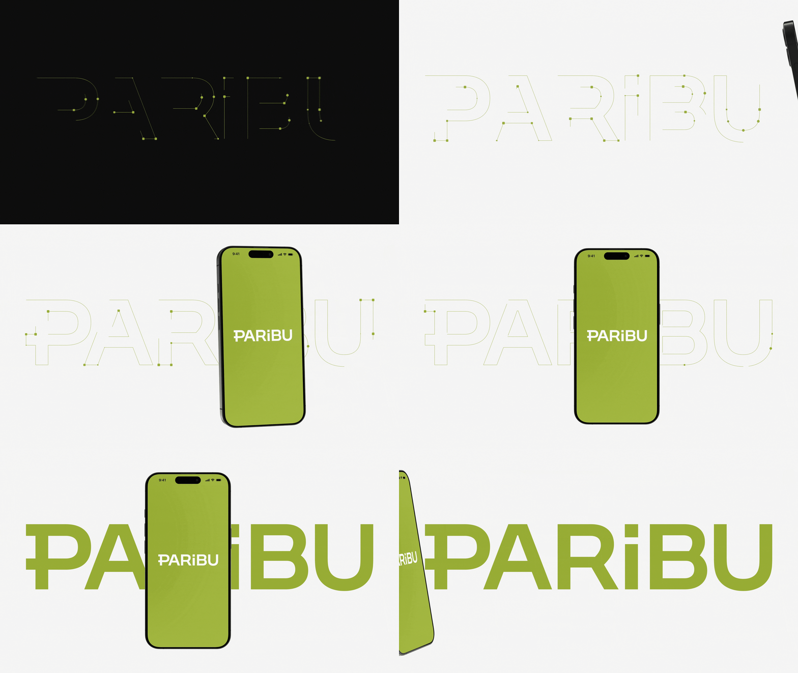
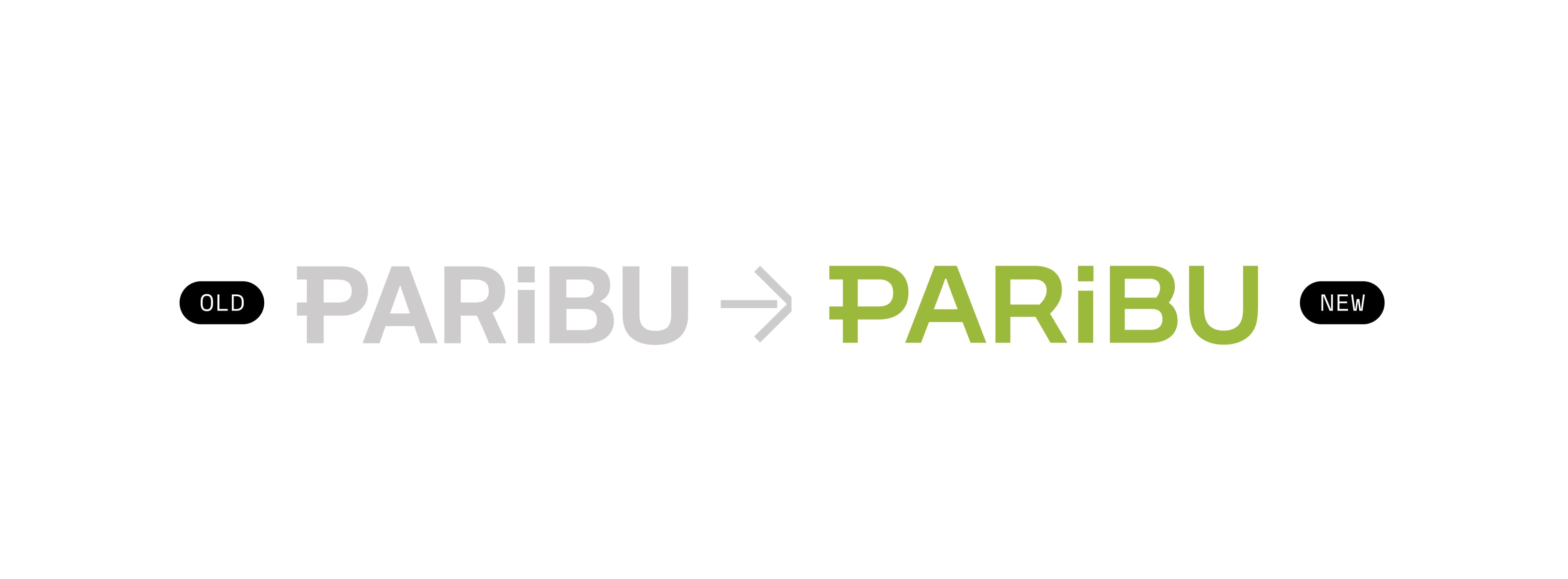
Within the scope of the corporate identity renewal, the Paribu logotype was reconstructed using the core letterforms of the new corporate typeface family. Special attention was given to weight distribution, inter letter spacing, and the optical balance of distinctive characters such as P and İ, ensuring visual consistency throughout. A detailed type mastering process was undertaken to fine-tune proportions and spacing, ensuring consistent rendering and optimal legibility in both large-small scale applications.
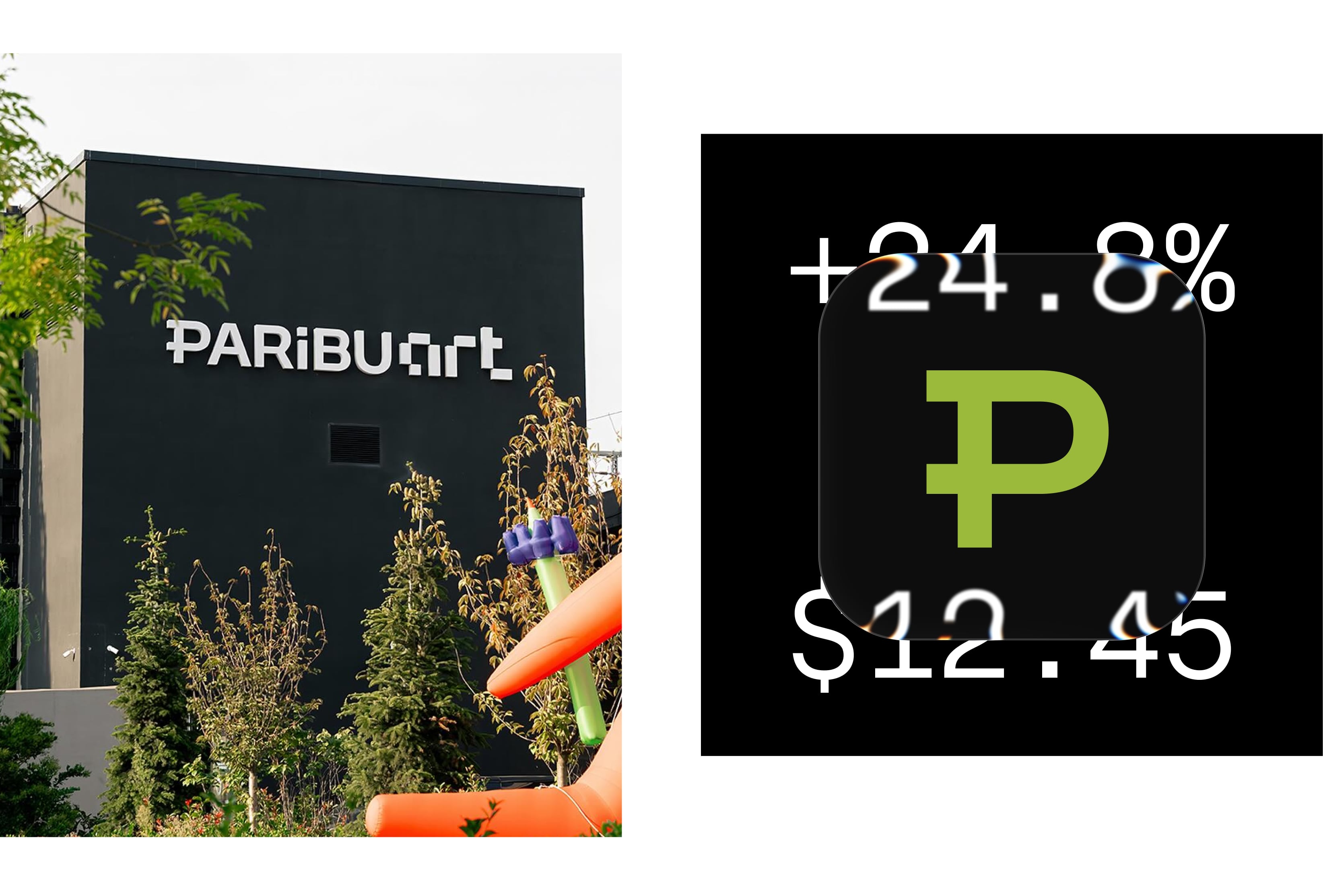
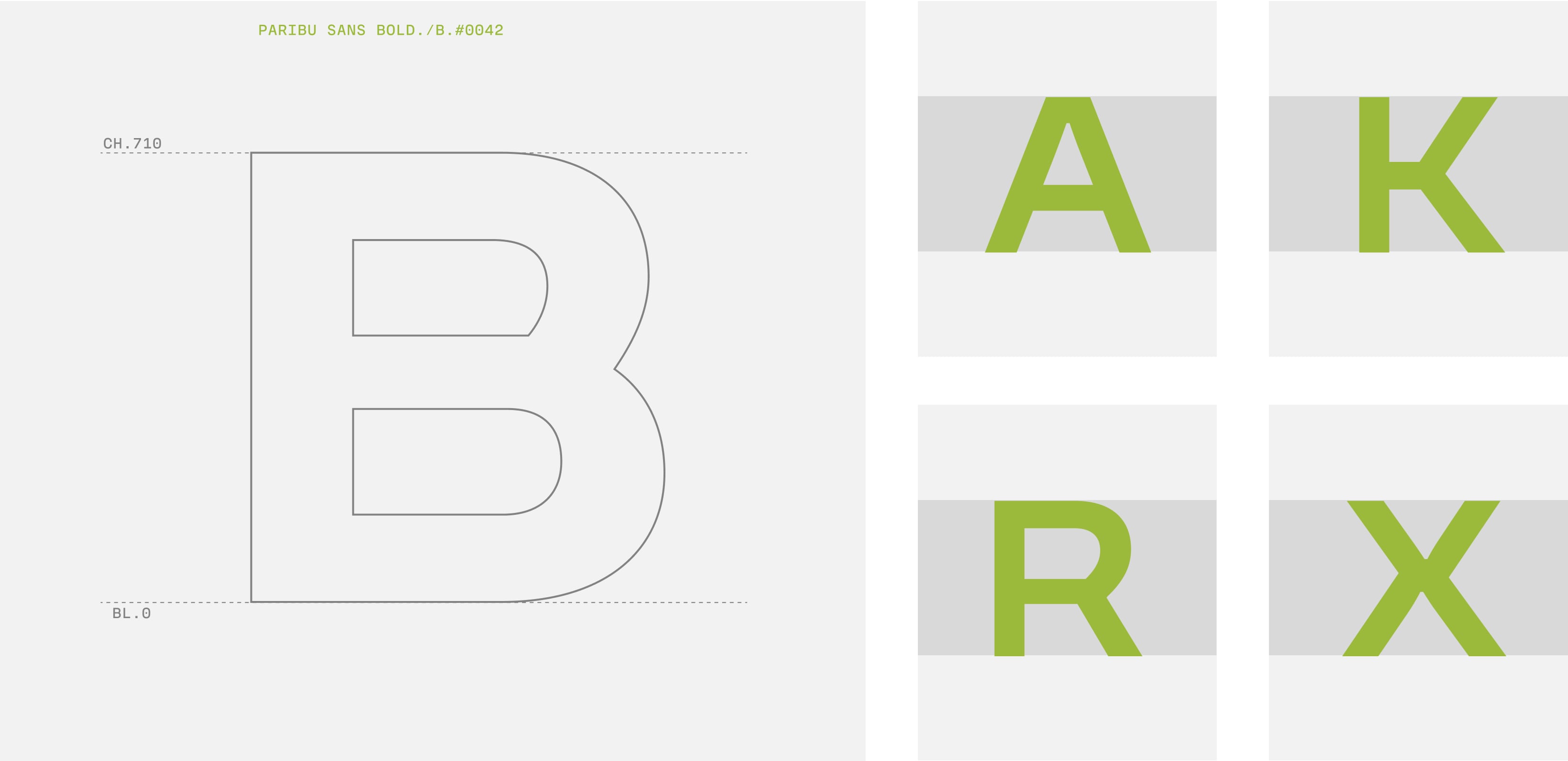
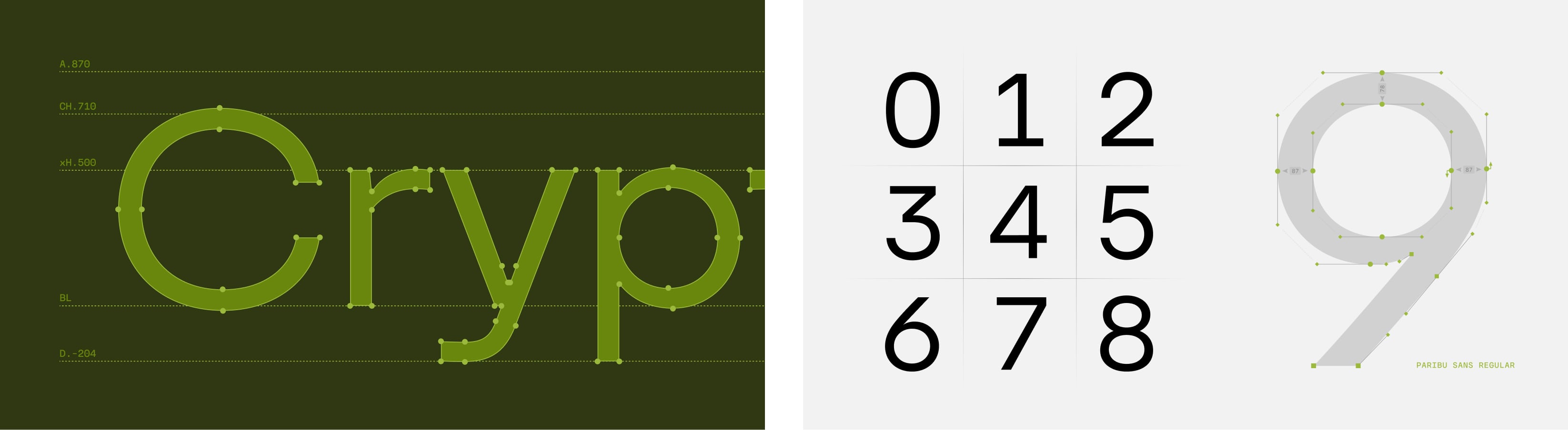
The renewed visual identity formed the foundation of the typeface brief. The typeface was envisioned not merely as a functional tool but as an integral piece of the overall visual puzzle, one that would complete the system cohesively while also standing as a strong and distinctive brand persona. As a central pillar of the rebranding process, the corporate typeface became the carrier of the visual language. The anatomical structure of the letterforms was treated as the cornerstone of brand construction, with each formal decision reflecting the identity’s core values. Principles such as simplicity, geometry, transformation, and efficiency shaped the silhouette of the typeface.
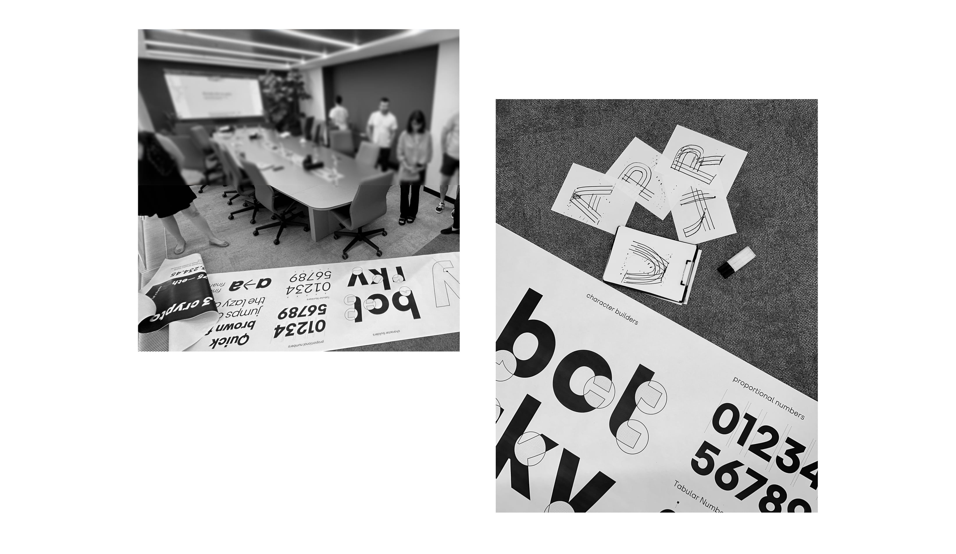
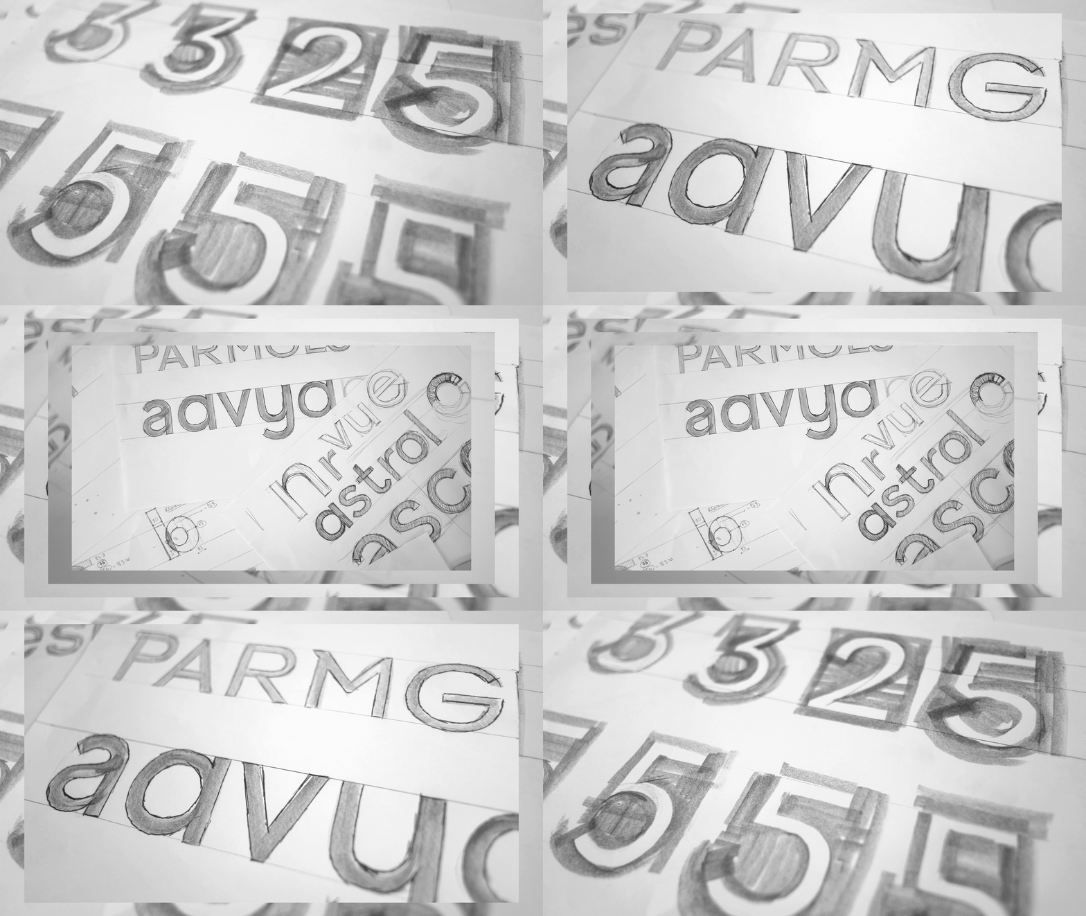
Guided by principles such as simplicity, geometry, transformation, and efficiency, the typeface evolved through three distinct anatomical explorations. Through close collaboration with the brand team, the typographic voice and functional structure were carefully refined, resulting in a corporate typeface comprising both Sans and Monospaced versions that reflect the brand dynamics and visionary principles, supporting branding and corporate materials as well as financial communication across the screens of over 7 million users.